The NHL has long been recognized as the league, among the “big four”, with the best looking jerseys. From the Chicago Blackhawks to the New York Rangers, the NHL’s list of great sweaters just goes on and on.
But while everyone talks about the best looking jerseys of the current teams in the league, many forget about the threads of teams that are no longer with us. Teams like the Quebec Nordiques and Hartford Whalers had some of the nicest looking jerseys we’ve seen during the history of the NHL. That being said, which ones are the best of the best? Check out my votes for the top five now-defunct jerseys of the NHL.
#5 — Atlanta Flames

Though the jerseys stayed pretty much the same, aside from the logo, when the Atlanta Flames moved up to Calgary, there was something the flaming “A” on the chest that made the sweater pop. The simplistic red, white and yellow scheme just worked so well for the Flames, that only subtle changes were ever made to the uniform during the team’s existence. When the biggest change is adding a player’s name to the back, you know you have a pretty good jersey.
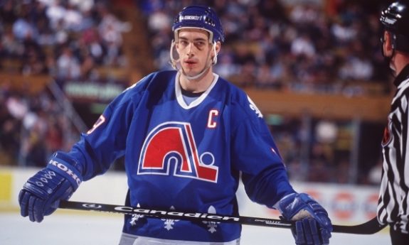
#4 — Quebec Nordiques
The Quebec Nordiques were another team that only had to make subtle changes over the time of their existence. The light shade of blue along with the fleur-de-lis along the bottom of the jersey looked so nice together. The biggest thing keeping them out of the top three is their road blue uniforms. Now, I love the color they used, by the all blue look just wasn’t the best. Had they had the same template as the road whites, they probably would’ve been more towards the top.
#3 — Hartford Whalers
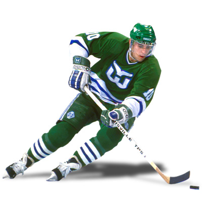 The Hartford Whalers went through a number of changes in their jersey design before finding the perfect look with the late-70s/early-80s of the light green, blue and white look. The jersey was simple while still having a nice piping around the waist and forearms. Unfortunately, the team had to go and ruin a great look with the navy blue road jerseys and the adding of gray in 1992, costing them a spot in my top two.
#2 — Cleveland Barons
The Cleveland Barons are a team I can bet not many would’ve expected to see here, especially at number two. But when you can take the shape of your state, implement it into a logo and then add it to a jersey without it looking tacky, you’ve done something right. They took the red and black look and made it cool before almost every other team in the NHL, Chicago aside, tried to do the same. They were only around two seasons, but the Barons jerseys, both home and away, earned a spot high on this list.
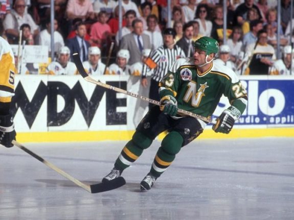
#1 — Minnesota North Stars
The honor of the top now-defunct jersey in the NHL has to go to the Minnesota North Stars. Specifically, it was the jerseys from 1981-1991 that I really happen to like. The bright green and yellow look of the 70s was nice, but it just became too much to look at one white ice. The addition of black in 1981 added a perfect counter to balance out the colors already in place. It looked nice on the ice, and is a jersey that could still pass as a viable design in today’s NHL.
Free Newsletter
Get Hockey History coverage delivered to your inbox
In-depth analysis, breaking news, and insider takes - free.
Subscribe Free →