There have been too many NHL sweaters to count over the years, what with the 30 current franchises and the 17 defunct teams. And then you add alternate jerseys, All-Star Game uniforms… yikes. While not the prettiest sweaters to grace the game, here’s a top-10 list of some of the best NHL jerseys to ever hit the ice, from Quebec to California.
# 10 – The Atlanta Flames 1973-80
In the team’s brief eight year history, the Atlanta Flames captivated the fans of opposing teams with their rich, red sweaters, accented with gold and white stripes along the bottom hem. While reminiscent of the Detroit uniform, the Flames’ red-white-gold color scheme was topped by the classic flaming “A” logo, which can now be seen on current Calgary Flames jerseys- but only if the player is an assistant captain, of course. A classic jersey and a fan favorite even today.
#9 – The Boston Bruins 1957-58
The Bruins franchise has gone through a lot of uniform changes in its 86 year history… a LOT of changes. Out of the 29 different match-ups (many of which were considered some of the ugliest in the NHL) the most interesting had to have been the 1957-58 lineup. Eliminating the third, black jersey, the away sweater was now yellow and the home was the standard white. The pants were black with a gold stripe going along each side of the leg and the traditional Boston “B” crest graced the front of the sweater. However, the arms of the jersey, as well as the socks, kept the striped black-white-gold pattern of the squad’s previous uniform, giving the Bruins an almost jail-house look. If they were going for a “rough” image, it didn’t help- they were still crushed by Montreal in the ’58 finals.
# 8 – The Buffalo Sabres 1983-87
There’s a saying in Buffalo: Blue and Gold never get old. And as a life-long Sabres fan, there’s nothing more true when it comes to Buffalo uniforms. Believe me, no one needs to be reminded of those awful 1996-2006 black-red-white sweaters with that ridiculous bison logo, or that dreadful alternate red jersey issued in 2000; those are dark shadows on an otherwise great jersey history. That’s why the 1983-87 sweater was the best the boys from Buffalo have ever donned. A royal blue sweater with rich, gold stripes on the sleeves, hem and socks, joined by the bison/dual-sabre crest on the chest and each shoulder make it a one of a kind jersey and one of the best selling throwback sweaters to date.
#7 – The Calgary Flames 1998-2006
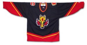
Borrowing a bit from the jersey introduced to the hockey world by the 1978-79 Vancouver Canucks, the alternate dark jersey introduced to the Flames-nation in 1998 came on like gangbusters. With the “V” design on the front, back, and sleeves, the dominantly black and red jersey was accented with a yellow stripe and a yellow horse logo with red flames shooting from its nose. The tried and true Calgary “C” still made an appearance on the jersey, sitting atop each shoulder, just above the player’s number.
#6 – The Chicago Blackhawks 1955-present
Starting in 1955, the Chicago Blackhawks changed its logo from the Indian head-dress in a circle to the stand alone logo we know today. Other than that, the uniform has remained generally the same for the past six decades- minus the relentless changes in the stripe-scheme that is. Chicago proved that a team can have a great, classic jersey and not have to change or add anything. The deep red and bone white home and away jerseys, with the addition of the black alternate jersey in 1996, are about as good as you can get in the NHL.
#5 – The Colorado Rockies 1976-82
After a move from Kansas City, the Colorado Rockies suited up with one of the most colorful (and arguably ugly) jerseys to ever hit the ice. The deep blue away jersey, with red and gold stripes on the sleeves and hem was topped by the “C” inside the mountain logo and another “C” crest on each shoulder. One of the most sought after jerseys today, the Rockies abstract color scheme made this one a real favorite of hockey fans the world over.
#4 – The Edmonton Oilers 1979-96
Who doesn’t love that blue and orange sweater? Well, maybe not Flames fans, but the deep blue, topped with the great Oilers crest on the chest just screams hockey (particularly 1980’s hockey thanks to Gretzky). The traditional Edmonton jersey is completed with white and orange stripes on the hem and sleeves. Unfortunately, 1996 brought about the era of the copper and dark blue color scheme, which gave the uniform a dull look. Thankfully, the concept of throwback jerseys came to the NHL in 2008, so fans began to see the old blue and orange once again.
#3 – The Montreal Canadiens 2007-presenth
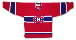
The Reebok Edge uniforms, the standard in the current NHL, introduced the hockey world to a re-vamp of many classic sweaters, including the everlasting Habs jersey. Another sweater that’s stood the test of time, 100 years in Montreal’s case, the Canadiens current jersey is the standard red, with the classic C/H logo set upon a white-blue-white stripe across the center of the chest; numbers on each arm are set above the same white-blue-white stripe. One of the most popular teams in the NHL, Montreal jerseys sell through the roof and this one is no different.
#2 – The Quebec Nordiques 1980-95
Jumping over from the World Hockey Association in 1979, the Quebec Nordiques’ jersey remained relatively the same over its short 15 year history. The home white and away light blue jerseys each had three fluer-de-lis on the bottom hem and one on each shoulder, just above the player’s number. While a bit boring, the sweater’s logo was just the exclamation point the jersey needed. The big red “N” logo with the hockey stick and puck gave color to an otherwise uninteresting jersey. A fan favorite even today, the Nodiques jersey gave the hockey world another unique uniform.
# 1 – The California Golden Seals 1970-73
Originally the Oakland Seals, the club was bought out in 1970 and renamed the California Golden Seals. Along with the name change, the Seals received new jerseys and a new color scheme: gold, white and green. The deep green and rich gold instantly became an NHL classic, with the logo changing from a drawing of a seal to simply the word “Seals” in a diagonal pattern across the chest. The sweater also had white-gold-white and white-green-white stripes on each sleeve and the bottom hem of the jersey. While the green eventually became teal in 1974, the classic gold, green and white, mixed with the simplicity of the jersey itself makes this one of the best hockey jerseys of all time.