Yesterday, Paul Lukas of ESPN Playbook released his full and final Uni Watch Power Rankings, and the results were not flattering for the Colorado Avalanche. In fact, Lukas placed the Avalanche at the very bottom of the NHL list, with an overall ranking of 118 out of the 122 teams throughout the NHL, NBA, NFL & MLB (edging out the Minnesota Vikings, Brooklyn Nets, Cincinnati Bengals & Sacramento Kings).
Here’s what Lukas had to say about the Avs current uniforms:
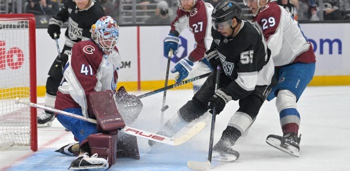
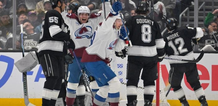
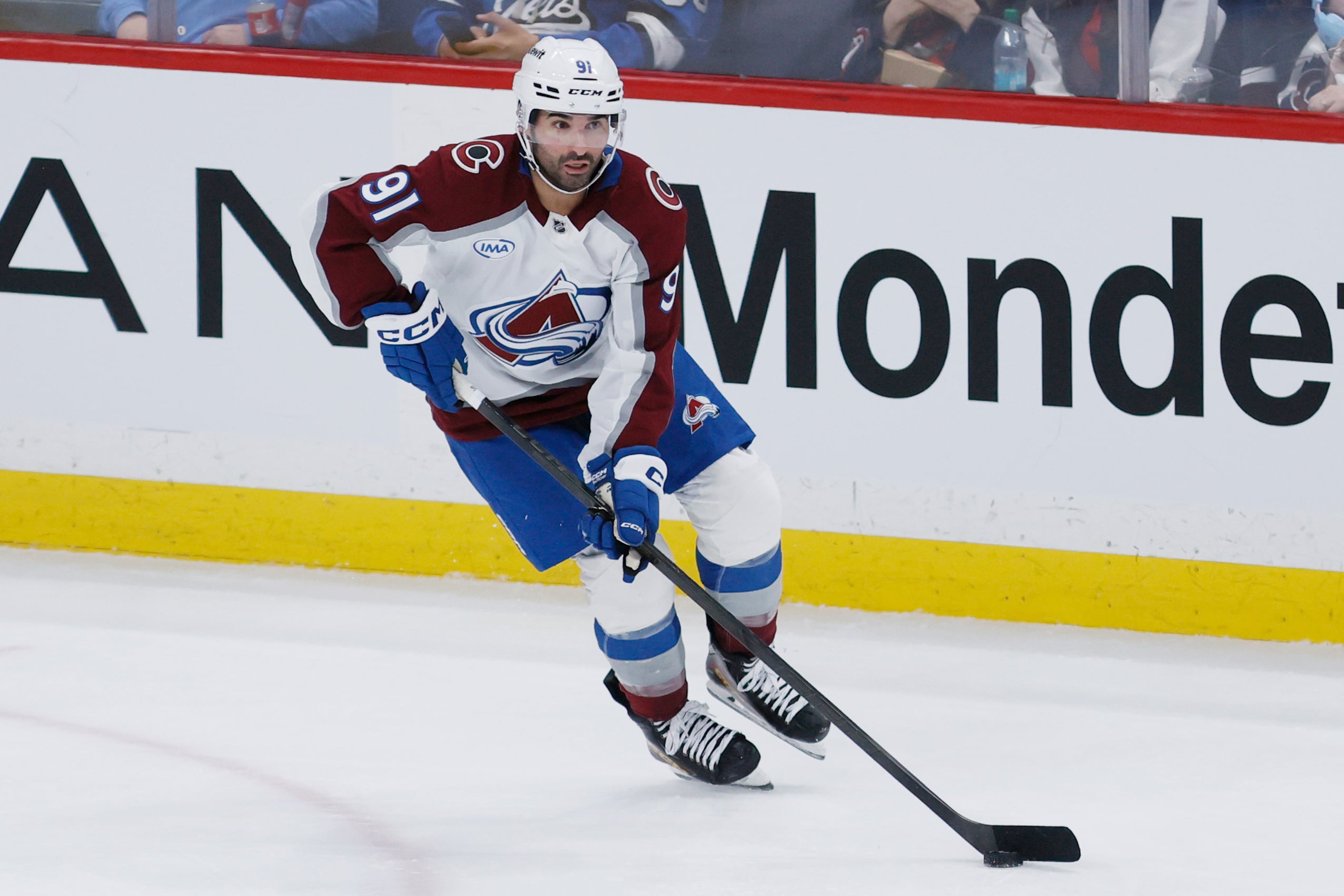
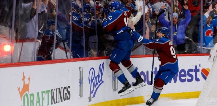
Once upon a time, this was a passable-looking team. Not great, but passable. Now, though, it’s a jumble of ill-fitting elements — the apron-string jersey stripes, the pointless side panels, the laughable number font, the alternate jersey that’s just a Rangers rip-off. If a team could get a game misconduct for its uniform, the Avs would certainly deserve one.
To put the ranking in context, it should be noted that the top six NHL uniforms (Montreal, Boston, New York Rangers, Detroit, Philadelphia, Toronto), belong to more traditional markets, with the Canadiens coming in first among all North American pro sports teams, and the other five also finding themselves in the top 25 overall. Despite a few tweaks & experiments here or there, these looks have largely remained unchanged over the years, and these are franchises that are widely recognized as foundational to the league (with Chicago – ranked 11th in the NHL – thrown in that mix as well). Among ‘newer’ markets, the Blue Jackets, Sharks and Panthers all rank in the top half of the league, with the Kings and Stars coming in at 28th & 29th. It should also be noted that Lukas does comment on the Islanders alternate jersey, which he says “might be the single worst uniform in North American sports.” Agreed.
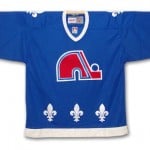 Before commenting on these rankings and the state of the Avalanche uniforms, it must be said that any jersey donned by Colorado players could never live up to the greatness of the old Nordiques look. As described by coolhockey.com, “the Nordiques’ original colours were red, blue, and white. The team jersey was simple; it was primarily a single colour with several Fleur-de-Lis across the bottom and the team logo. The team’s logo was a stylized Igloo that also depicted the letter “N” and a hockey stick and puck.” Simple, classic, and very much up there with the old Whalers look in terms of jerseys that many are still drawn to and would love to see back in the league.

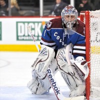
But with the move to Colorado in 1995, the franchise needed a new look and identity, hence the adoption of the Avalanche nickname. The original jerseys are described as having a “stripping pattern (with) a double bar, zigzagging on the sleeves from wrist to wrist on the front and back as well as a separate pattern that ran at the bottom of the torso.” The logo design was based around a large capital letter “A”, and had “a cascading avalanche, lead by a hockey puck, which wraps across it in the shape of a letter “C.” A secondary logo was positioned on the shoulder of the jersey, “the imprint of an abominable snowman’s foot.” In 2007, with the advent of the Reebok Edge jerseys, “the stripping was dropped, leaving essentially a two tone appearance. The secondary colour panels ran along the top of the shoulder and on the side of the torso to the underarm. A small double stripe runs down from the neck to the bottom of the jersey along the outside of the chest, as well as on the outside of the side panels on the back.” At that time, the team also introduced the predominantly blue alternate jersey described by Lukas as a “Rangers rip-off”. (jersey descriptions via coolhockey.com)
The reality of these kinds of rankings is that they are entirely subjective; not only are people drawn to different looks for all kinds of aesthetic reasons, but hockey fans will also have an affinity for certain jerseys based on emotional attachment & personal history, regardless of whether or not it looks all that great. While it would seem as though such notables as the Wild (8th), Canucks (17th), Coyotes (18th), Hurricanes (21st) & Predators (22nd) may be ranked higher than they should be, with the Oilers (26th) and Blues (25th) coming in a touch low, the simple fact is that there is no definitive way to measure such a thing without ruffling a few feathers.
In all honesty, the Avalanche logo and jersey would probably not rank too high on a list created by this particular hockey writer, but that’s just one man’s opinion, as is Lukas’. Of course, this should not dissuade anyone from proudly sporting their Avalanche gear; goodness knows that as a Blue Jays fan, I’ve put on some pretty hideous looking apparel in recent years, prior to the new, 21st-ranked jerseys they’re currently donning.
When your team’s captain is raising the Cup – accomplished twice by player’s wearing Avalanche jerseys – no one’s thinking about these kinds of things. At the end of the day, true hockey fans will proudly wear their favorite team’s gear without a second thought, and that’s really what matters.
(For another look at the evolution of the Avalanche look, check out their sportslogos.net page)
—
I’ve also been meaning to post this video for a while, and was reminded of it when I saw Matt Duchene recently tweet about the band ‘Fun.’ Here’s a look at those low-rated Avs jerseys in action, with this 2011-12 ‘Season Montage’ (via TheJohnbiehlerfims“)
Free Newsletter
Get Colorado Avalanche coverage delivered to your inbox
In-depth analysis, breaking news, and insider takes - free.
Subscribe Free →