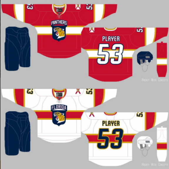
It’s been widely known that the Florida Panthers are going to be overhauling the look of the team for the 2016-17 season. However, no one really has had an idea about what the team will look like going forward.
Until now that is.
Panthers beat reporter George Richards of the Miami Herald got a look at the new duds of the Panthers, and he gave out full details of the new look.
Based on what he said, a concept artist from SportsLogos.net decided to create the look. Everything is spot on from what was said, but it’s tough to really gauge on the look of the Panther because it can go any way.
Florida is one of the best young teams in hockey, and appear to be on the verge of becoming something very special. It makes sense that a rebranding would occur as the team looks to finally hit relevancy. The taking from the look of Montreal is weird, but I think it works here.
The logo, on the other hand, I’m not too crazy about. What the team has in the leaping panther is unique, and one of the most underrated in the league. It just seems like their trying to hard to fit it with this simplified look. Based on the above concept, Richards said the design “wasn’t bad”, leading to the belief that the artist is close to the actual look.
What do you think of the look? Think it’s a step forward or back from the current look of the team?
