- 1967-1988: Kings Are Introduced to the NHL With Original Purple and Gold Jerseys
- 1988-1998: Gretzky Arrives in Los Angeles, Along With New Jerseys
- 1995: The Burger King Jersey
- 1998-2013: Purple Makes a Comeback in Kings Uniforms
- 1999: Kings Introduce New Alternate Jersey
- 2008: Kings Introduce Purple-Less Alternate Jersey
- 2011-Present: Kings Eliminate Color From Primary Jerseys
- 2016: Grey Alternate Jersey is Added to Kings Uniform
- 2020: Kings Reverse Retro Jersey
- 2021: Kings Replace Alternate Jersey
- What Is the Future for Kings Uniforms?
The Los Angeles Kings have had some of the most classic jerseys in NHL history. Many legends have worn the Kings jersey and all the history that goes with it. Since the team was founded in 1966, they have only had three main color schemes, that have changed little over the years. Even within these designs, some commonalities keep the Kings’ identity consistent.
Most Kings jerseys have been hits, but like any team, they have had their share of misses. However, overall, they’ve done a solid job with their logo, branding, and jersey design over the years.
1967-1988: Kings Are Introduced to the NHL With Original Purple and Gold Jerseys
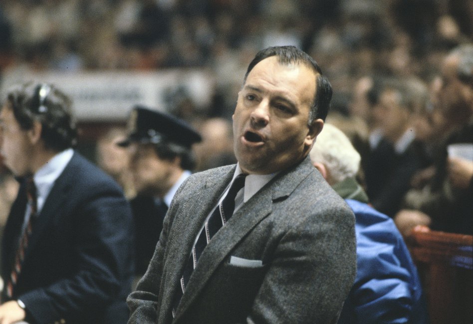
The Kings came into the league in 1967 with fairly simple jerseys that are still remembered today. Purple and gold were their first colors, featuring one thick stripe on the sleeve in the contrasting color. On the purple jersey, a gold stripe sits at the bottom, while on the gold jersey, there is a purple stripe at the bottom. The original crown logo was used on this jersey and continued to be used until 1988.

The main alteration to the original jersey came in 1980 (see above) when extra stripes and contrasting sleeves were added. The Kings added two thin white stripes surrounding the bottom contrasting stripe. They also added shoulders and sleeves in the color that contrasted the main shade of the jersey. The original jerseys matched the Los Angeles Lakers’ color scheme.
1988-1998: Gretzky Arrives in Los Angeles, Along With New Jerseys
With the arrival of Wayne Gretzky came new jerseys and a new color scheme. The Kings altered their main colors to black, white, and silver, to match the NFL’s Raiders who were based in LA at the time. The new logo had a small “Los Angeles” atop a larger “Kings” with a smaller crown logo underneath the wordmark. There were still stripes of the contrasting color on the sleeves and bottom of the jersey, surrounded by thin silver stripes. They also had contrasting and silver collars.
1995: The Burger King Jersey
In 1995, the Kings introduced an alternate jersey that was one of the worst in NHL history. The Burger King/White Castle-looking logo isn’t even the main issue with the jersey. Due to the gradient streak across the jersey, that resembled a royal sash, the logo was placed at the top right near the shoulder, not in the middle. All of these issues, combined with the circus-like purple numbers, made it a jersey to forget.
You may also like:
- NHL Rumors: Tkachuk Frustrated, Sundin to Maple Leafs, Doughty and Kings
- Does Drew Doughty Still Fit the LA Kings’ Long-Term Plan?
- What a Fifth Consecutive First-Round Exit Would Mean for the Kings
- Kings Continue to Struggle Offensively; Allow Avalanche to Take 3-0 Series Lead
- Kings Takeaways: Hang With Avalanche in Game 1, Lose 2-1
The only good part about this alternate jersey is that it only lasted one season. Yes, the organization wanted to breathe some life into a brand that was considered bland for the previous seven years, but this was not the way to do it.
1998-2013: Purple Makes a Comeback in Kings Uniforms
In 1998, the Kings redesigned their jerseys to bring back the original purple while still incorporating black into the uniform. The primary colors of these uniforms were white and black, but they had a thick purple stripe on the sleeves, bottom, and shoulders. These lines were surrounded by thin black and silver stripes. The collar featured no purple, only black and silver.
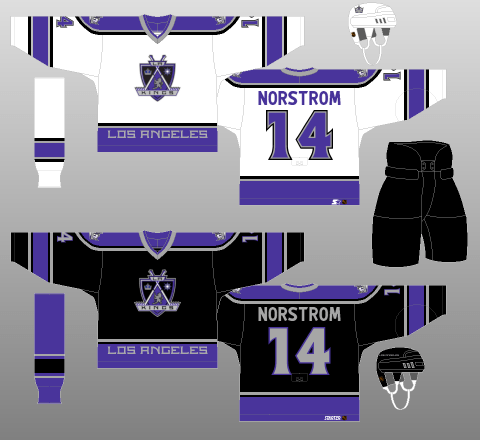
In terms of the logo, two swords crossed over a shield. There is a small “LA” wordmark on the top of the shield and a small “Kings” wordmark along the bottom of the logo. There is a large “Los Angeles” in the purple stripe on the bottom of the jersey.
1999: Kings Introduce New Alternate Jersey
After the redesign of the uniform in 1998, the Kings added an alternate jersey one season later. This jersey has the same design as the primary black jersey, but the purple and black are swapped. There is also a different logo, bringing back the crown instead of the shield.
Although the Kings used a purple alternate jersey until 2007, the logos were changed in 2002. The shield became the alternate logo, and the crown became the primary logo. This was the first time the Kings had used the crown as their primary logo since 1988.
2008: Kings Introduce Purple-Less Alternate Jersey
With a new alternate jersey, the Kings threw it back to the Gretzky era and removed the purple. This jersey is very similar to what the Kings use now as their home uniform. It is primarily black, with a white stripe on the sleeve. This stripe is surrounded by silver, similar to the silver stripe along the bottom of the jersey.
2011-Present: Kings Eliminate Color From Primary Jerseys
The Kings kept the purple accent in the alternate jersey until 2013, but eliminated all other colors from their home and away uniforms. These new jerseys matched the previous black alternate introduced in 2008.
In 2017, Adidas became the manufacturer of all NHL jerseys, though few changed, and the Kings saw no significant differences in their uniforms.
2016: Grey Alternate Jersey is Added to Kings Uniform
In 2016, the Kings added a grey alternate jersey, that resembled their primary uniform. The inside of the collar on this jersey is purple and has a gold trim around the numbers. The alternate jersey introduced in 2016 only lasted one season but was reintroduced in 2018 without the gold trim.
2020: Kings Reverse Retro Jersey
For the 2020-21 season, Adidas added 31 new Reverse Retro jerseys — one for each team. Most of the jerseys received very mixed opinions, but the Kings’ jersey was one of few that was considered a success by nearly all critics.
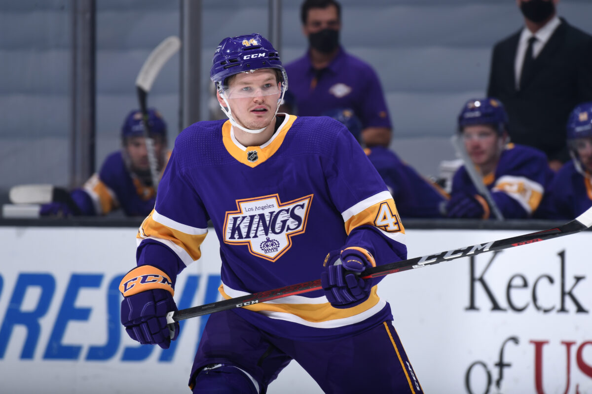
Going along with the concept of combining past with present, LA utilized the logo most recently used in 1998 along with the team’s original colors. Like the rest of the jerseys in the collection, it was only worn for one season.
2021: Kings Replace Alternate Jersey
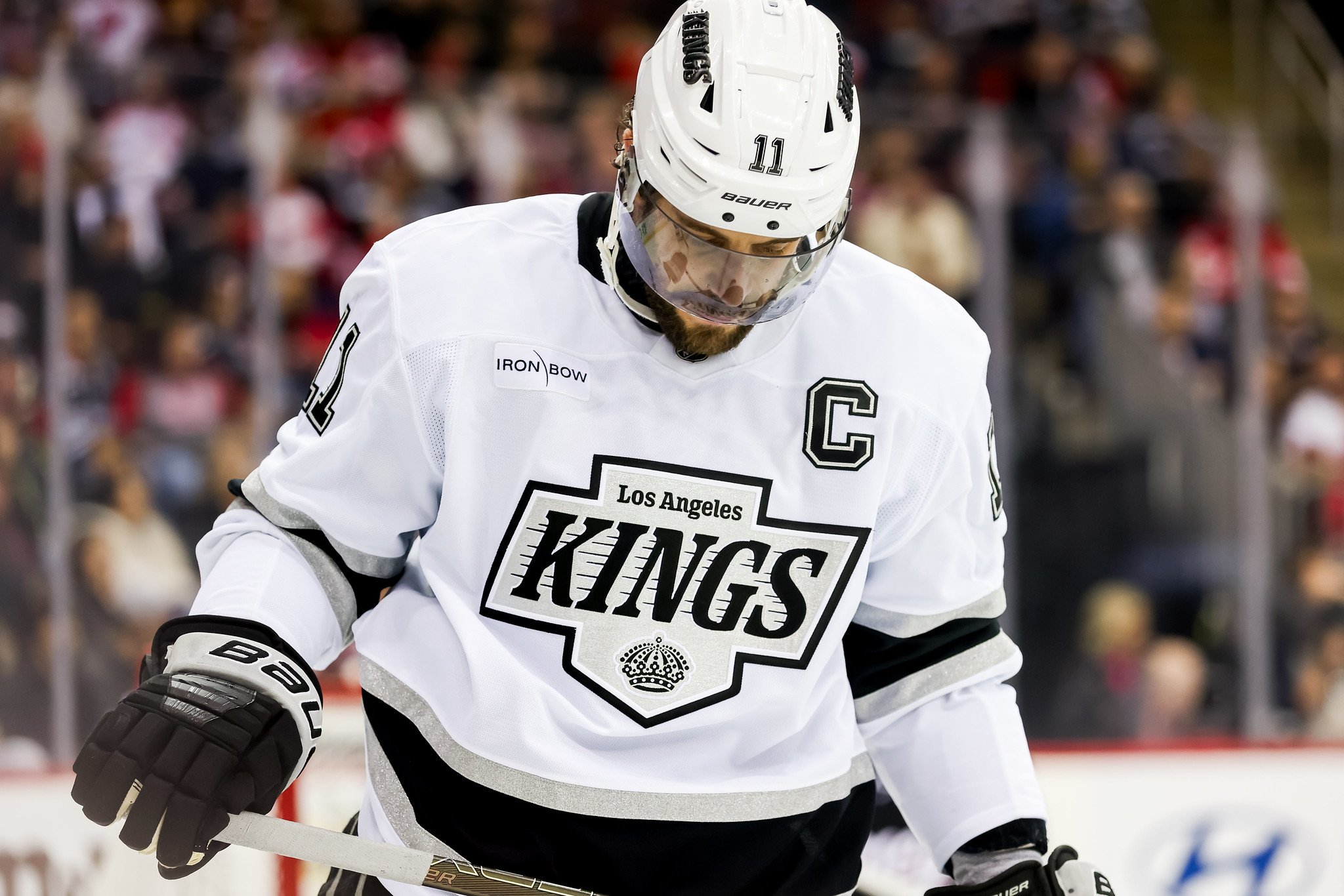
Recently, the Kings’ replaced their grey alternate jersey with a white uniform that resembles the team’s heritage jersey. It uses the same logo from the Reverse Retro jersey and adds a couple of elements from the Vegas Golden Knights’ uniforms.
Along with the Knights, the Kings are one of only two teams in the league to feature fabric with sparkles on the sleeves and bottom of the jersey. They also brought along the chrome helmets that were unique to Vegas — the Kings’ helmets are chrome silver rather than chrome gold.
What Is the Future for Kings Uniforms?
There is no denying that the Kings have one of the blandest uniforms in the NHL. The team’s history shows it hasn’t always been this way, and Kings fans are looking to the organization to bring some color back. Adidas recently revamped the Arizona Coyotes’ primary jerseys, and LA should be next.
Free Newsletter
Get Kings History coverage delivered to your inbox
In-depth analysis, breaking news, and insider takes - free.
Subscribe Free →