I’ll just say it. Overall, I don’t like the Adidas “Reverse Retro” jerseys. I don’t like how cartoonish most of them look, and I don’t like the fact that this is obviously another cash grab for both the National Hockey League and Adidas. The NHL is one of the most financially stable sports leagues in the world, and the league already attracts hordes of devoted followers.
This Reverse Retro campaign does one of two things automatically. It belittles the iconography of the league’s historic franchises, and it makes the newer ones look like an episode of Art Attack vomited all over their sweaters.
The Original Six Lose Ground
When I think of the Original Six, there’s a certain element of class and distinction that comes with that term. The Montréal Canadiens, Toronto Maple Leafs, Boston Bruins, New York Rangers, Chicago Blackhawks, and Detroit Red Wings have carried the metaphorical torch of the NHL for over 100 years, and the Reverse Retro campaign makes somewhat of a mockery of the Six.
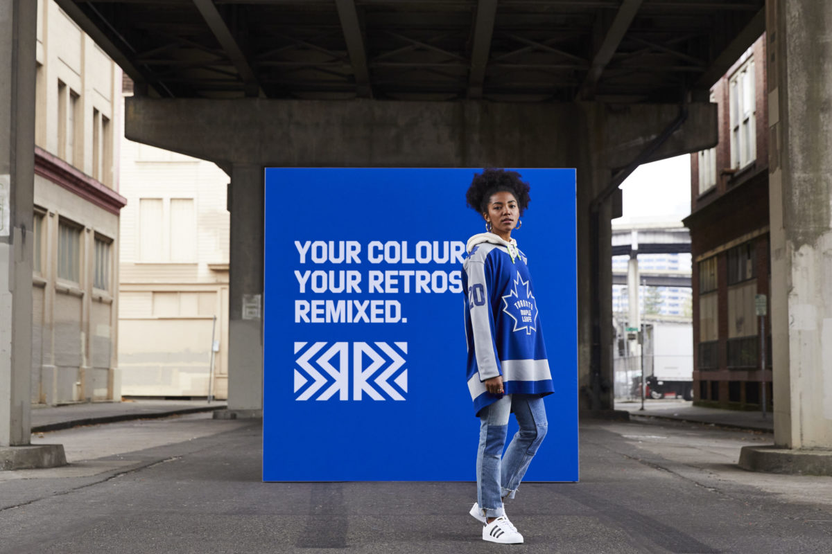
Take the Maple Leafs’ new retro jersey, for example. While they were going for an homage to the 1970s-era Darryl Sittler and Lanny McDonald teams, the teaser looked a lot better than the full reveal. The Leafs and Adidas seem to have combined the iconic jersey from that era with the throwback uniform they wore during the 2013 season.
The throwback uniform was alright, but this “updated” or “modern” version (if you can even call it that) makes both uniforms look awful. The dark logos against a dark background make no sense, and the chest logo itself looks like it was put together by a child who made a mistake tracing the leaf and just went with it.
The Sacred Sweater
Perhaps the worst Original Six offender is the Canadiens. As it stands, the sweater is lovingly called the Sainte-Flanelle (the sacred sweater) by Habs’ fans and occupies a particularly special place in the history of the sport and the history of Québec. In open defiance of all that is good and pure, the PR team in Montréal decided to take the “reverse” part of the Reverse Retro extremely literally.
In place of the iconic red, they’ve turned blue. Where the blue bordered the logo is now red. The iconic bleu, blanc, rouge is now replaced with a completely alien concept which would turn Youppi! into Grover from Sesame Street, should the mascot choose to wear the new sweater. Given the historic nature of the sweater and the symbolism of the logo and the franchise, changing it in any way seems like blasphemy.
A Bad Comic Book
If the Original Six jerseys are bad, some of the others are absolutely horrifying. The Anaheim Ducks’ choice to include a leaping, full-body Wild Wing surrounded by water and a white background simply looks like a comic book artist fell asleep at their desk. Obviously, it lacks colour. A kid working with Microsoft Paint could come up with something better. Honestly.
Another ridiculous one is the Arizona Coyotes’ purple “sky coyote” design. Not only is it ugly, but who’s going to go to the games to see them wear it?Tom Hunter of SBNation likes this one, but his description fits for criticism, too. “No jersey in any sport has so perfectly defined ‘come do peyote in the desert.'”
The rest are just lame. So lame that I don’t even want to discuss them at length. The Boston Bruins’ new jersey can be seen from space. It’s the St. Louis Blues, so the red doesn’t make sense. It didn’t before and it doesn’t now.
The majority of them do nothing but capitalize on nostalgia to sell jerseys and make money. Of course, I say all of this knowing that one dissenting opinion isn’t going to change the fact that this concept is going to generate tonnes of money for Adidas and the NHL and that the majority really like the jerseys.
I just wanted the world to know.
Free Newsletter
Get Commentary coverage delivered to your inbox
In-depth analysis, breaking news, and insider takes - free.
Subscribe Free →