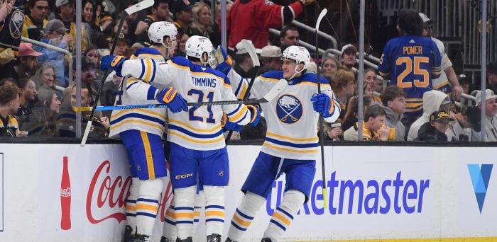
Remember all those ugly knitted sweaters your Aunt Ida or your Grandma Ruth decided to give you for the holidays? You’d wear them all Christmas day, smile politely, while churning inside at the mockery quietly displayed by the rest of your family. Hopefully, they all got ugly Christmas sweaters too. Here’s a quick example, provided by some typically well-dressed Blue Shirts (Henrik still pulls off a tie).
New York Rangers Ugly Sweater Party
But anyway, post-Christmas, the sweaters probably end up in the trash or at the back of your closet or at Value Village. It’s a one-day thing. You don’t wear them year round. So what then, is the excuse for hockey teams to wear repugnant sweaters all season? Here are your top 10, most hideous hockey jerseys from the past few decades:
10) 1991-1992 New Jersey Devils

Come on Marty, what’re you doing?! This jersey is actually the exact meaning of ugly Christmas sweater—it’s green, red, and white. Only Saint Nick would take pride in wearing such wreckage. It was only when the Devils opted out of the green for black that they began to see success (the emergence of Marty, Scott Stevens, and Scott Niedermayer certainly helped), and eventually led them to Lord Stanley in 1995.
9) 2003-2004 Dallas Stars
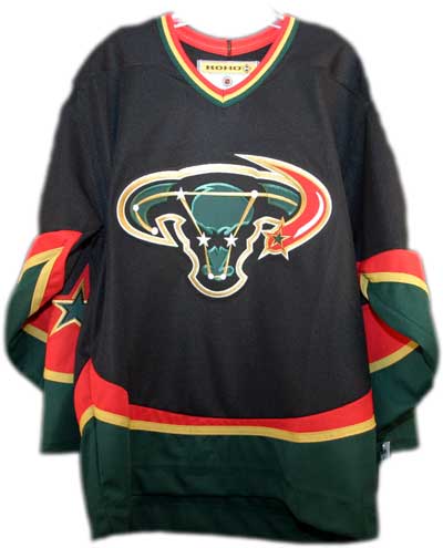
Mike Modano wore this? Really? One of the greatest American players of all-time? Were they trying to represent Mexicans living in Texas with the yellow, green, and red? I’m fairly certain for the three years this jersey was around, they were still known as the Dallas Stars, not the Dallas Enraged Bulls. Once they took this horrid jersey out of their line-up in 2006, they did something even wiser—signed free agent Eric Lindros.
8) 1999-2000 Phoenix Coyotes
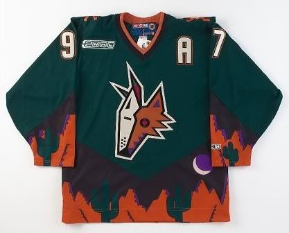
Jeremy Roenick had more class than this. First of all, the coyote looks like it just got dropped on with an anvil by the Road Runner. Second of all, orange and green? That’s worse than white after Labour Day. Third of all, is that the set of Breaking Bad at the bottom of the jersey? Sucks for a team that had never won their division—until last season.
7) 2011-2012 Anaheim Ducks

Why do NHL teams feel it necessary to implement orange into their sweaters? Seriously. San Jose and Anaheim are supposed to be fashionable, coming out of California. The Sharks jersey luckily only has tiny orange detailing, but this Ducks jersey sucks something fierce. The combination of black and orange gives the connotation that it’s Halloween all season long. Which is funny, since my first Halloween costume I can remember, I went out in hockey gear with a (normal) Ducks jersey on. Even Bobby Ryan can’t make this atrocity look pretty. See how annoyed he is?
6) 1980-1981 Vancouver Canucks
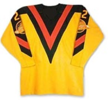
This sweater makes it look like the Canucks were a team of guys wearing very, very revealing low cut yellow v-necks, had black abdomen, and tattooed the V from V For Vendetta on their chests. The Canucks made it all the way to the Stanley Cup Finals in 1982 with this jersey, most likely distracting every opposition along the way.
5) 2011-2012 Ottawa Senators
Traditions from back in the early days of the NHL are great; I’m all for them…except this one. It’s plain, boring, and one red stripe away from being a prison jersey—something ex-Senator Dany Heatley sure knows enough about. (Too soon?)
4) 1995-1996 Los Angeles Kings
The Great One or the grotesque one? No wonder he wanted a trade out to St. Louis that season. I don’t mind fading colours on jerseys—I’m still a big fan of the Canucks red-to-blue—but coupled with awkward stripes, a terrible font and placing the C on the wrong side? Detroit can’t pull it off, and neither did you, LA.
3) 1996-1996 Anaheim Ducks
95-96 really wasn’t the NHL’s best season for style (and Anaheim is on the list twice–sheesh). Here we have Teemu Selanne sporting an unpleasant teal jersey with a symbol that resembles a player from Space Jam. Or perhaps, a child’s cartoon drawing? Was there a contest for best jersey design that I was unaware of? I’m a diehard Mighty Ducks fan (the movies…not the team), but even Charlie Conway’s District 5 uniform was favourited compared to this.
2) 2011-2012 New York Islanders
This sweater is actually dreadful. Absolutely dreadful. Almost as dreadful as the Islanders’ record last season (or Tavares’ Movember stache). Though I appreciate the attempt to tie together the Knicks and Mets colour schemes, I also really think it’s a poor idea for teams to place jersey numbers in the middle of the front of the jersey (i.e. the Dallas Stars)—if I wanted to see that, I’d watch football.
1) 2005-2006 Nashville Predators
I’m not sure what bodily liquid this more resembles—urine or vomit. The team’s name references to the fossilized remains found back in the 70’s while constructing the First American Center—a saber toothed tiger. I’m just thankful they didn’t opt for orange and black jerseys. Though frankly, could it be worse than Shea Weber in mustard? And no, I DON’T want “MY NAME” on the back.
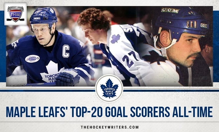
I’m sure you’re all familiar with the old children’s book, “The Hockey Sweater” by Roch Carrier—the book about the boy who dreams of receiving a Rocket Richard jersey, but ends up with a Leafs one instead (poor kid didn’t know right from wrong). Well, my first Leaf jersey, at the ripe age of 7, was also my favourite design so far:
It’s a uniform any hockey player would be ecstatic to wear. However with the new design in 1997, came Mats Sundin as captain, Pat Quinn as head coach, and Cujo between the pipes. It was a period of playoff victories and new beginnings at the ACC. I don’t know about you, but I liked the circular font—it was original and matched our logo. This jersey reminds me of happier times in Leafs Nation, probably why it’s my go-to sweater.
Maybe for Ducks fans, or any of the above fans, their putrid jerseys remind them of a better era—so it doesn’t matter if your logo is Wile E. Coyote or if it looks like a box of crayons threw up all over your team’s sweater—if you’re lucky enough, your team can turn an ugly looking sweater into something beautiful on the ice. Happy Hockey Holidays!
Free Newsletter
Get Hockey History coverage delivered to your inbox
In-depth analysis, breaking news, and insider takes - free.
Subscribe Free →
