by Stephanie Lewark
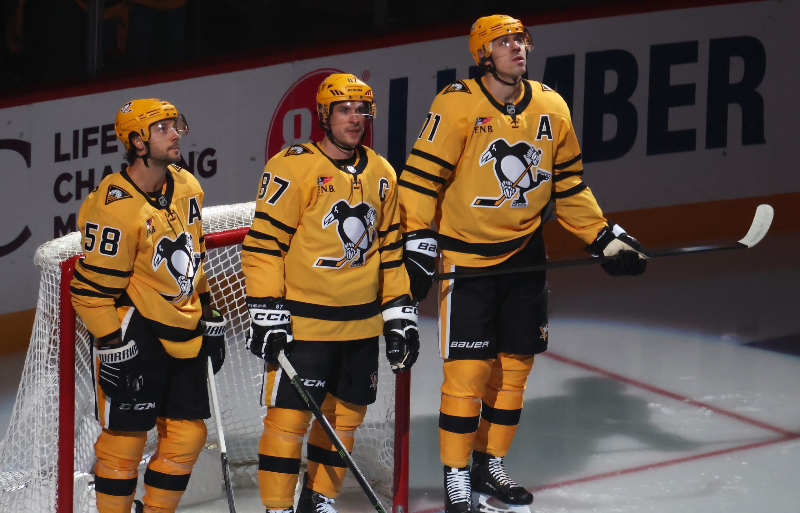
The organization showed off the special threads at a short press conference following the team’s practice with Evgeni Malkin skating out onto center ice in full gear and Jordan Staal following him shortly after to address the media.
In an interview Mark Madden conducted earlier this afternoon on the Penguins Radio Network with the Penguins Vice President of Communications, Tom McMillan explained that these uniforms are a combination of past Penguins uniforms; the colors were taken from the 1970’s era while the logo was taken from the team’s original logo from 1967-68.
According to pittsburghhockey.net, this original logo (the one with the scarf) only lasted one season, never actually made it onto a jersey and was primarily used on pucks and stationary. And for those of us who weren’t around to remember the role that the darker / navy blue played in the team’s jersey history, pittsburghhockey.net clarifies the fact that the Boston Bruins claimed to own the black and gold colors at the time. So the Penguins organization (through a decision made by their GM, Jack Riley, an Ontario native) chose to change the colors to Columbia blue, navy blue and white which were the colors of the Toronto Argonauts (of the Canadian Football League) and St. Michael’s College in Ontario.
I personally like the new look and appreciate all the history that has gone into it. I especially like the number design with the powder blue shadowing the white, as well as the darker blue color; however, it seems as though I’m in the minority and most of the fans don’t like this new version (of the same old concept). I believe they may have been looking forward to something similar to what the team wore back in the 1990’s when the team won two of their Stanley Cups in the earlier part of the decade (we’re coming up on the 20th Anniversary of the first Cup, so it may not only have been more of a change, but also more appropriate).
And as much as the Pittsburgh organization believes that the fanbase still likes the blue throwbacks (as referenced in what they told the Penguins webpage below), I believe that it may have been more popular going with something a bit more different than what they did for the original Winter Classic.
Also, the team wanted to stay with the blue theme because it has become so popular with Penguins fans.
The Penguins wore various versions of blue uniforms from 1967-80, so the colors were selected as a tribute to team history – in keeping with the theme of the Winter Classic event, which is to take the game back to its roots.
But at least the players who modeled them today like them according to the Penguins webpage:
As mentioned, Malkin is a huge fan of the logo.
“I was told this is the 1967 logo, so it is very old,” Malkin said. “I really like it a lot, especially the penguin. He is a friendly penguin, but not on the ice.”
Malkin liked the penguin in the logo so much so that he said he might mirror his look on Jan. 1.
“Maybe I’ll wear a scarf too.”
Like Malkin, Staal came away impressed with what the Penguins, Reebok and the NHL designed.
“It’s a very nice jersey,” Staal said. “It’s a new look. All of the guys seem to like it.”
Other 2011 Winter Classic jersey noteables:
- although the Penguins will debut the uniforms on January 1st, the team will wear them for two additional home games on February 10th (vs. the LA Kings) and March 12th (vs. the Montreal Canadiens)
- these jerseys will go on sale to the public the week of November 15th at the following locations: Dick’s Sporting Goods, PensGear stores in the CONSOL as well as a number of other retail outlets
Free Newsletter
Get Pittsburgh Penguins coverage delivered to your inbox
In-depth analysis, breaking news, and insider takes - free.
Subscribe Free →