A couple of teams unveiled brand new alternate jerseys at the 2018 NHL Draft this past weekend, but the Winnipeg Jets were not among them.
Prior to the 2017-18 season, Adidas took over from Reebok as the NHL’s jersey provider and dedicated its focus on redesigning all 31 teams’ home and away sweaters. That meant there were no third jerseys at all last year.
There are two now though, and more to come. “I can’t tell you the number exactly, but about a third of the teams will have a different one,” NHL deputy commissioner Bill Daly said last month.
Will the Jets finally be one of them? And if they are, what should their alternate look like?
Jets Could Use Some New Duds
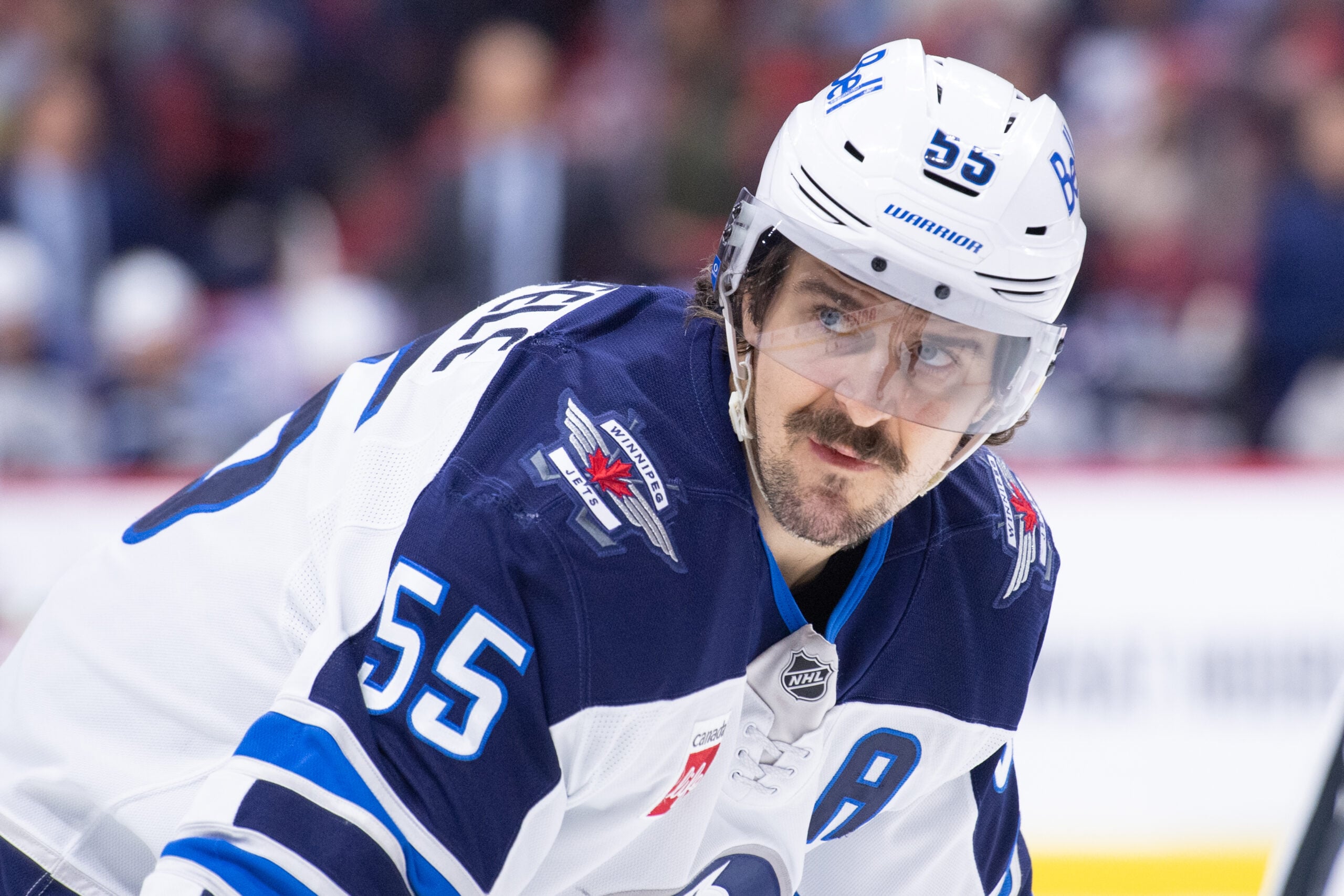
It’s been seven seasons and nearly 2,500 days since the Jets introduced the jerseys they still wear today. The polar night blue, aviator blue, silver, and red colour scheme, along with the logo, pay homage to the Royal Canadian Air Force.
While the jerseys — blue at home and white on the road — are undoubtedly sharp, well-designed, and honour a great organization, it’s high time the Jets introduce something new. As the old saying goes, “variety is the spice of life.”
The Jets are overdue for a little shake of that spice. Even Adidas’ redesign before last season made only very minute, nearly unnoticeable changes.
Heritage Classic Jersey Striking, but Short-Lived
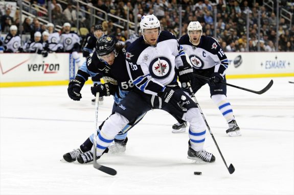
The Jets have worn a uniform other than their traditional blues and whites just three times in the 561 games they’ve played since relocation from Atlanta.
When they played the Edmonton Oilers in the NHL Heritage Classic at Investors Group Field in October 2016, they wore a gorgeous retro-style jersey (albeit with modern touches and an updated colour palette) featuring the logo that was introduced by the first incarnation of the Jets in 1973, when they were still members of the upstart World Hockey Association.

The jerseys were immensely popular and fans snapped them up faster than the Jets gear and sporting goods stores could stock them. Two years later, thousands sport the jerseys at each Jets home game, and many wear them to opposing teams’ rinks too.
“These jerseys are by far the best selling item in our Jets Gear Stores this season,” Scott Brown, senior director of corporate communications for True North Sports and Entertainment, said just after the Heritage Classic game.
Watch the Jets wear their Heritage Classic jerseys as they face the Flames this Monday!
Buy from Seat Exchange >> https://t.co/y76DlGcf1D pic.twitter.com/PAy7IrhA4J
— Winnipeg Jets (@NHLJets) January 7, 2017
The Jets wore the throwback threads two more times in the 2016-17 season, against the Calgary Flames and Minnesota Wild. However, Adidas becoming the jersey supplier at the end of that year ensured the Reebok jersey would never see the light of day again.
A Jets Third Jersey Should Combine Past With Present
The first question, of course, is: are the Jets one of the teams on the list? The next question is: if so, what should their new ensemble look like?
The Jets 2.0 franchise has always done well when acknowledging and paying tribute to last century’s team, even though the Jets 1.0 history technically belongs to the Arizona Coyotes. They gave Finnish Flash Teemu Selanne a key to the city. Banners bearing the names of the “Hot Line” — the prolific trio of Anders Hedberg, Ulf Nilsson, and Bobby Hull — hang from the rafters of Bell MTS Place. The Winnipeg Whiteout, which began back in 1987, came back in 2018 with the vengeance of a Manitoba snowstorm and attracted tens of thousands of lily-clad fans downtown during the Jets’ deep playoff run.
The Jets would be smart to continue the pattern of saluting their past, and could do it by featuring the original 1972 WHA logo on a new jersey.

However, a new jersey should also make reference to the strides Winnipeg has made since the tearful day the Jets 1.0 departed for sunny Phoenix more than 20 years ago. Winnipeg is a far different — and much more economically prosperous — place than it was in the mid-1990s. The Jets’ 2.0 franchise is far different, too. It’s a powerhouse with legitimate Cup contender status, a far cry from the 1.0 days, which were more characterized with futility and heartbreak than celebration and success.
Incorporating a Winnipeg landmark that didn’t exist when the Jets left into the 1972 logo would be a great way to go. One example is the Esplanade Riel, a side-spar cable-stayed pedestrian bridge that’s arguably Winnipeg’s most iconic structure.
For the record, I’m not the first to come up with this – check out this third jersey concept and logo drawn up by logo designer Johnny Griswold, which features the jet soaring over the bridge and skyline.
Another option is to use one of their alternate logos as a new crest to make a sleek-looking modern jersey.

The above logo was designed by the Jets right out of the gate, but it’s only on the helmets right now. Using a script or words in place of a logo is becoming common — the Flames had a similar alternate that was eye-catching and unique, as did the Tampa Bay Lightning with their “Bolts” jersey.

If they decided to do something similar to the Flames or Lightning jersey, they could still go with polar night blue as the main colour and punctuate it with stripes of aviator blue, silver, and white. If they wanted to be a bit bit more adventurous, they could make the main colour the lighter aviator blue — although that may look too similar to the Atlanta Thrashers’ home jerseys, a team with little historical value from which they’ve done their best to disassociate themselves.
Of course, these are just two of many options the Jets have and just one writer’s opinion. If the Jets were to get a third jersey, what do you think they should look like? Should they use an old logo, an existing alternate, or come up with something completely new?
Free Newsletter
Get Winnipeg Jets coverage delivered to your inbox
In-depth analysis, breaking news, and insider takes - free.
Subscribe Free →