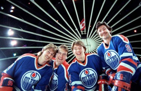
The National Hockey League version of the Edmonton Oilers has always been an all-or-nothing team. For their first 13 seasons – starting in 1979-80, the Oilers made the playoffs every single year, winning five Stanley Cups and only losing in the first round on three occasions. Star players were sprinkled throughout the Edmonton roster, from goaltenders Grant Fuhr and Andy Moog, to defenseman Paul Coffey, to forwards Glenn Anderson, Jari Kurri, Mark Messier and the Great One himself, Wayne Gretzky.
For the next 23 seasons, the Oilers made the playoffs seven times, winning only five playoff rounds – three of which came in their improbable run to Game 7 of the Stanley Cup Final in the chaos that was the post-lockout 2005-06 campaign. After that magical Cup run, Edmonton missed the postseason for ten consecutive years.
Thankfully, they were able to end that tough stretch the following year, as they put up 103 points during the 2016-17 regular season which was good enough for second place in the Pacific Division. Though they lost out in the second round to the Anaheim Ducks, it appeared they were well on their way to becoming a dynasty once again.
Unfortunately, that has not been the case. They missed the playoffs the following two seasons by a significant margin, before once again finishing second place in the Pacific Division in 2019-20. While they certainly have elite top-end talent, they are team that lacks any type of depth and as a result has many doubting they are contenders of any sort.
Dynastic Duds
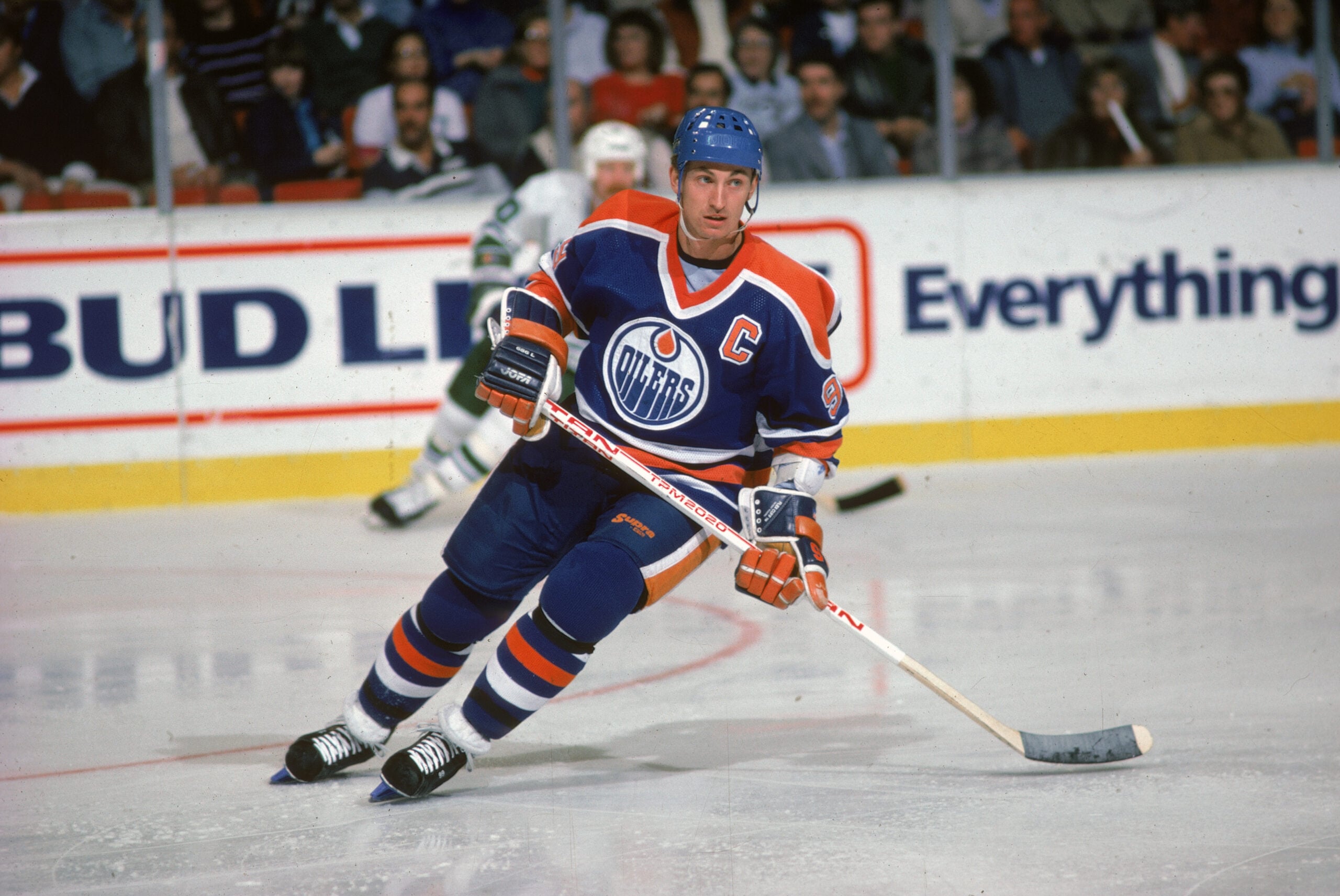
Much like their franchise fortunes (insert Peter Pocklington joke here), the Oilers’ uniform history has been up and down, as well. It started off so promisingly, with the kits made popular during their dynastic years lasting, relatively unadulterated (save for a lightening of the blue and some tweaks to the font) until the end of the 1995-96 campaign.
Wow, what a thing of beauty. A soft, comforting blue with just enough sharp orange trim to create the perfect balance of professional poise and eye-catching good looks. Are the colours menacing? No. Is the logo ferocious? No. But then again, they didn’t need to be; facing the Oilers was intimidating enough.
A classic three-stripe pattern graces the sleeves and tails of these magnificent jerseys, with accented cuffs added for the road blues. The same simple, pleasing pattern is continued on the pants and socks. Of particular note is the way the shoulder yokes flow into the jersey collar, with the innermost colour of the yoke leading to the inside of the collar, while the yoke’s trim seamlessly becomes the collar’s outermost border. This two-tone collar also gives me pause in my omnipresent desire to see lace-up collars; in this instance, the V-neck just…works.
My only complaint would be the numbering, as I generally don’t like offset trim on the numbers. To me, the flush alignment of number and trim looks cleaner and more polished, but these are small potatoes in an otherwise excellent dish.
Dark Times in Oil Country
But all good things must come to an end, and the Edmonton dynasty was no different. By 1996-97, the team had changed its colours to the darker, drabber midnight blue and copper colour scheme, while adding a mysterious oil worker, known as “Rigger” as a secondary logo. The following season, the shoulder yokes were dropped from the home whites – having not been included on the redesigned dark away jerseys, completing the home and away kit for the next decade.
Truth be told, I actually quite like this iteration of the Oilers uniforms. Yes, in one of the loudest, brightest fashion decades on record, the Oilers chose a colour palette that makes Scandinavian police dramas look cheery. But given the NHL’s coming emphasis on dark, dreary uniforms, maybe it was just a design ahead of its time. The copper and blue just seem to…fit. I can’t explain it, it’s just rather good. I also can’t explain why the copper striping is trimmed with red.
You may also like:
- 3 Stanley Cup Winning Goalies Not in the Hockey Hall of Fame
- Edmonton Oilers’ 3 Worst Contracts for 2026-27
- Oilers Should Target Owen Tippett if Flyers Land Leo Carlsson
- Oilers Leadership Group Getting Blasted By Babcock Was Positive
- How the Oilers’ Offseason Decisions Affect Their AHL Prospects
The Oilers kept their traditional striping pattern, save for the pants, which were simply solid midnight blue. Unfortunately, they also retained the offset font trim, and the once-lovely collar area looked odd and out of place with no shoulder yoke flowing around it. The Rigger is also a weird touch. Seems like a secondary logo for the sake of having a secondary logo (see also: Bruins, Boston). The Oilers have one of the best, most timeless logos in the entire NHL. Not really sure what they were going for with this secondary…
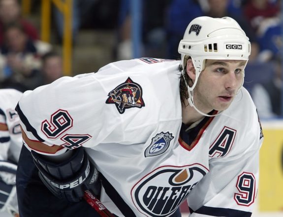
…and I’m really not sure what they were going for with the so-called “Oil Drop” jersey, designed by then co-owner Todd McFarlane and debuted in 2001-02. A midnight blue backdrop trimmed with silver and white is not exactly the most inspiring colour scheme. Nor is the logo, a giant, metallic oil drop with five sprockets and five rivets, symbolising the Oilers’ five Stanley Cups. There is another chunk of metal on the shoulders, with some more mechanical stuff and an Oilers wordmark.
This uniform did have a classic slim-thick-slim sleeve and sock striping setup…which was sliced in half for the tail section, rendering an already bland, colourless, downright depressing uniform wholly asymmetrical, as well. Even the lace-up collar doesn’t seem to belong; it seems too soft, too loving, too classic for this hard, soulless jersey.
Edge of Reason
Mercifully, the advent of the Reebok Edge uniform system saw the end of the Oil Drop era, and the standard home and away (blue and white, respectively, since the 2003-04 reversal of protocol) uniforms were redesigned. And much like the team’s fortunes, nothing much changed.
The Oilers went full-bore into Reebok Edge, doing away with tail striping and replacing it with thing vertical piping that tapered towards the top, intersecting with captaincy patches along the way. The sleeve and sock striping changed to a slim-thick-slim pattern, but the sleeve stripes didn’t even make it all the way around the arm. And it’s not as though the gap was under the arm where nobody could see; the missing link was on the outside of the sleeve, just under the numbers. Madness!
The chunky, one-tone collar, vertical piping on the jersey and pants, and the lack of tail stripes – not to mention the lack of completed stripes anywhere on the jersey – make this iteration of the Edmonton uniform kit reminiscent of an off-brand jersey from Walmart. Not to mention the font trim was still offset and the mysterious red trim still clung like a remora to the copper sections of the uniform. To say this was a glorified practice jersey would be an understatement.
Back to the Future
Thankfully, someone in the Oilers organisation came to their senses in time for the 2008-09 season, reintroducing an updated version of the Oilers’ dynastic kit into the team’s uniform rotation. By the 2012-13 season (I guess it was just 2013? Whatever. Not the point.), Edmonton had switched over to this vintage look – for both jerseys – on a full-time basis. In 2015-16, they added an alternate kit, which pays homage to the World Hockey Association tenure of the franchise.
The home and away kits of this new uniform set largely mirror the Oilers’ original NHL cuts. The only substantive difference is the collar, which kind of sticks out like a sore thumb. Part of this is due to the fact it does not taper down to a “V”, but instead sees its two sides connected by a flat bottom. As such, there is no flow from the shoulder yoke trim around the collar, resulting in a choppy viewing experience. Other than that, the throwback design is a welcome sight, even if the offset number trim has not been addressed.
But it is the alternate kit of this uniform set that really draws the eye. Harkening back nearly a half-century, the orange-based jersey has slim-thick-slim striping action on the sleeves and tail. The familiar shoulder yokes also make an appearance, though this time accompanied by the numbers one would normally find on an NHL jersey’s sleeve.
Orange Overload
And that’s where the problem comes to light: this jersey was just far too…orange. The orange background is a neat idea, even if Oilers orange is a tone too harsh. But the numbers, because they are enclosed within the blue shoulder yoke, have to be orange as well, in order to stand out. As a result, the orange background of the jersey is unbroken, leading to the entire kit appearing washed out. This condition is not helped by the collar, which is composed of two orange stripes sandwiching one blue bit. It’s just too much orange.
Why not put the numbers halfway down the sleeve, like everyone else in the world? Then they would be blue, and help to balance out an obnoxiously bright design. I really hope the shoulder numbers don’t catch on in hockey, like that idiotic idea of putting a tiny jersey number on the front of the jersey from a few years back (sorry, Buffalo).
Thankfully, the collar is V-shaped (though its pieces overlap, rather than being joined at the centre. The asymmetry is maddening). And kudos to the Oilers for ensuring their font trim is flush with their numbering and lettering. But neither of these improvements is enough to save us from the overload of orange.
Change in Brand
After that first season of Edmonton wearing their orange jerseys, the NHL announced a seven-year jersey deal with Adidas, which ended their partnership with Reebok. Despite what many had hoped when this deal was announced however, they chose to keep the Oilers orange jersey, though they did make some changes to it.
The orange was noticeably lighter on this jersey, while the blue was darkened significantly, similar to the blue they had from 1996-2012. Though it wasn’t the change back to the blue uniforms many Oilers fans had wished, the majority seemed to agree that these were a step up from the Reebok sweaters they dawned the prior season.
The Oilers are still wearing these same orange jerseys as of the 2020-21 season, though they have a few new sweaters as well. Prior to the 2019-20 season, Adidas launched an Oilers third jersey, which is quite different than any past jersey they’ve worn. The dark blue from their orange jersey is the base color of this uniform, while the same orange forms a solid stripe along the bottom, as well as two stripes on the arms.
One noticeable change from these compared to their current orange uniforms is that they decided to keep the shoulders the same dark blue color as the base of the jersey, which resulted in many finding the jersey plain and boring.
Yet another new Oilers jersey was created by Adidas prior to the 2020-21 season as part of their reverse retro series. Though the Oilers sweaters aren’t as creative as some, they went back to their white jerseys similar to what they wore in the 1980s but flipped the orange and blue colors.
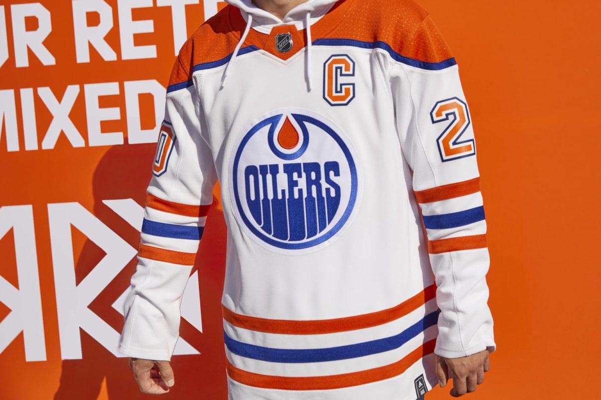
This jersey seemed to have a wide variety of opinions, but individually speaking, they are pretty sharp. Given that the Oilers are currently just seven games into the season, they have not yet been worn, but should be making their debut in the near future.
Rich History
The Oilers jerseys are somewhat consistent with the team’s play over the years, in that their best jerseys were without a doubt during the 1980s, which was also the best their team has ever been. Though in the last 10-15 years they have gone through some dark times, both their uniforms and on-ice talent appear to be trending in the right direction.
Free Newsletter
Get Oilers History coverage delivered to your inbox
In-depth analysis, breaking news, and insider takes - free.
Subscribe Free →