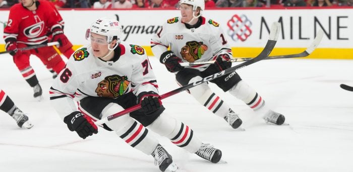
The 2026 Winter Classic is almost here. The Winter Classic has become a tradition in the NHL, one that the St. Louis Blues have participated in three times. The team is 3-0 in the game, each time donning a unique jersey. Today, we are going to celebrate the Winter Classic by taking a look at each jersey. I will conclude by sharing my personal ranking and some thoughts from fellow Blues fans on their favorites.
2017 Winter Classic
The Blues hosted the Chicago Blackhawks at Busch Stadium for the 2017 Winter Classic. For their first Winter Classic jersey, the organization decided to pay homage to the team’s 1967 jerseys.
The fonts and striping on the jerseys were historically accurate re-creations of the original design. The iconic Blue Note on the front was also a recreation of the team’s original logo. For a game meant to celebrate hockey’s past and present, the color scheme and design were a perfect choice for fans who remembered the 1967-68 team that wore that look and reached the Stanley Cup Final; seeing the similar design must have created a great deal of nostalgia.

Fans of all ages immediately fell in love with the jerseys. Following the game, the Blues wore the jerseys a few more times that season. However, they made them the team’s new ‘heritage’ jersey to be worn on Saturday night home games. This lasted for eight seasons, until the organization introduced new home jerseys that were based on and closely resembled the Winter Classic jerseys.
The jersey has even received recognition outside the organization, with some outlets ranking it among the top-15 Winter Classic jerseys in the event’s history.
2022 Winter Classic
The Blues visited the Minnesota Wild for the 2022 Winter Classic at Target Field. As the visiting team, the organization needed to create a road jersey that would be worn for the game.
After the 2017 jerseys paid homage to the blue jerseys, the 2022 jerseys paid homage to the white jerseys from the 1967-68 design. Unlike the 2017 jersey, the 2022 jersey used alternative creations of the previous look, including the logo. The base color was cream rather than the traditional white. The blue on the jerseys’ sleeves matched the shade used on the 2017 jerseys, a callback to the recent past. Lastly, the font used for the player’s name and number was a historical re-creation of the 1967 jerseys.

The combination of old and new designs makes the jersey popular among fans. Many feel it strikes a strong balance between tradition and the present day, introducing a new look for the team that did not feel entirely out of left field.
For the game itself, the jerseys stood out well on the ice. Furthermore, the cream-white color scheme of the Blues matched the forest green of the Wild, creating a pretty scene on the ice.
Related: Revisiting the St. Louis Blues’ Previous Winter Classic Appearances
The Blues wore the jerseys a few more times that season, but have not worn them since. This is not uncommon for Winter Classic jerseys to only be worn during the season the game was played, with some exceptions (including the 2017 jerseys). Personally, I would have liked to see them used as a heritage road jersey for Saturday games.
2025 Winter Classic
The Blues and Blackhawks met again, this time at Wrigley Field. The organization thought outside the box for this jersey.
For the first time in team history, the jersey logo was not the iconic Blue Note. While the note did appear on the shoulder, the primary logo was the word “St. Louis” in yellow letters, with a blue stripe behind it. The fleur-de-lis design, used on the St. Louis flag, was also used in the stitching on the inside of the jersey. The design choice was not entirely random; it was based on a prototype jersey designed in 1966.

The organization went outside the box, and the fans promptly suggested it go back in. Reactions to the jerseys were not positive. Some compared it to a book report started and completed the night before the due date. Others found the lack of the Blue Note unforgivable. Check out the link below to see more initial reactions to the jersey reveal.
I liked the decision to go outside the box, and I like the jerseys. Is it my favorite of the three? Absolutely not. I do like it, and I do own one. In fact, if you check out my writer’s profile, you will see me wearing it.
Ultimately, the decision to advertise St. Louis on the front rather than just the Blue Note is one I respect. St. Louis, the community, has a significant role in the organization’s history. It was also an opportunity to advertise to the sports world that St. Louis is a strong sports city. For the game itself, it was a reminder of the St. Louis-Chicago rivalry that extends beyond hockey. For a jersey worn only three times, why not go outside the box? Why not give St. Louis the extra spotlight?
What the Fans Say Now
I went to the Blues’ Reddit page to gather fans’ opinions on which jersey they felt was the best. In a poll, fans voted the 2022 jersey as their favorite. It was a close race, however. Of the 120 votes, 50 went to 2022 while 49 went to 2017. In 2025, to no one’s surprise, I finished nowhere close to the lead, with just 21 votes. However, there were fans of it in the comments, with many sharing my opinion that while it is not the best of the three, it is still a good jersey.
Interestingly, the 2017 jersey was not the most voted for. Comments on the thread offered some explanation, mentioning that the cream color was a nice touch and made the jersey stand out in a good way.
Writer’s Ranking
My rankings of these jerseys won’t blow minds. There are no hot takes here.
While I do like the 2025 jersey, it is my least favorite of the three. Again, I do not dislike it. I like the other two more. The middle ranking goes to the 2022 jersey. I liked the use of a cream color rather than solid white. I enjoyed the combination of tradition and new ideas. My favorite, like many others, is the 2017 jersey. The “heritage blue” cannot be beat. It is a great reminder of everything that Blues’ hockey is, was, and will be. I have a bias towards that jersey, as I was fortunate enough to attend the Winter Classic and see them in action in the outdoor environment.
Anthony Testaguzza, one of the many talented writers with The Hockey Writers, agrees that the 2017 jersey is the best of the three, citing its simplicity and incorporation of the inaugural Blues’ team.
Looking Ahead
Should the Blues participate in another outdoor game (and they should), what would those jerseys look like?
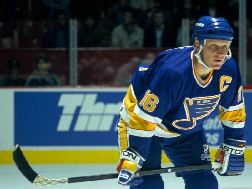
An option could be to design a jersey based on the retro jersey from the 1990s. The jersey is one of the most popular in team history, so it would make sense to create a variant of it for another outdoor game.

Of course, 2025 showed that an original idea can work, even if it does generate some backlash. The organization may decide to go that route again. As it is, we should probably wait until the Blues are chosen to play in another outdoor game before we start designing the jersey.
Free Newsletter
Get Blues History coverage delivered to your inbox
In-depth analysis, breaking news, and insider takes - free.
Subscribe Free →


