- 20: Flint Firebirds
- 19: Windsor Spitfires
- 18: Owen Sound Attack
- 17: Sudbury Wolves
- 16: Hamilton Bulldogs
- 15: Barrie Colts
- 14: Kitchener Rangers
- 13: Erie Otters
- 12: Saginaw Spirit
- 11: Sarnia Sting
- 10: Mississauga Steelheads
- 9: Sault Ste. Marie Greyhounds
- 8: Guelph Storm
- 7: North Bay Battalion
- 6: Niagara IceDogs
- 5: Kingston Frontenacs
- 4: Ottawa 67’s
- 3: Oshawa Generals
- 2: London Knights
- 1: Peterborough Petes
- Wrapping It Up
There can’t be a topic that gets more people interested than jerseys and lists, and when you combine the two, you are certain to get a varying array of responses and opinions. When it comes to jerseys in the Ontario Hockey League, there is an exceptional mix of new cutting-edge looks and classic jerseys that show a team’s history.
There aren’t many designs that I actually dislike in the OHL, and while overall the league is very good looking, some dark uniforms are better than others. As an additional note, this list looks at the main dark jersey. Some teams have multiple, but the one worn most frequently will be ranked.
20: Flint Firebirds
The Firebirds are one of the OHL’s youngest franchises, and after leaving Plymouth for Flint, the Whalers moniker was ditched, and so was the good taste that went along with it. Instead of the wonderful cartoon whale holding a hockey stick comically in his fins, we were met with a design that blended so many things together it could make your head spin.
Logo aside, the jersey and uniform as a whole aren’t the most appealing thing to look at. While the orange and the blue work okay together, the grey competes with the blue for attention. It screams chaos, but maybe that’s what they were going for.

It’s not that these are the worst thing to ever hit the ice by any means, but these jerseys made me cringe when they were unveiled, and they make me cringe now. I can see how these would be a hit for people who like a modern take on things, but for me the traditionalist, this doesn’t work.
One of the things that bother me the most about the whole deal the Firebirds have going on is their socks. While not overly important in a jersey ranking, I can’t help but mention that they have three sets of socks that they rotate and wear whenever they chose. I can’t think of another team that doesn’t have a set sock selection based on the jersey, and I can’t stand it.
19: Windsor Spitfires
This one is sure to shock some people, but before you send me a DM on Twitter telling me what a terrible ranking this is, please hear me out for one second.
I won’t hold it against teams that use a design similar or exactly the same as an NHL team in this ranking, but what I will say is if you want to copy someone, don’t copy the Washington Capitals. Yet again, this is a modern take on something that just misses the mark for me. It’s also bothersome to me that the Spits have better designs in their wardrobe that don’t get to shine.

Although this look is now nearly iconic, the Spitfires have a blue version of this that would rank higher and they have a navy blue and cream-colored jersey with a very simple and classic “W” logo. I would much rather see them use either of those two more frequently.
18: Owen Sound Attack
The Attack has done an outstanding job of creating a jersey that tries to be interesting and has come out as nothing better than a ‘meh’. They took steps to try and modernize their look when they changed their logo from the bear holding a hockey stick they previously had to this one. I have routinely called both Attack logos the “butter bear,” however.
The change removed the interesting striping pattern and changed them out for a design that was probably cooler on paper. I can’t exactly put my finger on what is so off-putting about this jersey for me, but if I had to suggest something, it’s the overkill of the black and random stripes that kill it.
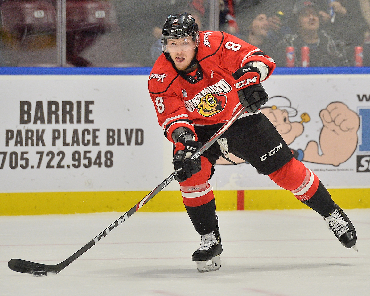
It just seems too busy. From the large blacks and white stripes on the elbows and waist to the black stripe to outline the shoulders and the shoulder logo that should only be on the helmet if anything, there is just too much going on.
If I got to make changes to this jersey, I would remove the shoulder stripe and shoulder patch, but I would also remove the wordmark from the logo. Going with just the bear’s head could help declutter this jersey and elevate it up higher on this list.
17: Sudbury Wolves
The Sudbury Wolves combine three colors together that work together to make a great jersey with blue, grey, and white. This is a look that I have liked for nearly my entire life and while I would love to put them higher up the list, I can’t with some of the great jerseys that are up higher. But for the Wolves, they have done just about everything right with these newish uniforms.
The wolves unveiled these new jerseys ahead of the 2017-18 season simplifying their previous design and harkening back to the team’s original blue jersey in the early ’90s. The Wolves had previously worn green and yellow but changed over to the current colors for the 1989-90 season.
The grey shoulders pop and so do the grey and white stripes features on the sleeves and on the waist of the jersey. One of the best things about this jersey is easily the numbers on it. It’s a unique font with complex corners and edges that seem to perfectly fit what the Wolves’ identity is.
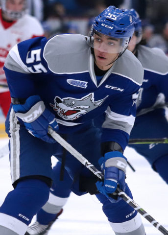
The logo on the chest is just another thing that is very different. The logo itself is more of a hand-drawn logo than you would be used to seeing, and the red tongue on the wolf and the red drops of blood strangely work really well. This is one of those situations where you have to ignore a low ranking because they really don’t deserve it, but some of the others are just better.
16: Hamilton Bulldogs
Not too long ago, the Belleville Bulls were among my favorite logos and jerseys in the OHL, including the yellow jersey with the realistic standing bull logo that so many people hated. The move to Hamilton was crushing and meant the Bulls were no more. It was even worse that they adopted the Montreal Canadiens colors and wore the same uniforms the Bulldogs of the AHL had worn.
Thankfully, the Bulldogs adopted the colors Hamilton is known for, black and gold. A toughness was added to the franchise that day that better identifies themselves as a Hamilton sports team. It’s an intimidating scheme that has suited the Hamilton Tiger-Cats of the Canadian Football League for years.

There is nothing wrong with this design what so ever and it fits perfectly with the tough town that Hamilton is known to be. Hard-nosed and a perfect fit for the Steel City. The yellow, while there is a lot of it, isn’t overbearing and the white is well placed to neutralize some of the darker tones. Even though the Penguins did it first, Hamilton also did it right.
15: Barrie Colts
I can’t understand the hate towards this Barrie Colts jersey for the life of me because this whole uniform is awesome! The first thing that I need to mention about this design is the logo set. The horse with a hockey stick inside of the horseshoe is fantastic and the shoulder logo with the horseshoe and the ‘Colts’ wordmark stands out as a solid design on the shoulder.
For the jersey itself, the yellow pops off the navy and the red is subtle and quiet. One of the more interesting things about this jersey is the near-complete absence of white. There are some very small white stripes around the elbows, but other than that, it is only in the logos. It is unusual for me to like a dark jersey that has nothing to brighten it up, but this one is an exception to that rule.
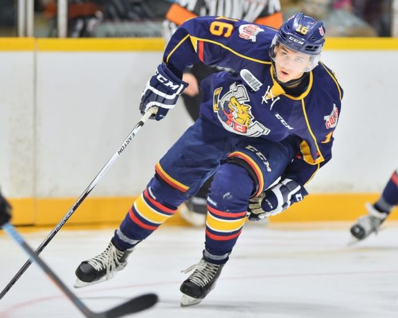
The yellow numbers outlined in a thin line of red stand out from the rest of the jersey and don’t make things hard to read, something that fans in the stands will appreciate. Right down the to pants and the socks, the blue, yellow, red, and white work perfectly in unison to make the Colts shine.
Some would argue that the Colts should return to their original design, and while that too could be nice, it could just as easily become boring and out-dated very quickly.
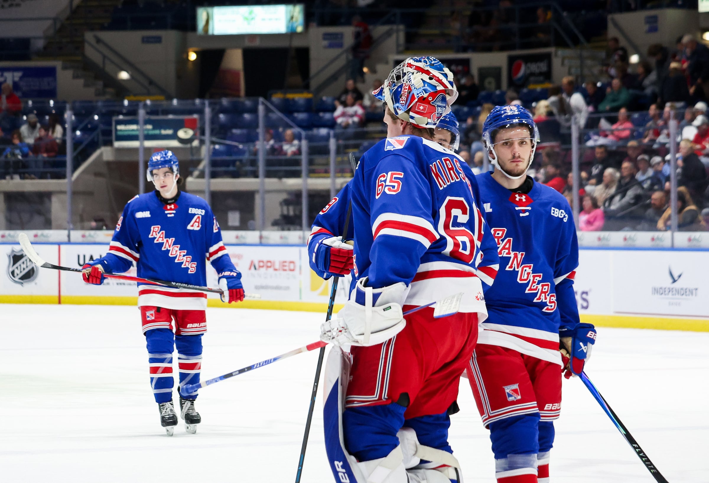
14: Kitchener Rangers
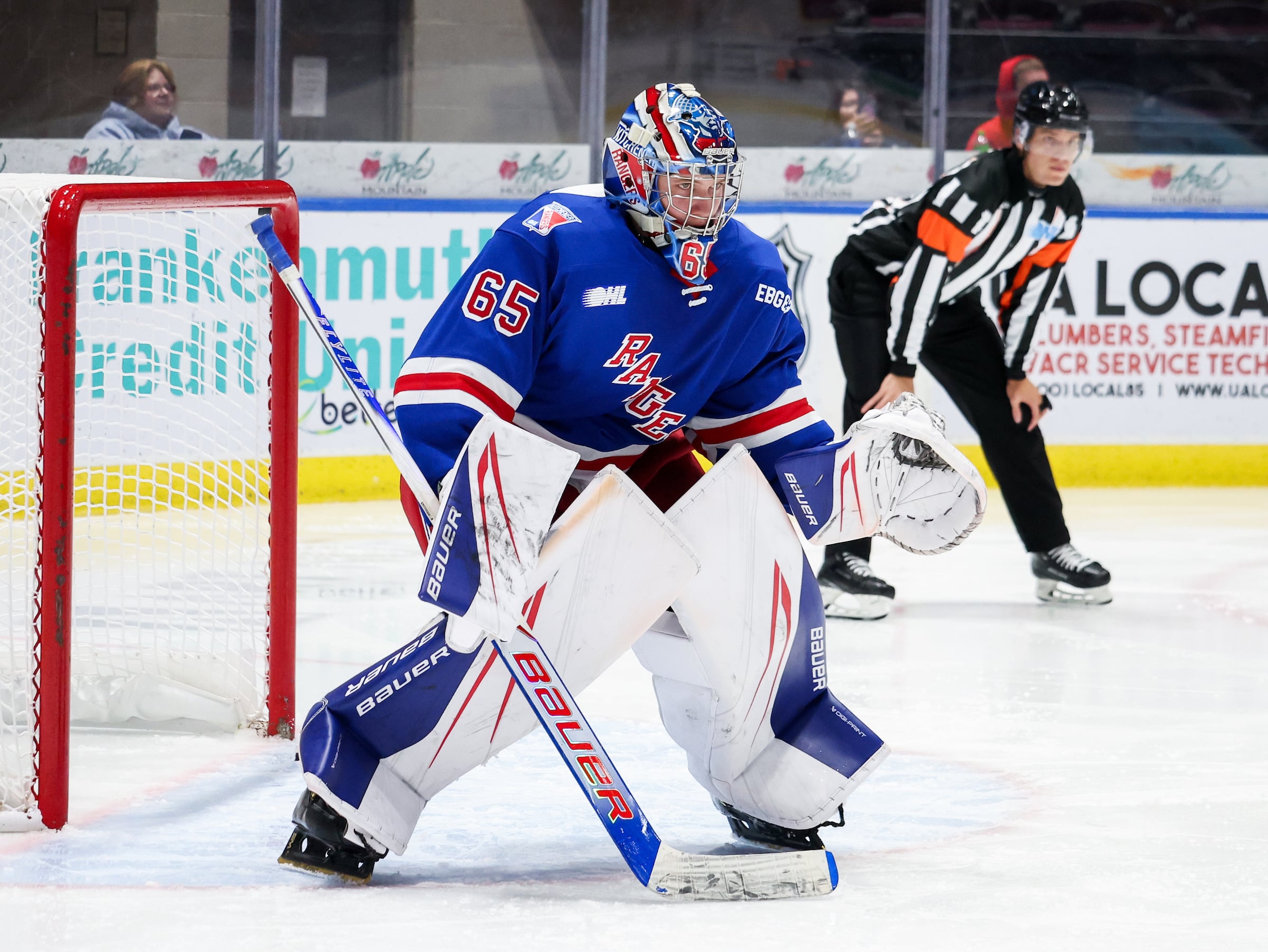
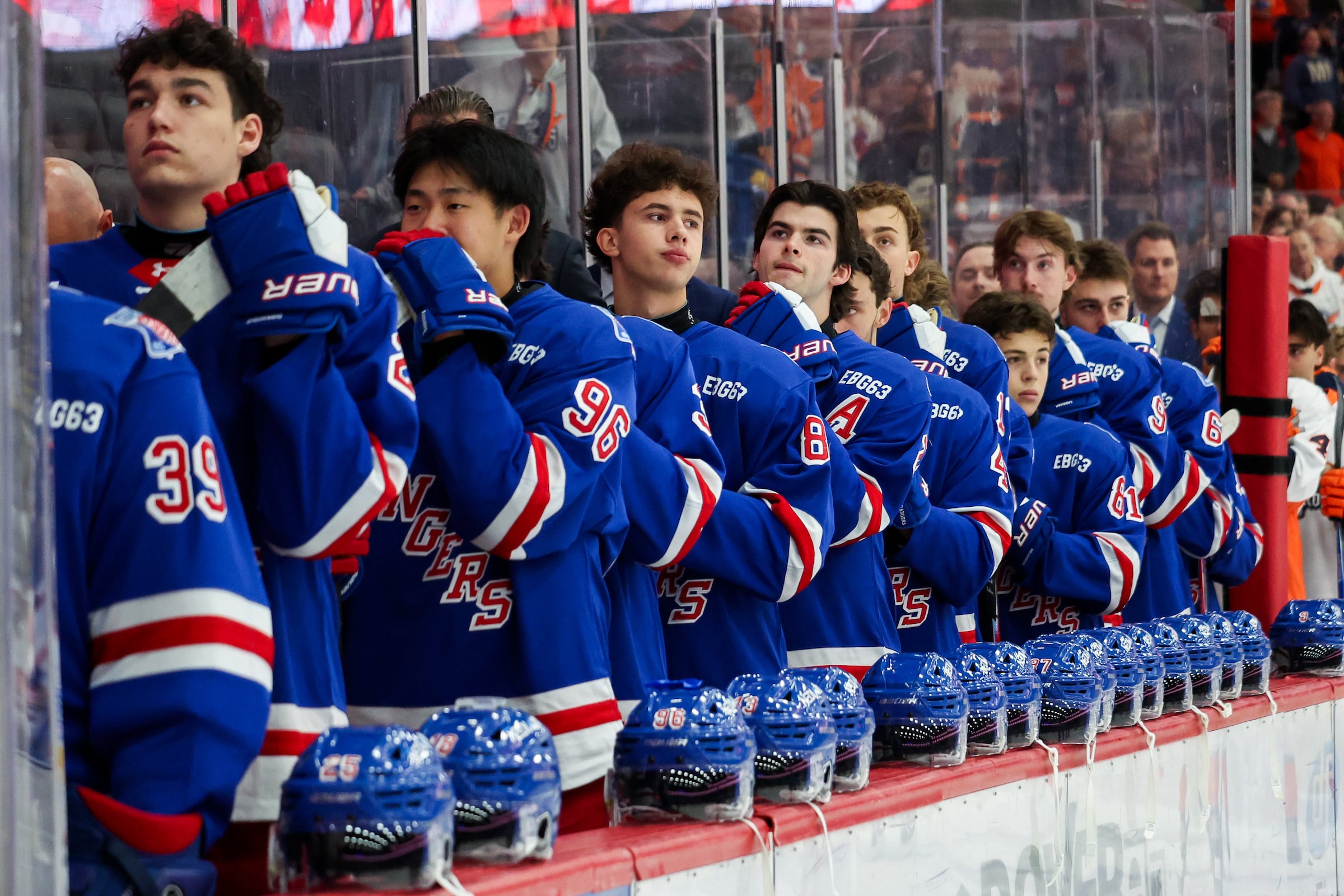
Okay, remember that part about not judging teams for having designs taken from NHL teams? Well, I can’t do that for the Rangers here. It’s not like the Rangers can’t design their own uniforms either, they have an absolutely amazing red design with a soldier on the front of it that would easily rank inside the top five if it was their primary jersey, but they refuse to make the change.
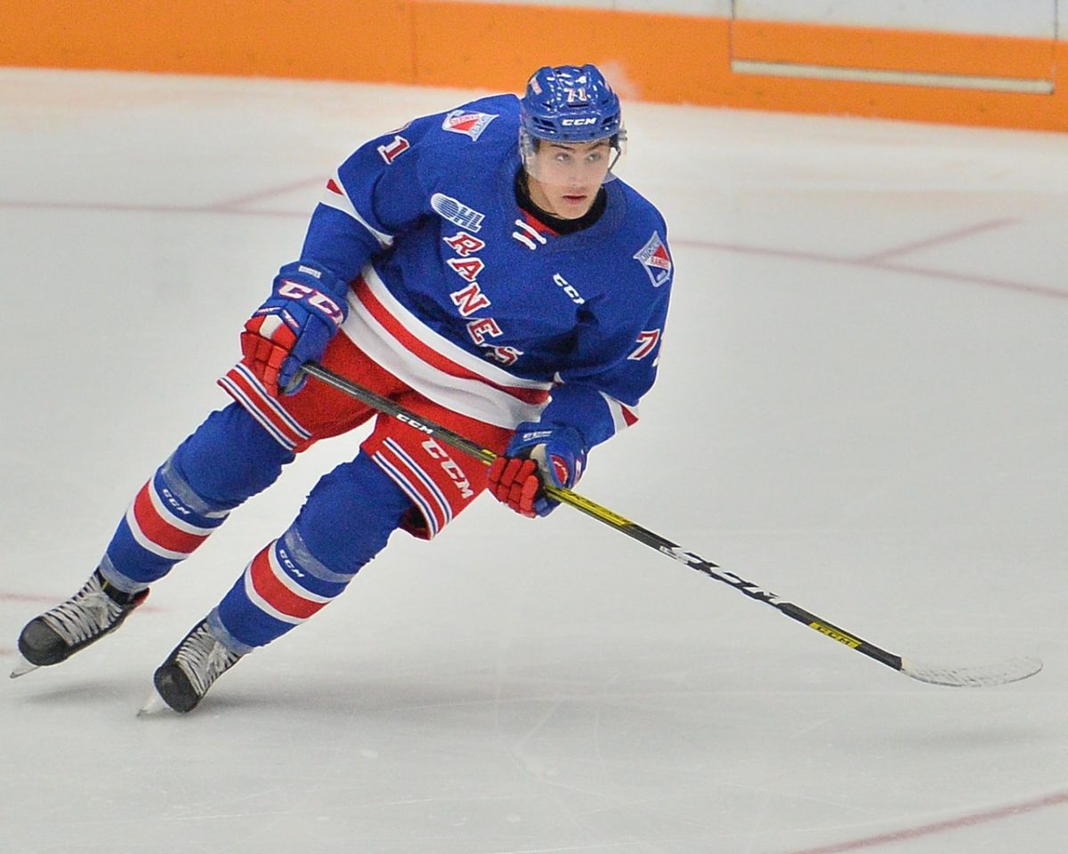
How much is there to talk about with this one? I don’t enjoy seeing teams use diagonal font across the front of a jersey and just because you are the Rangers, doesn’t mean you need to rip off New York entirely. The word across the front fits weirdly and the logos on the shoulder don’t belong there to me either.
Overall, I don’t hate this jersey at all, in fact, I actually really like it in the NHL, but I need to be critical of this one. Everyone wants the red jersey with the soldier to become the full-time jersey for the Rangers. Look, I will even let Gabriel Landeskog model it off for you.
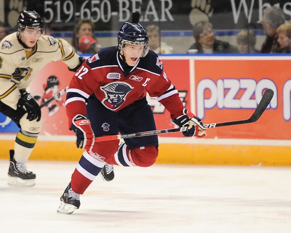
Please, if you have the power to change anything in Kitchener and just so happen to be reading this, make the change! OHL fans deserve to see this beauty more often!
13: Erie Otters
This might be the Otters best set of uniforms the team has ever had and it comes after a couple of seasons of confusion for the franchise. Ahead of the 2019-20 season, the Otters brought back their old logo and adopted the new color set that they used with the wordmark logo from 2016-2019. A very welcome change.
The Otter is just another one of those goofy and fun logos that do so well in the OHL, and updating the colors was certainly the right choice. As for the jersey, the navy blue with the yellow and white striping patterns looks fantastic. The yellow is bold and prominent and the white is a nice contrast to it all.

The shoulder patch featured on this jersey is also very nice. It’s a more realistic-looking otter but still colored in the team’s colors. It is different enough to be a secondary logo but can still be taken seriously by itself. It’s one of those logos that you would want to have on a hat.
The only complaint that I have with this jersey is that the numbers can be tough to read sometimes. It’s not too awful or anything, but something that could be improved upon. This is definitely one of those instances where the white jersey is better than the dark jersey, however.
12: Saginaw Spirit
The Saginaw Spirit are the classic American team, and you can’t fault them for going with this truthfully. The logo has always been one of my favorites in the league. The in-your-face eagle featuring the stars and stripes of the American flag with the wordmark below is perfect for this team.
The jersey itself is so simple that it is nearly impossible to get wrong. The classic template has been tried and tested for years and years, and the Spirit have added their names to the teams who do it well. The navy blue paired with a darker red contrast against one another really well and allow for the white to pop off the jersey and stand out.
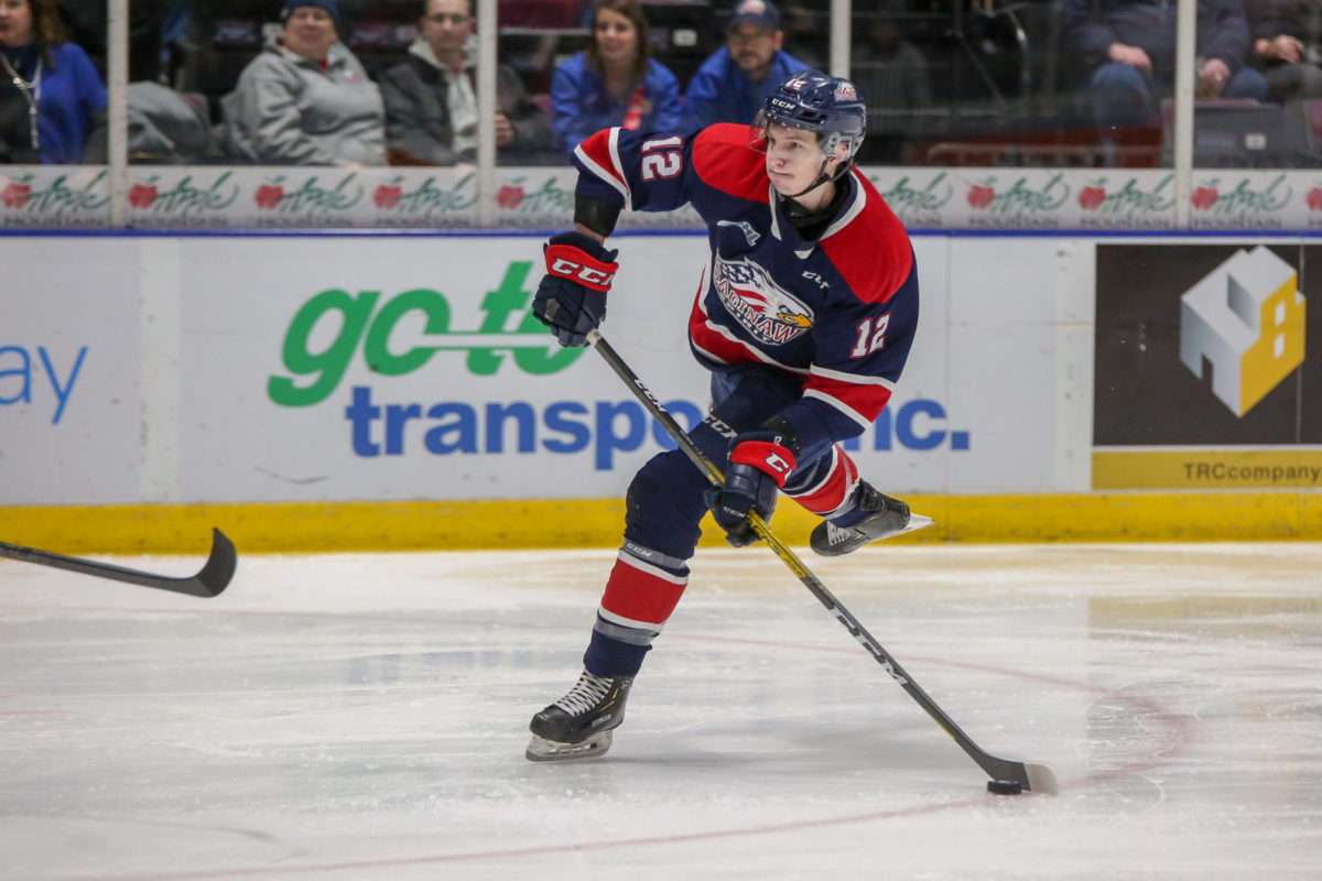
The choice in numbers is also really well done and calculated. As with the stripes in the jersey, the white pops and stands out. While the font itself isn’t the best by any means, it gets the job done and looks solid. There isn’t too much to complain about here.
11: Sarnia Sting
The Sting is another team who made a great change when CCM brought the Quicklite jerseys to the table where they went back to using their logo on the dark jersey instead of a wordmark that read “Sarnia”. It was hands down the right choice and has brought the Sting back to the middle of this ranking.
There is nothing overly special about this jersey, but it just looks good. From the striping on the arm to the yellow collar, everything works together to give the logo plenty of room the breath. It is another of the OHL’s more cartoony logos and it is allowed to speak for itself and draw the attention of anyone watching the game.
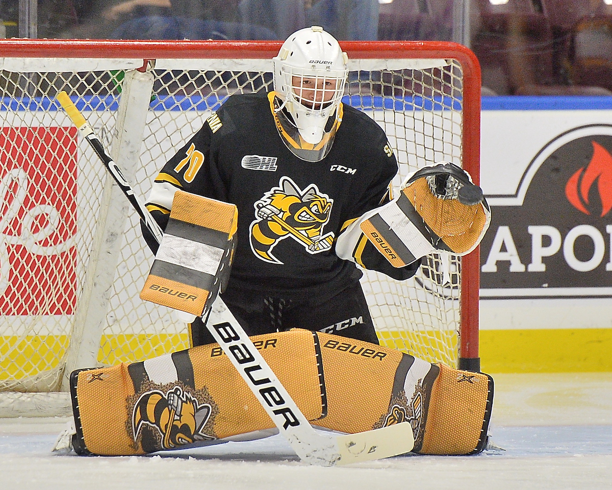
The numbers once again might be a little tougher to read, but it adds the splash of yellow that would otherwise be missing. The one issue that I have with this jersey is the shoulder patch. The logo on the shoulder was previously used on the front of the jersey, and while it is better up there, it should be thrown in the garbage can never to be used again.
The Sting had worn a circular logo featuring the head of the bee inside before, and I would like to see that make a return as a shoulder patch. It probably wouldn’t move this jersey too much, but it would certainly be better.
10: Mississauga Steelheads
With so many OHL teams in the greater Toronto area, you know one of them was bound to rip off the Toronto Maple Leafs. Despite the Leafs wearing a design nearly identical to this for years, the Steelheads have added their own twists to it that have brought it together.
To start, the blue and white combination is phenomenal. As much as it would hurt a non-Leafs fan to compliment them, it has always been and will always be a good colour scheme. The fish logo used on the front of the jersey is okay, but certainly not amazing.
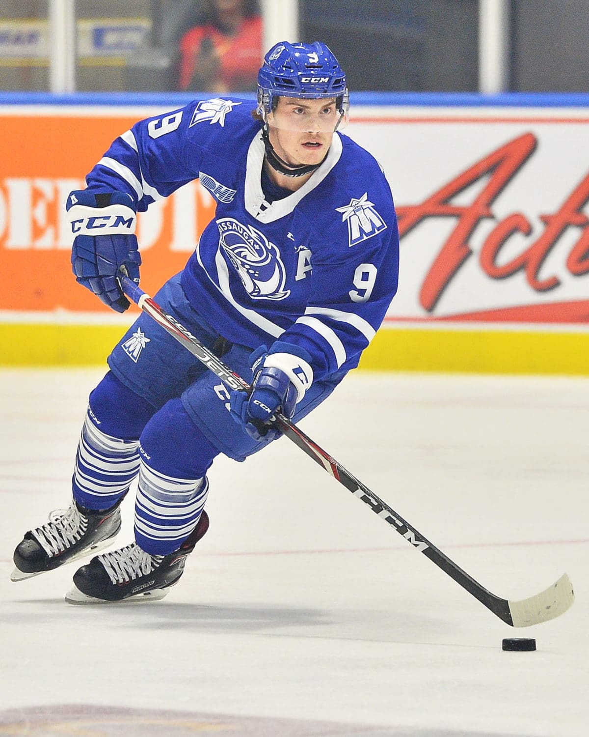
The white font with no outline is amazing too, but the thing that really makes this jersey so good to me is the shoulder patch. The logo is an ‘M’ with the Port Credit lighthouse in Mississauga featured on the inside. It is also a good reflection on past teams in Mississauga who have worn an ‘M’ on the front of the jersey.
9: Sault Ste. Marie Greyhounds
The Soo Greyhounds are another team that has taken inspiration from an NHL design, but unlike some of the others I have ranked lower, the Hounds have added more than just a logo to spice things up. The logo on the chest pops out and while I would normally say they should go with just the greyhound and drop the circle and words, they have tried that in the past and it didn’t do great. This is perfect.
Your eyes will immediately be drawn to the stars on the chest. These stars have been present on Greyhounds jerseys since 1981 except for when they decided to change everything in the late ’90s and went with a cartoon dog according to sportslogos.net.
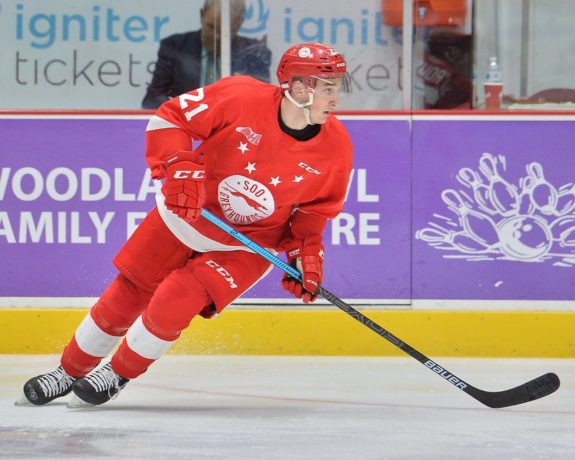
There is nothing that you can disagree with here. It has worked for the Red Wings for a very long time and it’s working for the Greyhounds now too. We might soon get to see this jersey on the ice for some games at the Memorial Cup too!
8: Guelph Storm
The Storm is one of two teams who use maroon and white in the OHL, but the other team does it just a little bit better. More about them in a second, but let’s talk about this Storm jersey. Very recently, the Storm modernized their logo set to bring out this new and updated version of their logo that has been around in some variation since they became the Guelph Storm. A tornado with eyes. You can’t get much more junior hockey than that!
Around the logo, the Storm is another team that uses a classic tried and true template for their jerseys. It’s something that the Blackhawks (among others) have used for years at it would be very hard to get wrong. The maroon base looks fantastic, and the striping on the jersey is really nicely done.
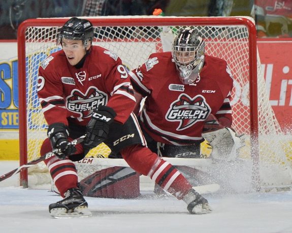
The numbers on the sleeves and the back of the jersey are unique but fit perfectly for the team. The curvature and pointed edges are the perfect template for them. If you are anything like me, however, you would be wondering what the shoulder patch is. As it turns out, it represents a Guelph icon, the Basilica of Our Lady. I love it when teams incorporate things like this into logos.
7: North Bay Battalion
When I ranked the jerseys a couple of years ago, this was near the bottom of my list, but now a handful of years later, it has grown on me and become one of my favorite jerseys in the league. Military green, or as I called it when I was a kid, stinky green, is an incredibly uncommon color for a sports team and takes someone who is open to taking risks to pull off.
It’s fitting for North Bay, however. The green, yellow, black, and white with tiny hints of red in the logo have got to be one of the oddest color schemes ever created, but it works. The striping on the jersey teeters on the edge of being overkill while somehow managing to remain tasteful and elegant. The yellow pops and the black helps to neutralize the otherwise overpowering green.
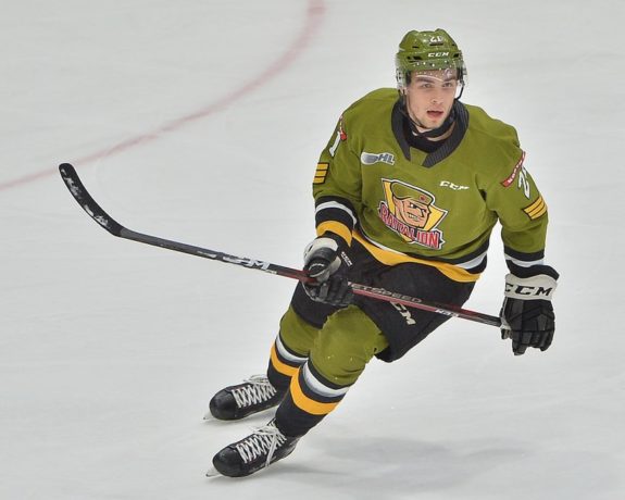
The green helmet is also a nice touch. When was the last time you saw a helmet in that color at a store? But the sleeves are where this jersey comes alive and gains its own personality. The banner wordmark that reads “North Bay” in the red works and the military-like symbols below the numbers are done perfectly.
While some people might think that the colors are off-putting and would rank them toward the bottom of the bunch, something that represents its community and is unique is always welcomed. Don’t change a thing, North Bay.
6: Niagara IceDogs
You might be wondering why the full red set is pictured below, and that is because the IceDogs announced that the red jersey will now be their primary dark uniform from here on out. While it remains unconfirmed they will bring back the red helmets and pants, that is the direction they should go, so let’s run with it.

While it is just the Blackhawks jersey, the red helmet and pants do enough for me to forget about that and see this as the IceDogs’ own identity. The cartoon dog with a hockey stick and an emblem representing St. Catherines with crossbones underneath on the shoulder is yet another great logo set.
The Blackhawks have forever had their jersey ranked among the best in the NHL by everyone who tries their hand at making a jersey ranking, so why wouldn’t this one be up there too? It’s certainly not very creative, but who am I to punish them for that when it looks this good?
5: Kingston Frontenacs
Since the OHL franchise in Kingston rebranded to the Frontenacs, all but one of their logos have featured a ‘K’. Previously, the spoked wheel dominated the team while they mirrored the look of the Boston Bruins almost entirely. There was a brief period where some kind of pirate with who knows what sticking off of his shoulder as their logo. After the ‘K’ in a spoked wheel returned for a couple of seasons, the Fronts went with just the ‘K’.
While the logo is simple, the jersey is anything but. If this was a ranking of the white jerseys, this would be even higher. I don’t love the white and the yellow touching on this jersey, but it’s hard to argue with the final outcome. Unlike other jerseys that I have described as busy, it’s not a bad thing here. It feels like there is plenty of history wrapped into this jersey even though they have never worn anything like it in the past.
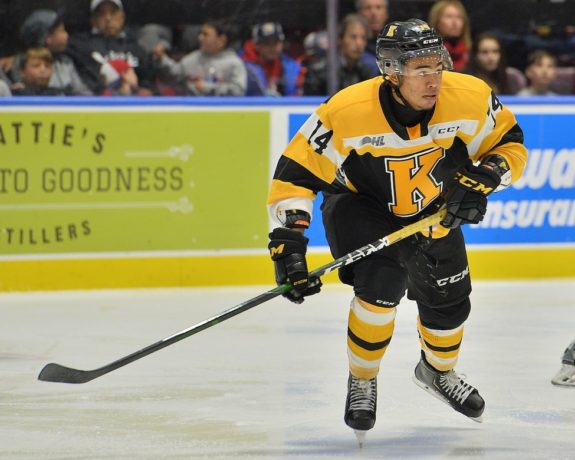
For a city like Kingston that has as much history as it does, this is fitting. A classic look that will likely be able to stand the test of time that is fun and playful while also being strong and tough. It might just be a ‘K’ with more stripes than you can shake a stick at, but this is hands down one of the best jerseys in the league.
4: Ottawa 67’s
If you want to talk about a classic and iconic jersey, look no further than the Ottawa 67’s. Simplicity be damned, the 67’s don’t care. The look has become a staple in Ottawa and has earned the team the nickname of the barber poles. The team is identified more by its iconic jersey design than by the logo on the front of it. It is one of the most unique jerseys in North America and looks really sharp on top of all of that.
Something the average fan might not notice about this jersey is the change made with the logo for the new CCM Quicklite jersey base brought to the league before the 2019-20 season. Previously, the logo had featured a white “O” with the inside being red, but that has since changed. The team now wears its traditional red “O” with “67’s” on the inside. A change that I was not fond of when it first happened but has since grown on me.

The font was also changed for the new jerseys where the numbers were made wider and bolder than they had previously been. Bringing the numbers up to the shoulders has also made them more readable and made the jersey as a whole nicer. One of the last changes the 67’s made was with the socks. The barber pole socks seem to be a fixture in just about every kid’s hockey bag at one point or another, and it’s hard to believe they even went away from them, to begin with.
It’s an iconic look for an iconic franchise. They allowed the barber pole to slip away from them when the league switched to Reebok but was brought back as soon as possible. It’s hard to imagine the 67’s without the barber pole. It’s their identity and a good-looking one at that.
3: Oshawa Generals
For a very long time, I had said that the Generals red jersey was not only the best jersey in the OHL but also the best jersey in all of hockey. I still believe that they are up there in that conversation, but when the OHL switched to the new CCM QuickLight jerseys, two teams unveiled new threads that I now consider even better.
This is nothing against the Generals, however. The logo on the chest of the jersey is both classic and modern at the same time, and the striping pattern on the arm, waist, and socks is unique to any other team in the league. The jersey and uniform as a whole are extremely well put together and coherent throughout the entire design.
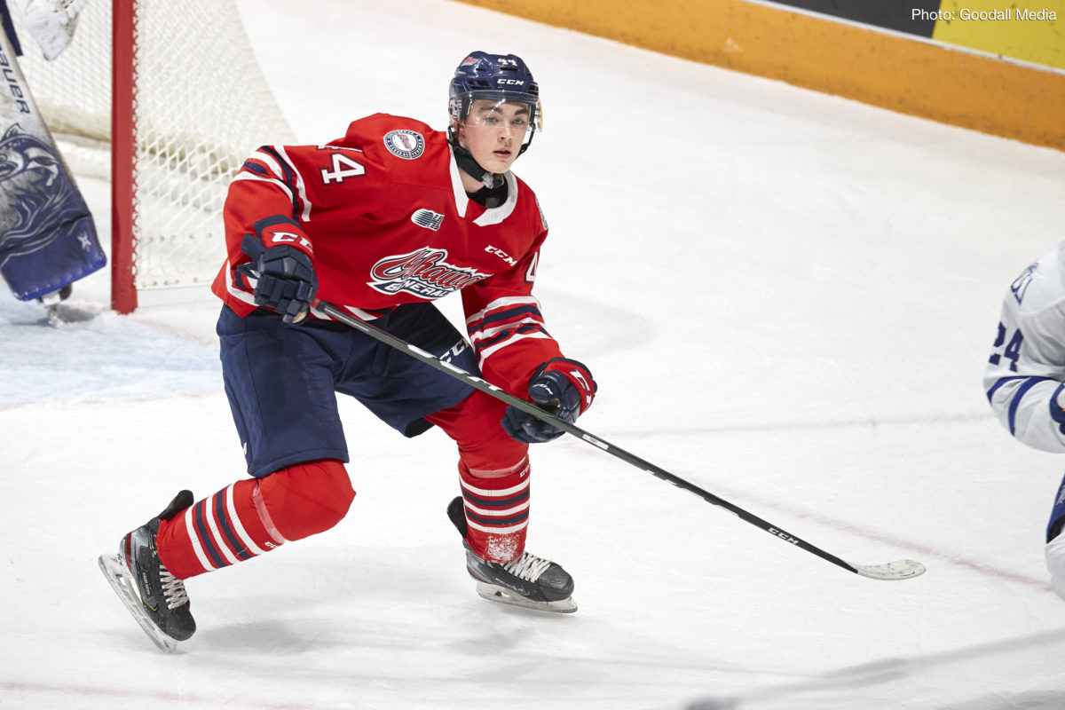
It is extremely hard to rank this jersey at three. There is nothing that I would change about this look. The only way to get it higher would be to rip off one of the other two designs, but that would really spoil the fun. Don’t change a thing, Oshawa.
2: London Knights
Are the London Knights bad at anything? It really doesn’t seem like it, and this is a jersey design that is worthy of the team it represents.
The 2019-20 season was the first time the new Knights threads were worn, and the new looks put the older, darker designs to shame. The Knights had previously worn a color scheme that consisted of dark green, an almost bronze color, and black. There was nothing terribly wrong with it, but brightening up the colors was the right choice.
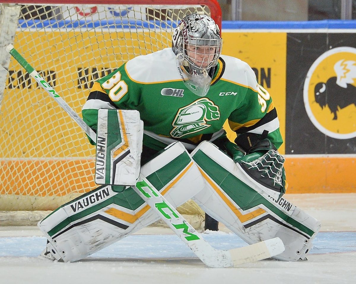
Adding the brighter green, white, and yellow and keeping the black to a minimum made the Knights all the more intimidating to play against. It’s an almost arrogant look that can really be off-putting if done wrong. Look at what the Minnesota Wild came up with for their Reverse Retro jersey this season.
1: Peterborough Petes
The first thing that I think when I see this jersey is how the Petes could have possibly decided to ditch this in favor of black, maroon, and cream. I’m a sucker for a good cream-colored jersey, but when you need to go away from something like this to do so, you shouldn’t even think about it.
The white arm sleeves with a hint of maroon in the stripe sets it apart from anything else in the league. The number set is also fantastic with simple one colored font and minimal jagged edges. It flows the entire way down the jersey. It’s easy on the eyes and is Peterborough. This is what the Petes are.
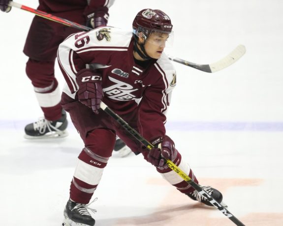
One of my favorite things about this jersey is the shoulder patch that is also massive on the side of the helmet. It features the Peterborough lift locks above a puck with the Petes logo on the inside. A great way to tie the team to the city, and more than deserving of the top spot on the jersey rankings list.
Wrapping It Up
So that’s it! There is how I rank the OHL dark jersey ahead of the hopefully upcoming season. There is still plenty to be hopeful for, but especially for jersey heads like myself who will get to check out some new threads when we do get back on the ice.
That being said, I encourage you to share with us your thoughts and your own list! I would love to see what you agree on, disagree with, and how you would rank the jerseys. Remember, there are no wrong answers.
Free Newsletter
Get CHL coverage delivered to your inbox
In-depth analysis, breaking news, and insider takes - free.
Subscribe Free →