- #9 2007-15 Home and Away Jerseys
- #8 2003-07 Home and Away Jerseys
- #7 2015-21 Home and Away Jerseys
- #6 2022-23 Reverse Retro Jersey
- #5 2008-15 Alternate Jersey
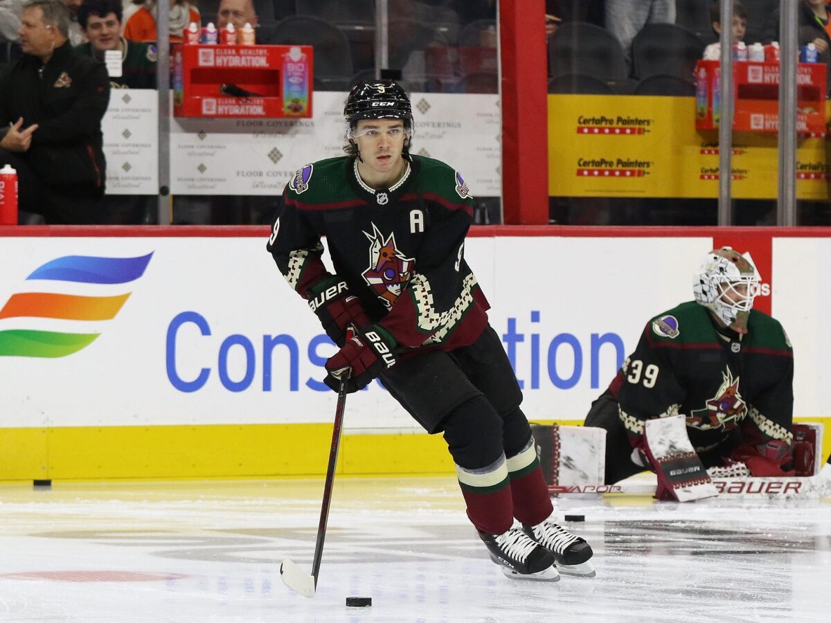
- #4 2022-Present Alternate Jersey
- #3 1998-03 Alternate Jersey
- #2 2021 Reverse Retro Jersey
- #1 1996-03, 2021-Present Home & Away, 2015-17, 2018-21 Alternate Jersey
The Arizona Coyotes might have had a history of being unstable on the ice but jersey-wise, they’ve pleased many with their limited jersey history. With the Adidas era ending after this season and more jerseys probably on the way when Fanatics takes over, I decided to rank the nine jerseys they’ve had in their history in the desert. To help me, I’ve enlisted the help of fellow Coyotes writer Haynes Evans to help rank the jerseys and share his opinions on each one as well. The ranking was decided by the two of us along with some input by Cooper Krigbaum by each of us ranking the jerseys and adding the score up to get a total. These are the results of the rankings.
#9 2007-15 Home and Away Jerseys
Chase: There was no competition for last place as we essentially all agreed that this is not a great Coyotes jersey. It isn’t bad, but there are flaws and it’s not comparable to the rest of the Coyotes’ jersey history.
I’m a big fan of the color maroon but there is a point where there’s too much maroon. This is an example of such a thing. The only break from it is the white stripes on the armbands. Everything else is maroon including the logo. It makes the jersey boring and uninteresting. The white jersey is better as the shoulders are maroon colored but it’s still so much maroon.
The only thing I really love is the shoulder patch but this wasn’t the jersey that started it. Even though this might be one of the more iconic jerseys in the Coyotes’ history due to their 2012 Cinderella run in the playoffs and the long tenure that the jerseys have had, it’s boring and uninteresting. I had it ranked eighth but it was very close to being ranked last.

Haynes: I ranked these last solely because they were a more simplified and rather boring version of the already bland 2003-07 uniform set. Removing the stripes from the bottom, while also using only one shoulder patch logo on one side made this a rather boring and easily forgettable uniform set, despite the fact that the Coyotes had their best success in these uniforms, including their deepest playoff run in 2012.
#8 2003-07 Home and Away Jerseys
Chase: Well, we all obviously didn’t like the maroon jerseys compared to the other jerseys in Coyotes’ history. These uniforms weren’t around for a long time as they actually had the shortest span as the home and away jersey for the team compared to the three other uniforms they’ve had.
I don’t dislike these jerseys at all. In fact, I had it ranked the highest among the three Coyotes writers at fifth. I like maroon and this jersey is all maroon with some white stripes on the armbands and near the waist which gives it an advantage over the last-place 2007-15 jerseys. In the white jerseys, the wrist cuffs are also maroon which gives it more color.
The shoulder patch is one of my favorite shoulder patches in the whole league. The outline of Arizona combined with the state flag and Coyotes colors is awesome and I want them to bring it back ASAP. The jersey is also known for having the decade in the desert patch on it as well which makes the jersey complete.
Wayne Gretzky infamously hated the Kachina logo and brought in these jerseys. Was it a downgrade? Yes, but I do actually like these jerseys. I’m a fan of the “howling coyote” logo and I might be in the minority by saying maroon is the best color in the Coyotes’ palate. Not a bad design at all.
Haynes: I ranked these seventh because while they were simplistic and a complete rebrand from the Kachina design, they lacked that pop or eye-catching appeal while following too closely with the color scheme of the Diamondbacks and Cardinals.
#7 2015-21 Home and Away Jerseys
Chase: These jerseys are beautiful and don’t let anyone tell you anything different. I think there are a lot of underrated aspects in this jersey and it makes me miss this jersey. I love the “howling coyote” logo a lot. That logo is iconic and I think it’s well designed. It’s also interesting because it’s a maroon logo on a maroon jersey which shouldn’t work but the white outline just makes it beautiful.
Speaking of maroon, it is one of my favorite colors ever and I loved it when it was one of the main colors for the Coyotes. The reason why this maroon jersey works and the others don’t is because of the black. The black in the shoulders and at the waistline make this jersey stand out and the increased white sections of the uniform help break up the plainness of the old Reebok ones.

Finally, the shoulder patches on both the home and away jerseys are beautiful. I especially love the one on the away jersey which is the outline of the state of Arizona with the Arizona flag shaded in Coyotes colors inside of it. The pawprint on the maroon jersey is also nice.
I had these two jerseys ranked at three which was by far the highest ranking out of the three of us. I love these jerseys and I would really love to see them return. I know people disrespect the maroon jerseys but I think they’re sharp, although seeing a black version of this design might look incredible.
Haynes: These were ranked eighth for me. While I appreciated the Coyotes going in a new direction from the previous two bland sets, I was not a fan of the striping on these uniforms or the extended use of black throughout both jerseys. I did however like the ‘A’ paw print patch secondary logo.
#6 2022-23 Reverse Retro Jersey
Chase: I know people love this jersey but I was so tempted to put it last. I don’t like this jersey at all and I think it’s ugly and lazy.
Let’s start with the jersey itself. The logo is shaded darker than normal for some reason and for a logo that had a lot of colors popping because of the lightness, the only color that looks better after the shade is purple. The main tan color is not a good look and doesn’t work as a primary color. I like the different colors in the desert landscape at the bottom of the jersey to make it look like a sunset but the moon sticks out like a sore thumb.
If the Coyotes wanted to go and make another space Coyote jersey (this is their third one in franchise history, second in the past three years), black or white would’ve been great colors to use as a primary but I think everyone (at least me) was burnt out with this jersey concept. I believe the Coyotes should’ve made a completely different jersey like a black redesign of the 2015-21 home and away jersey, a maroon version of the Kachina, or even a maroon version of the 2008-15 alternate jersey. It just seemed lazy on Adidas’ part to do this and it’s why the jersey ended up seventh in my rankings.
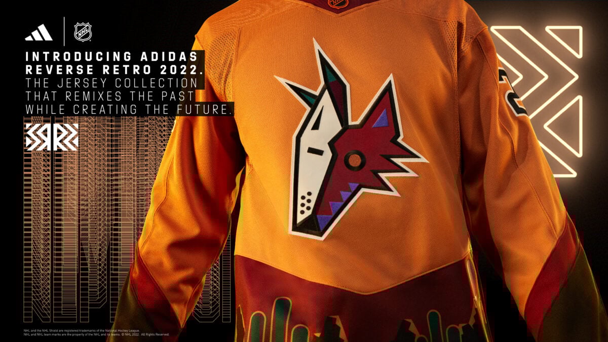
Haynes: When the NHL announced their decision to do Reverse Retro 2.0, many fans clamored for a revamped version of the full-body coyote uniform. Instead what they got was another version of the 2021 Reverse Retro, this time cast in sienna, with the logo and secondary patches being inverted. Overall I thought this look was a step down from the first edition and thus I give it a six.
#5 2008-15 Alternate Jersey
Chase: Black and maroon is just an amazing color combination and this proves it. This actually ended up in the upper half of the jerseys for me at number four. The “running coyote” logo is awesome and I will stand on that hill. It’s cool seeing the full animal and it actually looks like an actual coyote. I don’t care if it’s brought back as a shoulder patch or a main crest, just bring it back, Coyotes.
Now that I’ve gotten that out of the way, let’s talk about the rest of the jersey. I love how the Coyotes finally brought in a full black jersey. Previously, the home Kachina was the only one that featured black as the primary color but this changed it. The Reebok piping design actually works with this jersey with the tan and the maroon on the sides. The one critique I have is the two different shoulder patches. I think they should’ve just gone with the paw print in the circle for both sides but that’s just a minor critique. Overall, I love this jersey and I think it definitely should be brought back.

Haynes: Five years removed from the eye-catching green Peyote desert jersey, the Coyotes yearned for a new alternate jersey to match their new logo and uniform set. Enter the full-body coyote logo and black alternate jersey that came with it. While not as big of a statement as the original Peyote jersey, the new full-body alternate uniform received mixed emotions. Many who hated it at the time, love it now and have called for its return. Because of that, I ranked it at number five.
#4 2022-Present Alternate Jersey
Chase: This might be a hot take but I do not like this jersey at all. I like busy jerseys that have awesome logos and not wordmark jerseys. The Arizona logo is a cool design but it’s something I’d rather see on a t-shirt or as an alternate patch, not a main logo on a jersey.
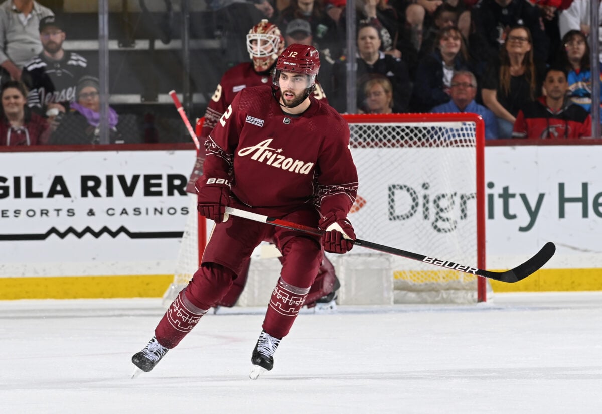
Beyond that, the jersey is just plain. There’s nothing that makes me want to go out and get it or beg for the team to wear it more. The Kachina design in tan at the bottom is fine but it’s been done better elsewhere. I’m glad the team brought back maroon as a main color scheme but why not make a maroon version of the Kachina? The felt fabric used in the jersey is cool but it doesn’t make a difference visually. The lizard in the collar is cool but you can’t see it when someone wears the jersey. I might be in the minority but I don’t like it and that’s why I ranked it as my least favorite. Apologies to my colleagues.
Haynes: Perhaps one of the most heavily scrutinized alternate uniforms released last season was the Coyotes ‘desert night’ set. Many hated the use of the Arizona word mark as the main crest and geometric kachina pattern along the waist and arms. What made this jersey number three for me was the creativity. Designed by Rhuigi Villaseñor, the new alternate captured a new side of the iconic Kachina look; the shooting star in the word mark, the lizards incorporated on the inside collar, the new simplistic Kachina pattern, and the giant cactus on the side of the pants. What started as a hated look, turned into one of the most beloved Coyotes’ alternate uniforms.
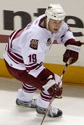
#3 1998-03 Alternate Jersey
Chase: I’ve always had mixed feelings about this jersey. The concept is awesome. Incorporating the desert into a jersey is a great idea but with this one, I felt like there was one big error that was holding it back. I don’t like the main color being green as it doesn’t mesh well with the black or purple. It’s something future redesigns of this jersey corrects and shoots this design to the top.
What I do like is the Arizona desert night skyline at the bottom of the waist. It’s a beautiful piece of this jersey with the crescent moon logo making an appearance as well. I like how the desert skyline is also on the sleeves which is something that only appeared on the green edition. It shows the amount of time that was dedicated to this jersey. The lizard shoulder patch is the other thing I love. It was originally going to be incorporated in their home and away jerseys before being trashed, but it was too good to not use somewhere else.
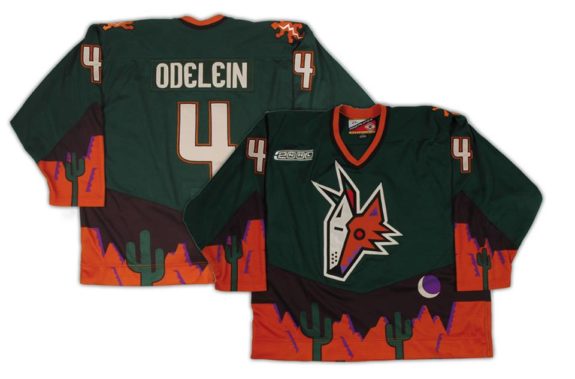
It’s not the worst ever but it certainly isn’t the best. Like most jerseys, this was the first version and it was improved on in the future. I had it ranked sixth overall and while it’s not my favorite, it’s a decent first design for an alternate jersey.
Haynes: I ranked this uniform as number four because it was the first true bold alternate uniform the Coyotes designed outside of the Kachina look, from the green base to the desert scape across the bottom of the jersey and onto the arms. Add in the lizard side patch logos and you have a very solid look.
#2 2021 Reverse Retro Jersey
Chase: I actually ranked this as the best jersey in Coyotes’ history. It’s one of my top five of all time and it was my favorite in the first line of the Reverse Retro. I know it’s based on the original green jersey but the remix in purple just pops. It’s one of the most underused colors in the NHL and it meshes well with the tan color.
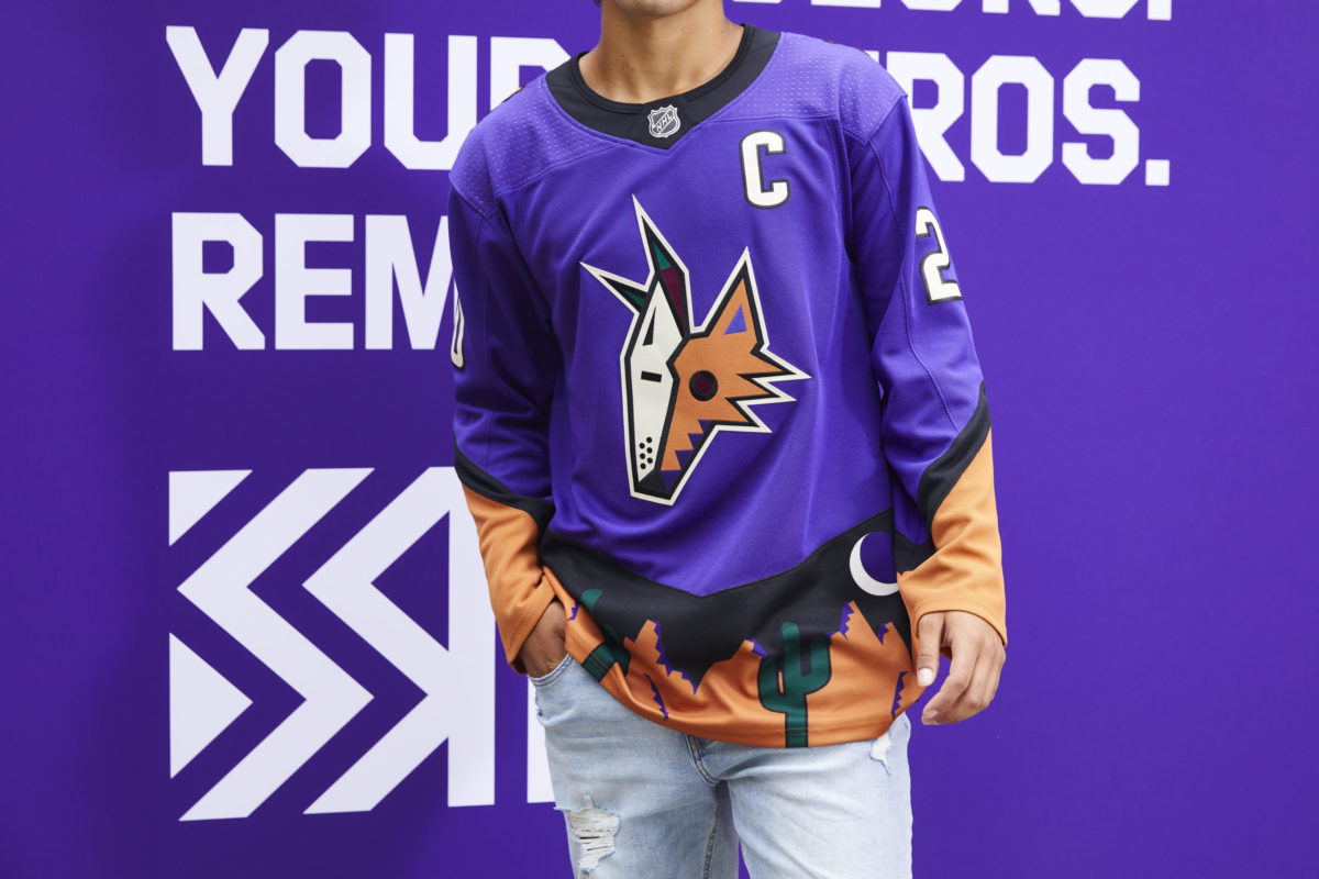
The purple edition is just so much cleaner than the green design. The desert skyline near the waist is beautiful. I love the cactus, rocks, and the moon all around the jersey. The fact that it’s on the back as well is just awesome. The gecko shoulder patch is a great simple design that just ties this jersey together along with the cream-colored numbers. Overall, this has been one of my favorites since the first time I saw it and it is still my favorite Coyotes’ jersey in their history.
Haynes: The return of the Peyote, but purple? That’s exactly what the Coyotes did with their first Reverse Retro jersey in 2021. Gone is the desert scape on the arms (bottom half of the uniform only), now much more simplified and cleaner looking. Switching from green to purple and incorporating more of the sienna into the look gave this jersey a refreshed look on an original classic. I ranked this jersey at number two.
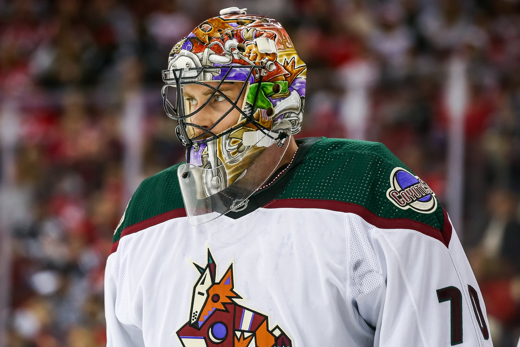
#1 1996-03, 2021-Present Home & Away, 2015-17, 2018-21 Alternate Jersey
Chase: Probably one of the best and most iconic jerseys in the league, it’s hard to believe that these were appalled by some when they were first released. The Kachinas have become undisputedly the face of the Coyotes. The logo was designed after a collection of dolls based on the supernatural beliefs of the Pueblo people. The color concepts come from a Native American palate and the designers met with the Hopi leaders in Arizona making this jersey not just a beautiful design but a respectful one to Arizona.
There are so many things to say about this jersey in so little time but I want to point out my favorite things about it. I love the Aztec design going on the arms, collar, and bottom of the jersey. It stands out as no one else in the four major sports leagues has anything like it. The shoulder patch is one of my favorite logos ever. The crescent moon in the night sky is such a simple design but it’s so beautiful. Finally, it’s one of the only current jersey designs that looks great in black and white. This is one of the best jerseys not only in the Coyotes franchise but in NHL history. There’s a reason why they brought it back to be their home and away jersey again.
Haynes: I ranked these number one because they’re the best uniforms of all-time in franchise history thanks to the history behind them. The Kachina look is not only synonymous with the Arizona Coyotes, but also with the Pueblo people and Native American cultures in the southwestern part of the United States.
There you have it, the Kachina came on top at number one (to no one’s surprise). Throughout the Coyotes’ history, they’ve used colors that many in the NHL haven’t, like maroon and purple along with creating designs that have become symbols in Arizona and will most likely be remembered throughout the rest of time. Which way the Coyotes go next with their branding is uncertain, although the Kachina and the maroon alternate will most likely be around for a while. However, if it’s anything like their current history, it will most likely be a success.
Free Newsletter
Get Arizona Coyotes coverage delivered to your inbox
In-depth analysis, breaking news, and insider takes - free.
Subscribe Free →