The “Rocket City Trash Pandas” are the double-A affiliate of the Los Angeles Angels in the MiLB Southern League. Calling any professional organization the “Trash Pandas” is, as Pepper Brooks would put it, “a bold strategy, Cotton.” Yet, the name and the uniform are marketing wizardry and represent one of a myriad of ways to popularize a team.
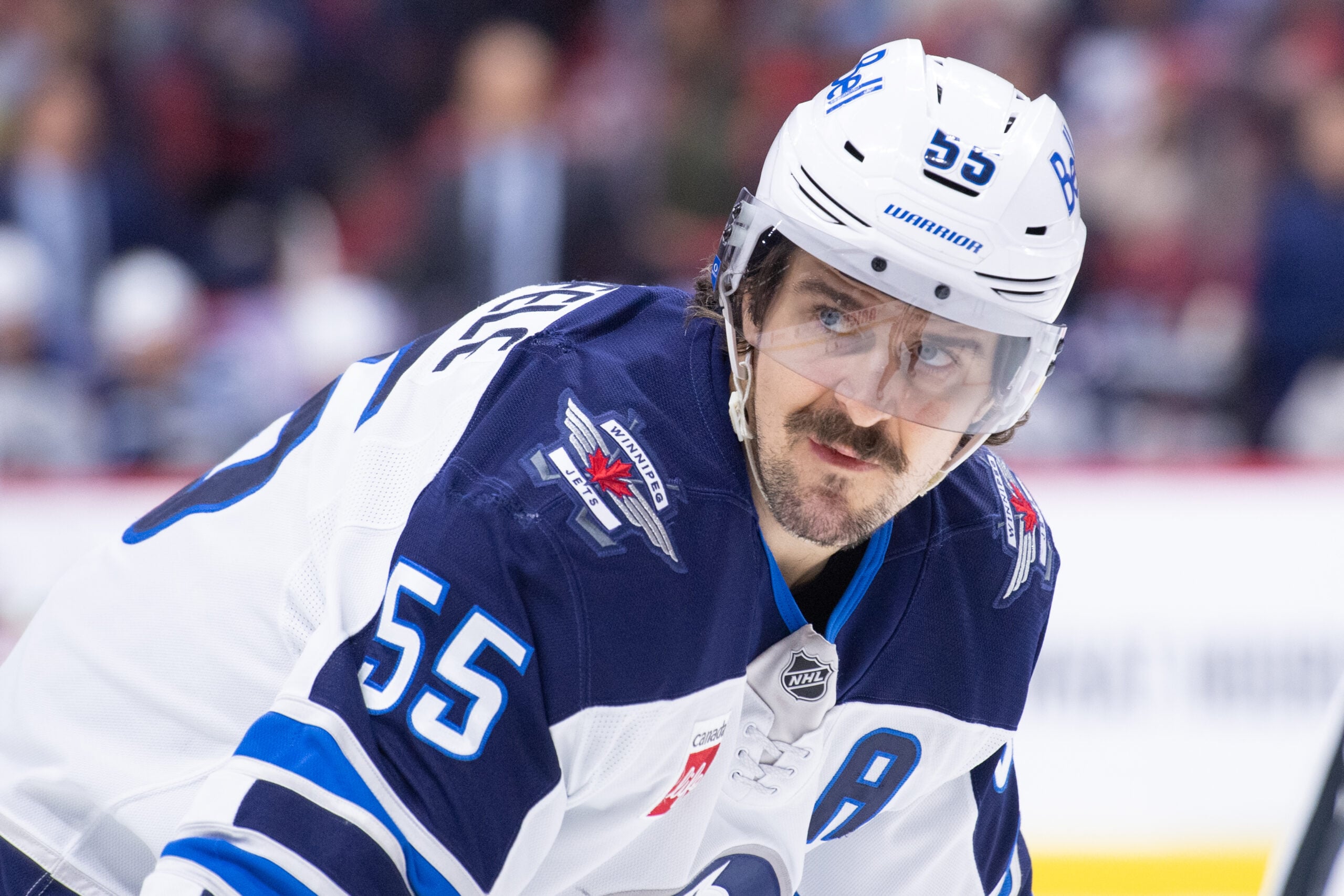
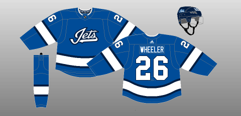
Tangentially, I submit that the Winnipeg Jets name, logo and uniforms are currently good but not great. A cross-sectional sampling reveals that NHL fans disagree somewhat with my assertion and generally rank the Jets’ uniforms and aesthetics as below average. Top-Down Hockey has the Jets’ uniforms ranked 21st, USA Today 16th, Sports Hub 27th and Bleacher Report 12th.
What can be done? I wanted to first determine which iteration of the Jets logo was most popular. Fans were asked to rank their top three historical Jets logos dating back to the WHL. The results were illuminating:
Small sample size aside, it appears as though Jets fans prefer the logos from the 80s and 90s over the current design. Uniform preference is obviously subjective, as is any sartorial choice, but the above represents that, at the very least, the Jets should entertain a change.
Teams can go in several branding directions, and I believe there are general guidelines for uniform and logo creation. Unofficially, here is a representative sample of strategies that work (or don’t work) in the NHL and professional sports in general.
Do the Winnipeg Jets Have Whimsy?
The Trash Pandas could just have easily called themselves the Alabama Raccoons. Creatively, they turned Alabama into Rocket City (Alabama is where NASA rockets were developed) and Raccoons into Trash Pandas. The “Alabama Racoons” evokes banjo overtures from “Deliverance,” whereas the Rocket City Trash Pandas sound like an edgy grunge quartet.
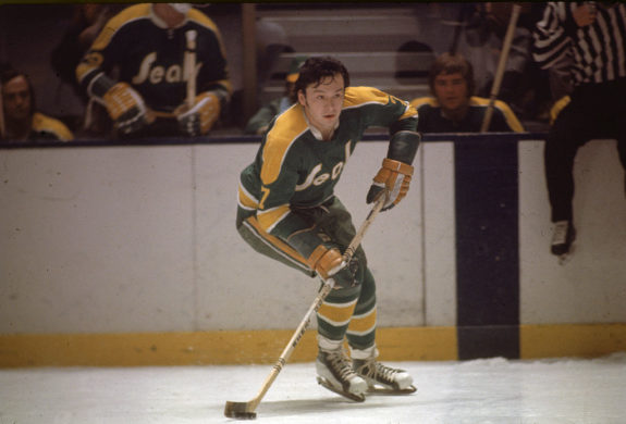
However, whimsy, especially in the NHL, can go very wrong. The Mighty Ducks of Anaheim or the California Golden Seals (Google it) are prime examples of playfulness run amok. By the time the Golden Seals changed their name in 1970, the team was already a joke. They chose to steer into the punch line, which deserves at least some modicum of respect.
The Jets ascribe to zero whimsy. It’s not their vibe, and that’s fine. There is a certain respectful stoicism to a military-themed ethos that I think fits Winnipeg’s no-frills essence.
Avoid Anthropomorphism
Why are some of the best NHL logos and uniforms from Original Six teams? Simplicity. The Montreal Canadiens and Detroit Red Wings logos stand the test of time because there is a basic elegance to the logo itself.
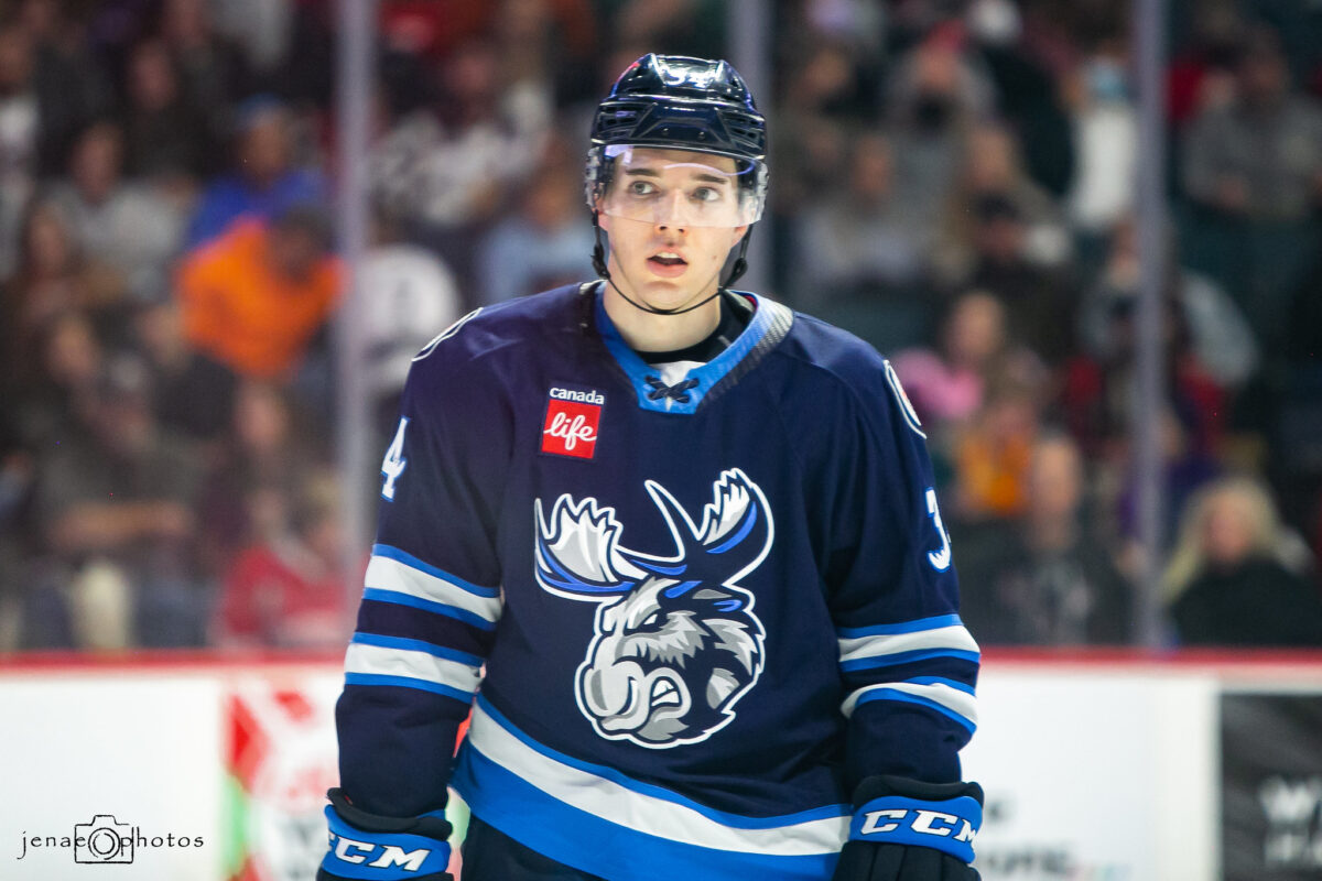
The Pittsburgh Penguins, San Jose Sharks, Arizona Coyotes, Nashville Predators, and Florida Panthers all feature anthropomorphic wildlife projecting menace or branding a hockey stick. Firstly, Penguins are NOT menacing, and Sharks and hockey are incongruent. The Manitoba Moose are guilty of this, as their logo looks like a reject from BoJack Horseman.
I understand the value of marketing to kids, as they are the future. To me, though, the Toronto Blue Jays are the only franchise to use an animal as a mascot with any significant success.
The Winnipeg Jets are a very solid concept. Given the aviation history and “Top Gun” slickness of a Jet, Winnipeg found the sweet spot. The Jets could have easily fallen prey to another mistake of naming convention – following the likes of the Tampa Bay Lightning or the Carolina Hurricanes and naming the team after a weather event. I shudder at the thought of the “Winnipeg Blizzard” or the “Winnipeg Flood.”
Abstract – How are the Winnipeg Jets doing in that regard?
Abstract is better. Not Picasso levels of abstract, but aspire to the less obvious. The Minnesota Wild logo typifies the folly in a graphic design trying too hard to encapsulate the name. Having a sun and evergreen trees in your logo is overkill – be creative.
Two of the best NHL logos are the Quebec Nordiques and the Vancouver Canucks “alternative stick.” They are a perfect example of a logo/jersey just being cool rather than telling a story.
Let’s use another defunct NHL team as a test case. The old Hartford Whalers logo is objectively sublime, but imagine if the Whalers were to return to the NHL. The logo would undoubtedly be a gaudy amalgam of boats, whales and the ocean. That is why the Seattle Kraken get kudos for their attempt at simplicity. It doesn’t quite work, but it eschews in favor of the figurative rather than the literal.
The old 80s and 90s Jets logos (our favorites) are not abstract at all — yet there is a cleanliness to them that is pleasing to the eye. The current Jets logo went for abstract, but humbly, having a Jet logo for a team named the ‘”Jets” is not Banksy levels of art.
Careful With Color — Winnipeg Jets Blue
I dislike the Las Vegas Golden Knights, so my opinion here is compromised, but gold doesn’t work. Neither does yellow (Nashville Predators) or teal (Seattle and San Jose). The Philadelphia Flyers make orange pop, and the Dallas Stars green, while unconventional, is a good look. In principle, though, stick to the basics.
This is where the Heritage blue and red of the Winnipeg Jets shines. The red pants with the “Traditional Royal Blue” is breathtaking, and it has my vote as the color choice for the future. The Aviator Blue Jets retros made a splashy entrance but now can be found on the shelves at Winners for under 50 bucks.
In sum, the Jets have a great theme and concept but could benefit from a stylistic rebrand. Anecdotally, Jets fans prefer the color scheme and aesthetic of the old 80s and 90s version, so let’s lean into that. Popular opinion dictates that the Jets make the simple switch to the Heritage jerseys or some variation thereof.
I understand that some readers may be perfectly content with the current Jets uniform and may recoil at the thought of change. However, if the Jets do decide to pivot, there is no need to reinvent the wheel or dig through the trash bins of discarded logos of other professional teams. After all, they are not Trash Pandas.
Free Newsletter
Get Winnipeg Jets coverage delivered to your inbox
In-depth analysis, breaking news, and insider takes - free.
Subscribe Free →