The NHL sets itself apart from the other major sporting leagues in a very unique way. As a league with a fraction of the money of its competitors, the NHL uses a creative aspect to lure a larger audience into becoming fans.
In fact, most children become lifelong fans simply due to the team’s jerseys. It could be the logo, the jersey designs, or even as simple as the colour combination. For me, I became a Wild fan at the prime age of five because I loved the red and green together, probably because it reminded me of Christmas. Of course, since that age I have developed a deeper connection to the team than with its colours, but have remained a diehard fan my entire life.
It is for that exact reason that each and every team takes its design process so delicately. Good looking jerseys create fanbases that last a lifetime.
Of course, not every jersey in the league is a thing of beauty. Some are outdated and stale, while others have just never had any pop to them. But, everyone has a different opinion on the look of a jersey, so it’s difficult to create a list from best to worst.
Most lists that are made have the oldest, ‘classic’ jerseys listed as the best. However, in my opinion, the original six jerseys are possibly some of the worst in the NHL. But because of the seemingly impossible chances that those teams will change their jersey concepts in the near future, I only listed jerseys that both need a revamp and could realistically happen soon.
With that said, here are five NHL teams that desperately need a new look.
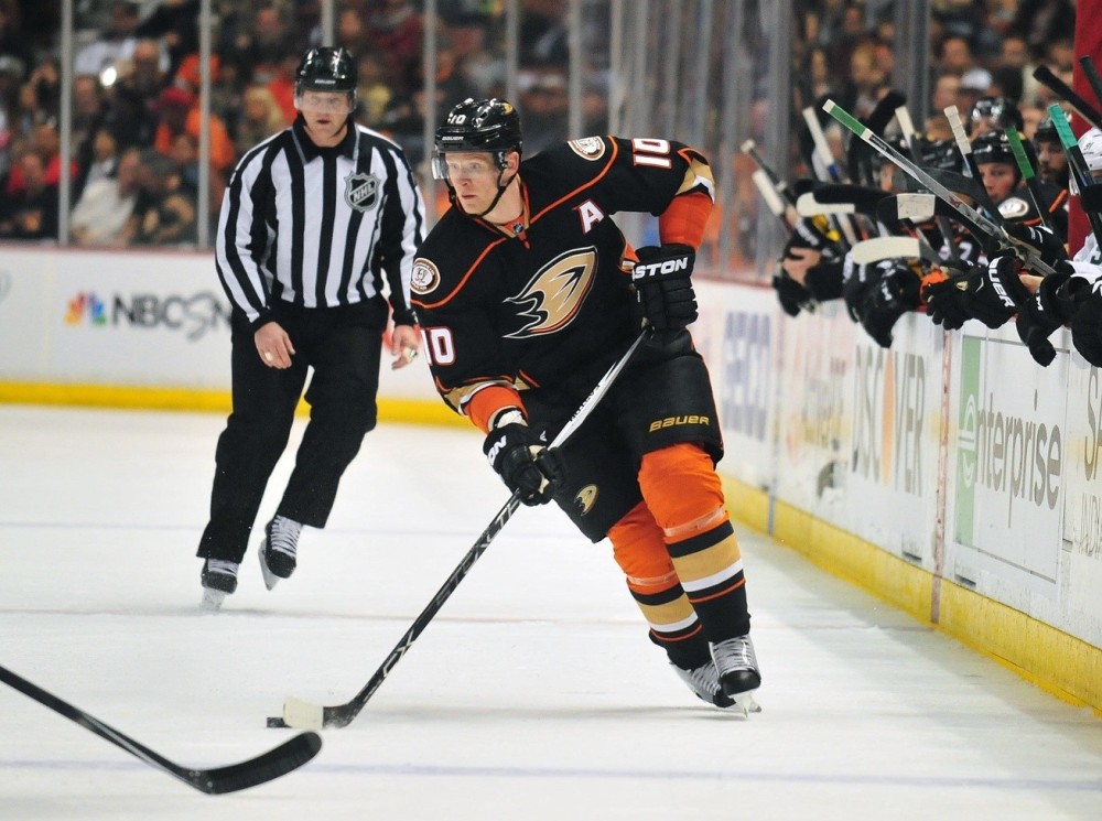
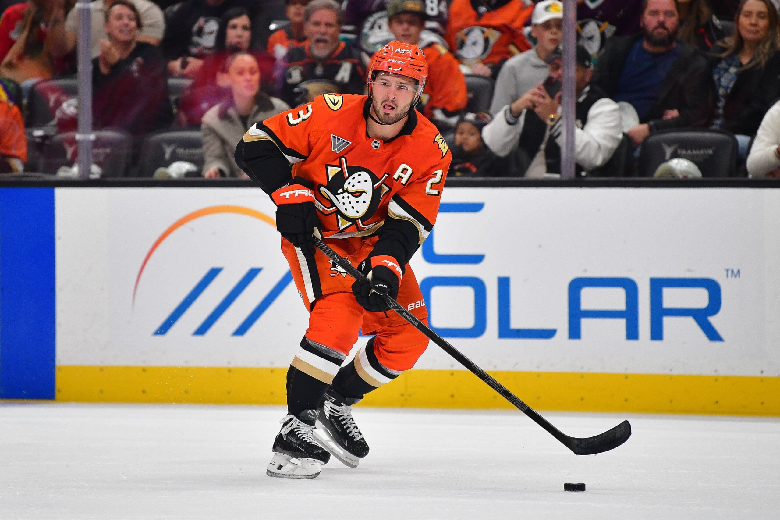
Anaheim Ducks –
After the Mighty Ducks lost their might in 2006 and became the Anaheim Ducks, they replaced burgundy and green with black, gold, and orange. Soon after, in 2010, the Ducks introduced a third jersey using the “D” from their main logo and added bright orange stripes on the arms and sides. Then, in 2014-15, the Ducks promoted their alternate jerseys to their full-time home sweaters and created a white road one as well.
Since we have seen these jerseys for five years now, they cannot exactly be considered a new look. In those years, the dominant black has become boring, with the orange getting lost more and more each time they take the ice. After innovating the concepts they originally created in 2006, it seems it is time to go back to the drawing board yet again. However, this time may require a total overhaul.
Icethetics.com’s NHL JerseyWatch 2015 has reported that the Ducks are very likely to introduce a new third jersey for the 2015-16 season. No details are known at this time, but for the sake of looking good, let’s all hope Anaheim is taking a chance with a brand new design. Perhaps they will bring in some throwback threads, as they did a few times last season, using their jersey from the 1990’s.

Calgary Flames –
The Calgary Flames have seen much of the same since 2003 when they introduced a black “C” crested, red home jersey. Although they took a step in the right direction with altercations in 2007, the lack of design makes this jersey feel like it’s lacking something.
Although there’s no argument with the eye-popping red, it has been too long with a simple design to keep fans intrigued by either the home or road jersey. The addition of an alternate jersey in 2013 gave the Flames a new look with a cursive “Calgary” logo, as well as horizontal stripes that gave the jersey a fresh feeling. They also wore a throwback jersey for ‘Retro Night’ last year, a similar sweater to those worn in the team’s early years.
The Flames logo is still a great looking one, and maybe all it would take to refuel the fire is a simple addition of a few horizontal stripes, like those in their alternate jerseys. Or in a more creative manner, they could bring back their retro jerseys as an alternate, perhaps promoting it to a full-time jersey soon after. There are currently no rumours of any possible changes for the Flames.
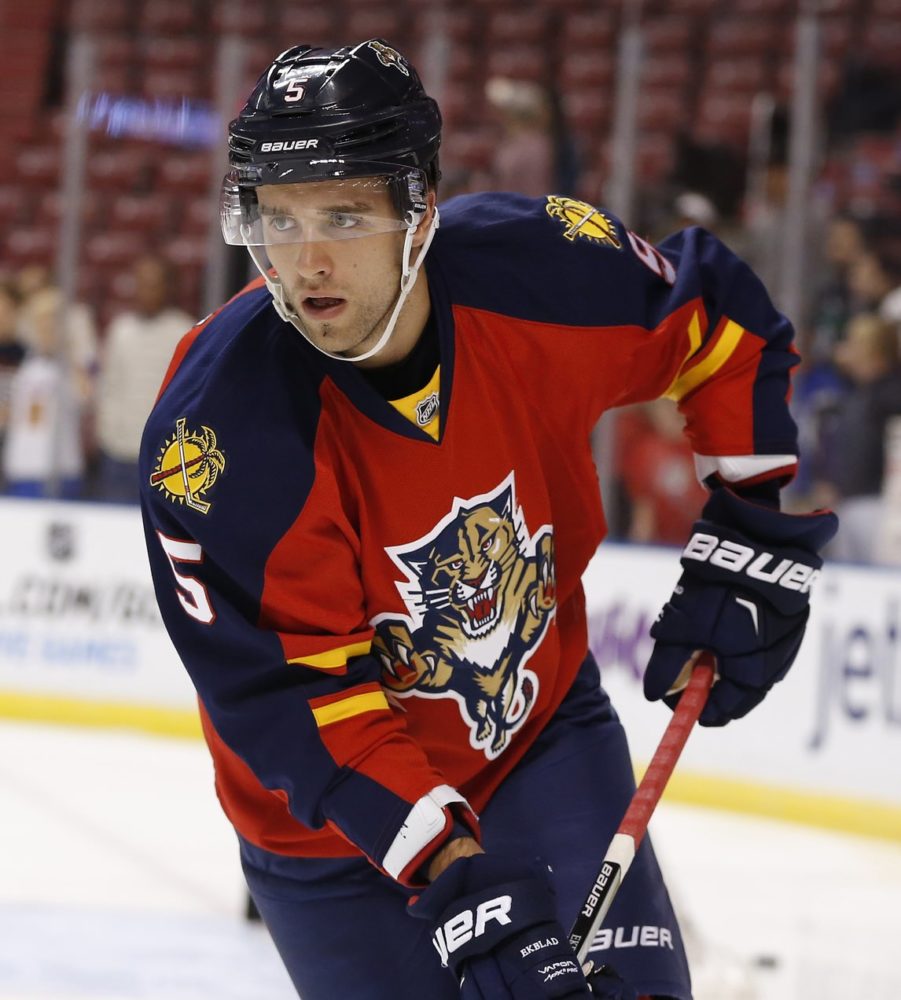
Florida Panthers –
The Florida Panthers have never had amazing jerseys in their 21 years in the NHL. Despite having a solid logo from the start, the colour combination has never seemed to work out. The Panthers changed things up multiple times looking to spark a keeper, changing their home jersey from red to blue and back to red. Unfortunately, none of which stuck, as Florida still sports one of the worst concepts in the league.
The Panther logo is definitely a great one, but they desperately need to find a new colour. Heck, they even tried the always popular baby blue uniforms, but they only lasted three years. After having a blue based jersey with red arms, Florida inverted the colours in 2011, but produced little love from hockey fans.
It’s quite clear, the only way to fix the Panthers terrible sweaters (assuming they aren’t relocated), is to bring in a new colour concept. In my opinion, they could keep the navy blue while enhancing more gold trim and bringing in some black lines to give the jersey a sharp and clean look. Those hopes will likely have to wait quite a while, as it seems there are no imminent changes coming.

New Jersey Devils –
The New Jersey Devils have seen virtually the exact same jerseys for over 20 years now. Although the team was one of the most successful in the league over that time frame, it seems it may be time for a fresh start, as the team heads into a rebuild for the first time in what seem like forever. The simple red and black design has gotten old, featuring a very basic logo.
The Devils have only had one major change to their jerseys since their relocation in 1982. In the beginning, the team’s colours were red and green. But, after 10 years, they decided to switch all the green with black, thinking it was more representative of a ‘devil’ look. Since then, they’ve worn the red and green jerseys on St. Patrick’s Day, and also during their Stadium Series game.
The uniform doesn’t necessarily look bad, it just looks as if it’s had its time. Although switching from the classic red and black may be a no-go, it couldn’t hurt to ponder over a new logo. If that doesn’t go over well either, the Devils should at least change the design of the jersey to represent a new time. Take off the silly black on the shoulders and incorporate stripes going along the arm maybe. There’s plenty of options, most of which would make the Devils look fresh going into a new phase in their history.
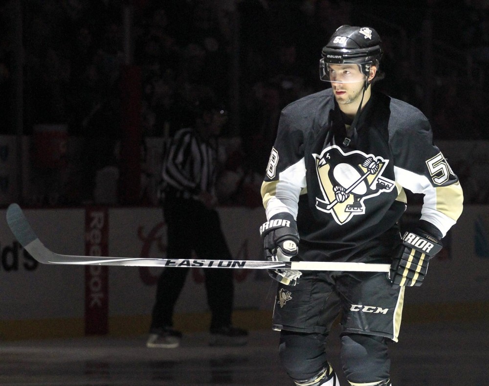
Pittsburgh Penguins –
In the Pittsburgh Penguins nearly 50 year history, they have gone through their fair share of jerseys. With 17 different official jerseys, they made altercations less than every three years, on average. Well, it’s been seven now, and it is definitely time for a major change. The home jersey is absolutely dominated by black, while the once bright yellow is now a very lame looking gold.
For over a decade, the Penguins sported baby blue sweaters, before turning to black and yellow in 1980. That wasn’t their big mistake however. It came in 2002, when they replaced the yellow with a soft shade of gold. Now, the once spectacular jersey, is a dark mess. There’s no eye-catching pop like in the good old days. Like every sporting team in Pittsburgh, the black and yellow will stay, it’s the shade of yellow that will make all the difference.
Last year, the Penguins introduced a new alternate home jersey, a throwback to their ’80’s uniforms, and it was amazing. It included the classic bright yellow and the team become one that young fans wanted to see. A potential decision for a jersey change in a no brainer in my opinion, make the alternate into the home jersey and replicate it with a white road sweater as well. Problem solved, Pittsburgh.
Well, there you have it. Five NHL teams who absolutely need a new look as soon as possible. Whether they’re old and boring, or simply have never looked good at all, there’s no doubt it is time for a change. That decision is one that will bring in tons of new, young fans and potentially start a new fan base for teams in need, like Florida and New Jersey. Who knows, maybe some amazing jerseys for Florida could spark fan interest and make everyone forget about a possible relocation. You never know the impact of looking good on the ice.
Disagree with these teams? Let us know who you think desperately needs a new look in the comments below!
For questions, comments, or concerns, you can contact Devin Slawson on Twitter @SlawsonTHW.
Free Newsletter
Get Anaheim Ducks coverage delivered to your inbox
In-depth analysis, breaking news, and insider takes - free.
Subscribe Free →