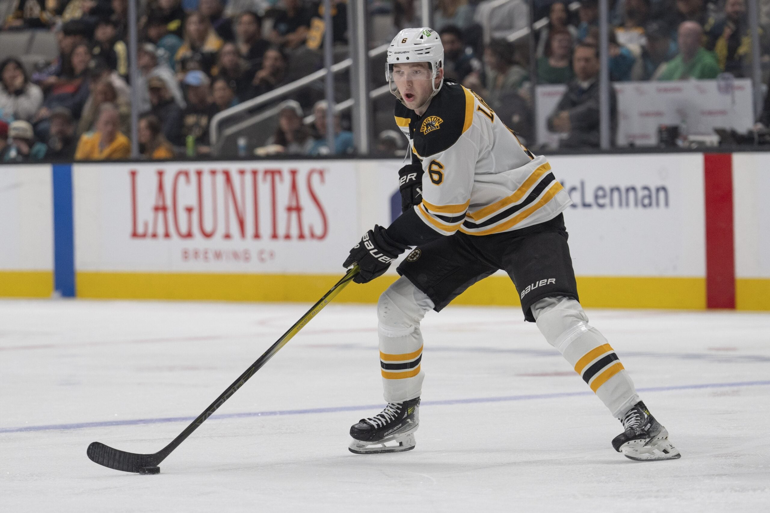
The Boston Bruins have finally revealed their new alternate uniforms that will be worn 11 times over the course of the 2019-20 regular season.
The uniforms sport a large varsity Block-B on the front and pay homage to the Bruins’ of old, dating back to the late-1940s and early 1950s. In that era, Bruins’ legends such as Milt Schmidt donned a similar gold varsity-style B on the front of their uniforms.
Now, the current NHL franchise will get a chance to do so again after sporting a similar varsity-style B on the front of their 2018 Winter Classic uniforms, though that uniform was very much derived from the team’s uniforms from 1932 to 1936.
The jerseys come from an era that’s slightly later in time than the previous iterations and also feature black and gold rather than the brown and gold the Bruins used to wear in the early days of the franchise.
This jersey may not be the Pooh-Bear jersey that has a cult-like following both in support of and against within the Bruins fanbase, but it will still certainly evoke a different reaction depending on who you ask.
Because of this, it seemed fitting to run the jersey past a few Bruins’ writers here at THW and find out their opinions. With that said, I was joined by fellow Bruins-writers Steph Thyng and Tim Kearns to have a simple round-table discussion on the matter.
Steph Thyng
The Bruins newly released third jerseys are simple yet appealing.
They’ve gone back in time and brought back a form of an original jersey, one that sports the varsity letter on the front and should have fans reminiscing of some of Boston’s greatest legends. These jerseys are much better than say, the Winter Classic jersey they sported last season.
While that jersey also had the big varsity letter on the chest, it had more color variations in the stripes that took away from the logo, paired with a bland, white background.
It was just a mess.
Personally, I like the simplicity. The big, bold, gold B on the chest is a nice contrast to the black shirt itself. It makes them look classy and pays respect to the former era of players that donned the similar theme.
Tim Kearns
I have always thought that the Bruins consistently have some of the best jerseys in the NHL and it seems like they have done it again with these third jerseys.
With a simplistic old school look, they give you a glimpse into a Bucyk-era type jersey. I love the dark color scheme as well as the non-spoked B on the front of the jersey. These jerseys seem to have been derived from last year’s well-liked winter classic jerseys and add color to the original design.
It’s a thumbs up from me.
Brandon Share-Cohen
Like anything else in the world, opinions differ from person to person. As far as fashion and uniform design goes, this is no exception.
Related: Bruins Logo History
Many were already aware of the Bruins’ new alternate uniforms prior to the official release and because of this, it’s possible that a certain level of acceptance has sunk in now that they’ve been announced.
While the jerseys aren’t bad by any stretch of the imagination, I do think they’re worse than each of the last three iterations of alternate uniforms, including the 2018 Winter Classic uniforms, the 2016 Winter Classic uniforms and the black jersey with the team’s alternate logo on the front that was used from 2008 until 2016.
With that said, the classic-feel of these jerseys are a nice touch and an homage to the late-1940s and early 1950s era.
Personally, I dislike the double-stripe look on the arms and the bottom of the jersey itself and would rather a three-stripe look much better. That said, I do understand the throw-back nature and think these uniforms are fine.
They aren’t the nicest uniforms in the world and they aren’t the worst. They’re very okay.
Free Newsletter
Get Boston Bruins coverage delivered to your inbox
In-depth analysis, breaking news, and insider takes - free.
Subscribe Free →