Like a fine wine, most NHL jerseys get better with age. Whether they were loved or despised, most sports jerseys end up finding a soft place in our heart as we yearn for the past and get lost in nostalgia.
Currently, in pop culture as well as sports, trends of ’90s are coming back in spades. In that spirit, here are the five best ’90s NHL jerseys that left us too soon.
Best ’90s NHL Jerseys: Anaheim Ducks (1993-2006)
Possibly one of the 90’s best jerseys in any sport, the Anaheim Mighty Ducks’ inaugural sweater was worn by the team from 1993-2006. To this day the image of a duck-shaped goalie mask will invoke memories of Charlie Conway’s triple deke, the bash brothers, Goldberg and a profound hatred for all things Iceland…oh and there was a NHL team too. These lovely sweaters came into existence in 1993 when the Ducks first came into the NHL under the ownership of the Disney Corporation.

For quick brand identification, the team was dubbed “The Mighty Ducks” and the team’s jersey and color scheme of purple, jade, silver and white were set to match that of Disney’s fictional and very popular misfit hockey team, The Mighty Ducks. Sadly in 2006 when Disney sold the Ducks the team was forced to terminate the affiliation with the quack attack and sadly these jerseys were terminated.
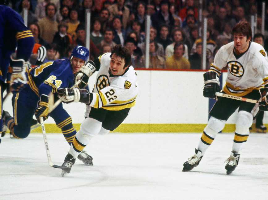
Best ’90s NHL Jerseys: Dallas Stars (1997-2006)
In 1997, the Dallas Stars introduced a new 3rd jersey that expanded the star logo over the entire body of the jersey. The design was so well received that the following season the once 3rd jersey was now the team’s main sweater. While wearing these jerseys, the Stars reached levels of success that were once never thought possible.
It was in these spectacular sweaters that the team would go on to win two Presidents’ Trophies and their first ever Stanley Cup victory in 1999. Sadly, in 2008 when the era of the Reebok Edge uniform began, the team had another uniform overhaul and has yet to recapture success since.
Best ’90s NHL Jerseys: New York Islanders (1995-1998)
The New York Islanders riled up their fan base prior to the 1995-96 season when they decided to abandon their original – and to many fans sacred – jersey in favor of a new fisherman-themed jersey. Team management hoped that these jerseys would not only increase merchandise revenue, but also help connect the team more to the Long Island seafaring culture. Sadly this experiment failed miserably, and the jerseys barely lasted a full season before the team re-incorporated their traditional logo.
While I do agree that the Islander’s original jerseys are gorgeous, I do believe that the fisherman jersey should have been held on to as an alternate. As the years pass this jerseys seems less campy and more fun and creative. I would love to see the fisherman and the Montauk Lighthouse brought back in some sort of fashion in future seasons – after all nothing could be worse than the Islanders current black alternate jersey.
Best ’90s NHL Jerseys: Colorado Avalanche (1995-2007)
The Colorado Avalanche’s inaugural jersey had many features that set it apart from other teams at the time. The striping pattern was a double bar with an unconventional zigzagging that went from wrist to wrist. The jersey had a nice mix of burgundy, blue and white – as well as silver and black accents. The centerpiece of the jersey was a puck leading an avalanche around a large “A” to form a “C” made out of snow. Possibly the most fun part of this jersey was imprints of the abominable snowman’s foot on each of the shoulders.
Much like the fate of the Dallas Stars’ inaugural sweater, this Avalanche jersey was changed with the arrival of the Reebok Edge jersey line. The updated jersey dropped the zigzagging pattern and simplified what was already a fantastic uniform.
Best ’90s NHL Jerseys: Phoenix Coyotes (1996-2003)
During their inaugural 1996 season, the Coyotes adopted the desert colors of red, brown, green, white and black for their team’s first jersey and the hockey world collectively scratched their heads. The Coyotes’ jersey looked like what you may see if you stumbled through the Arizona desert after ingesting heavy amounts of peyote.

The jersey’s pattern borrowed heavily from Aztec culture and featured an abstract coyote as the centerpiece. The coyote itself wore half of a goalie mask and had two feathers in its hair, another testament to native cultures that are associated with the deserts of Arizona. In 2003 the team abandoned their trippy aesthetic in favor of a much more simplified color scheme and logo. Their new jerseys were now solid red with white striping and a more realistic looking coyote centerpiece. In recent years, Aztec patterns have become culturally relevant and stylish once again. This has led to a high demand on eBay and other jersey selling sites for the team’s original jersey that was once thought to be an eye sore.
This article was originally published in January, 2013.
Free Newsletter
Get Hockey History coverage delivered to your inbox
In-depth analysis, breaking news, and insider takes - free.
Subscribe Free →