When sports teams debut a new logo and a new set of jerseys, it can lead to a lot of mixed feelings. It’s natural to be afraid of change, especially when considering the emotional investment that fans pour into their favorite teams. When the Boston Pride debuted their new logos and subsequently their new jerseys, however, the consensus opinion appeared to be a positive one as the team made changes to their uniform for the third time in as many seasons.

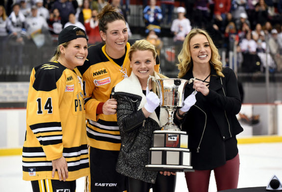
In the NWHL’s inaugural season in 2015-16, the Pride wore gold jerseys with the word “PRIDE” emblazoned across the chest with a claw mark replacing the letter “I.” It was recognizable and fans of the Pride will always remember it fondly as the team won the Isobel Cup that season, forever cementing themselves as the first ever champions in league history.
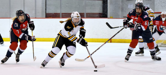
Changes came in the NWHL’s second season, however, that saw the Pride wear white jerseys with the same logo watermarked on the front. Despite a dominant regular season that saw them win every single game until their regular season finale, losing to the Metropolitan (formerly New York) Riveters, the Pride ultimately fell just short of a repeat, losing in the championship game against the Buffalo Beauts. Things were going to be different for the Pride in the NWHL’s third season.
Even outside of the numerous changes to the roster that would take place between seasons two and three due to the 2018 Olympic Games in PyeongChang, South Korea, major changes were in the works for the Pride.

New Logo, New Uniform, New Boston Pride
Finding an identity is important. While the Pride did a lot in their first two seasons to form a loyal and devoted fanbase, there was a need to give those fans something to cling to. Something more than just the word “PRIDE.” It’s for that reason that the Pride worked so hard to remodel their uniforms to give both the fans and the players a stronger identity that would not only read “PRIDE,” but would instill it deeply as well.
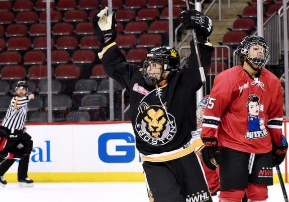
“The feedback we were getting over the last two years was that the fans and everyone in the Boston Pride hockey community loved the uniform, but wanted something more than words,”“The feedback we were getting over the last two years was that the fans and everyone in the Boston Pride hockey community loved the uniform, but wanted something more than words,” NWHL Commissioner Dani Rylan said. “The mission was to create a strong brand identity for the Pride, and we’re grateful to M Style for their outstanding work.” “The mission was to create a strong brand identity for the Pride, and we’re grateful to M Style for their outstanding work.”

“We created a brand worthy of the players and fans of the Boston Pride,” said Rob Striar, founder of M Style. “A stoic and fierce lion was illustrated to present the tough image of the Pride, the NWHL’s first champions. The lioness is well known for its hunting prowess as well as ability to work within complex teamwork — perfectly summing up the Pride.”
New Identity for a New Roster
For the Pride, these changes came at the perfect time. Due to the massive turnover of their roster from the 2016-17 season to the 2017-18 season, a new group of faces in the Pride’s locker room would now get to grow under this bolstered identity as a unit. It can be intimidating for anybody – athlete or otherwise, to become the new face in a group that has already experienced so much success that has set expectations so high. With the new uniform, these individuals now have a strong identity to cling to. A strong identity that will allow them to remain individuals, but that will also allow them to thrive as a cohesive unit with the same lioness crest instilling pride in each of them.
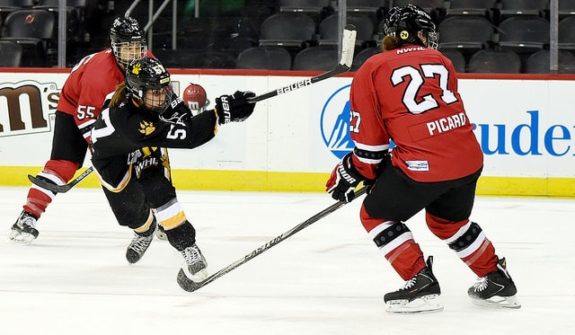
One player who should be a big part of the Pride’s plans this season should be Meagan Mangene. In her second stint in Boston after playing with the Connecticut Whale last season, Mangene has already made her mark just two games into the season despite the Pride holding an 0-2 record to start the season. In her first game back in Boston, Mangene scored the Pride’s only goal against the Riveters. While the loss was less than ideal, being back in Boston still means a lot for the veteran.
“I was excited to be back with the Pride,” Mangene said.” There is nothing like playing in the best city in the world.”

This time around, however, Mangene was playing alongside a bevy of new teammates with the Pride’s drastically changed uniforms.
“The team loves the new logo. [It’s] definitely fierce,” Mangene said of the team’s new uniforms. “I really enjoy the new logo and having a symbol that represents us and Boston.”
Boston is known as a very hardcore sports town – regardless of the sport involved. The New England Patriots, Boston Celtics, Boston Red Sox and Boston Bruins make up the four major sports teams in town. The Pride, along with the New England Revolution of the MLS are now doing their best to join the ranks of the elite and earn their spots in the hearts of the city of Boston. With their bolstered identity, this task will be much easier to accomplish than it once was.