- Senators Debut Make a Strong First Impression
- Minor Tweaks Improve Appearance
- The First Third Jersey Introduced
- The New Logo Takes Over
- Another Third Jersey Is Introduced
- The Reebok Redesign
- Another Awful Third Jersey
- The Heritage Jersey Is Born
- Adidas Makes Minor Adjustments
- The Heritage Classic Returns
- Going Back to Their Roots
- Reverse Retro Alternate Joins the New Look
- The Future Is Bright
The NHL has been under a redesign fever for the last several seasons. The Florida Panthers and Dallas Stars have been some of the boldest as of late, completely changing their colour scheme, but most teams in the league have undergone some form of an overhaul in the past 15 years. Even the Toronto Maple Leafs, who arguably has one of the most timeless jerseys in all of sport, decided to use a new logo in 2016-17, going for a leafier design.
Finally, after years of rumours and speculation of a logo change, the Ottawa Senators have finally joined the rest of the league. Prior to the 2020 draft, the team announced they were updating the unpopular 3-D centurion they’ve used since 1999 and returning to their original concept with the 2-D logo. The new logos and uniforms were received incredibly well, not only because they looked great, but because fans had grown accustomed to seeing sub-par redesign after sub-par redesign. A return to something that worked in the past was, surprisingly, something that didn’t happen all that often in Ottawa.
Senators Debut Make a Strong First Impression
In the late 1980s, the city of Ottawa made a long-shot bid for an NHL franchise and somehow won over other, more profitable locations. Although a brand-new franchise, they took inspiration from the original Ottawa hockey club that existed from 1883-1934 and won 11 Stanley Cups. Thus, the team became the Senators, a nod to being situated in Canada’s capital city. But when the logo was unveiled in 1991, it featured a red, black, and gold Roman centurion.
The logo admittedly didn’t make a lot of sense. It definitely wasn’t a senator, that was clear. But no one could agree on who it was supposed to be. Ownership claimed it was a Roman centurion figure, but the laurels on the helmet’s visor and surrounding the head, along with the crest, were much more Greek in origin. A centurion crest went across the helmet rather than front to back, too, although lower-ranked members of the army used vertical crests. Do you really want to reference lower-ranked officers?
Yes, it was a bit of a mess — the combination of too many ideas into one — but fans didn’t care. After nearly 60 years, they finally had an NHL team again. The original team had been one of the best for a time, too, with Hall-of-Famers like Frank McGee, King Clancy, and Clint Benedict making up its alumni. While the team went by several names over their history, from a simple Ottawa Hockey Club to the Silver Seven (thanks to their dominance) and finally the Senators, they were always recognized by their red, black, and white barber pole sweaters.
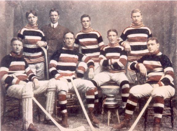
In an effort to combine the past and present, the new team in Ottawa revived the colours and name, but went with their own design and created a strong, determined, and somewhat confusing logo. It was a strong first impression, and although the team struggled in their first several seasons, fans grew to love the unorthodox uniforms. There was a simplicity to the overall jersey that drew the eye to the gold on the centurion. For a first attempt, it was far from the worst, and it helped the fledgling Senators form their own unique identity in the NHL.
Minor Tweaks Improve Appearance
However, the uniforms were far from perfect, and management seemed particularly displeased with the black road jerseys. The first adjustment came in 1993-94, the Senators’ second NHL season, when the red numbers with white trim were replaced with white numbers with red trim. It was minor, sure, but the extra pop of white helped give the uniform a bit more life and break up the very dark appearance.
But management still wasn’t happy. Two seasons later, they added more white to the arms and socks, filling in the black streak between the two red bars, as well as adding a white bar to the waist. The eye was no longer drawn to the logo as much as it had been in their first version, but the added bars of white lightened up the jersey considerably and gave the uniform a more typical NHL appearance.
Of course, the added white caused the white numbers to fade into the background, and after two more seasons, they were changed to black with both red and white trim. At the same time, the “Ottawa Senators” inscription that surrounded the centurion’s helmet was removed in favour of more laurels. That felt like too many laurels, so the one on the visor was removed.
Arguably, few people noticed this change since it was so minor. But with the Senators starting to develop into a better team, leading to a wider fan base around the country, maybe they felt that the text was no longer needed to identify the team. Yet management still didn’t appear to be happy with the black design, and with many teams beginning to transition away from black road jerseys, the Senators eventually followed suit, but not before they unveiled their first attempt at a redesign.
The First Third Jersey Introduced
In 1995-96, the NHL kicked off the third-jersey program, which allowed teams to use an alternate jersey for a few agreed-upon times during the hockey season. Five teams took advantage of it initially: the Pittsburgh Penguins, Vancouver Canucks, Boston Bruins, Los Angeles Kings, and Anaheim Ducks. However, two of them were abandoned immediately the following season, and another lasted just one more season after that.
The first group was a collection of experimental disasters, and it’s no surprise they were thrown away so quickly. But that didn’t stop others from joining in, and in 1996-97, a few more teams unveiled third jerseys. They were generally seen as an improvement from the first batch, so when the Senators debuted their third jersey in 1997-98, based on that trend, it should have been one of the NHL’s best. Sadly, they were very wrong.

There’s little that can be said that hasn’t already been said about these uniforms. The asymmetrical black slash was awkward and gave the jerseys a Star Trek feel, while the new 3-D logo was both too realistic and too cartoony. Thanks to the dark lines around the eyes, it was soon dubbed the “Senagoth.” A squiggly red line on the left side was almost indiscernible — was it a cape, an arm, or a piece that the graphic designer forgot to finish? The jersey was very strange, even among the other odd interpretations of the 1990s, and some critics even claimed it was one of the worst designs of the decade.
The New Logo Takes Over
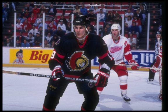
The Senagoth was the Senators’ official third jersey for two seasons, but in 2000-01, the team decided to return to just two uniforms. However, it was the black road jerseys that were retired, meaning that the unpopular red alternates were now officially the Senators’ away uniforms. It was a baffling decision — sure, the black jerseys weren’t perfect, but the white uniform had remained unchanged since 1992. Why use two different logos on your home and away jerseys?

It was difficult to be too mad, though; the Senators were better than ever, boasting a roster that had stars like Daniel Alfredsson, Marian Hossa, Patrick Lalime, Vaclav Prospal, and Wade Redden, and in 2001-02, they’d be joined by Jason Spezza and Zdeno Chara. In 2003, they made the Stanley Cup Semifinal and nearly defeated the New Jersey Devils, who would go on to win the Cup. The aging core, supported by newcomers Dany Heatley and Ray Emery, returned to the Semifinal in 2007 and managed to defeat the Buffalo Sabres and advance to their first Stanley Cup Final appearance in franchise history.
Despite an ugly uniform, the Senators set most of their franchise records during the team’s seven-season run with the Senagoth as their official road logo. It wasn’t pretty, and although the success became marred with disappointment, the jersey and the players who wore it still hold a place in many fans’ hearts.
Another Third Jersey Is Introduced
After retiring their third jersey, the Senators wasted no time in unveiling a new one, and in 2001, they returned to the black jersey. But, once again, they missed the mark. The designers decided to stick with the 3-D logo, despite the home jersey still sporting the original 2-D profile, but then added gold, laurel-covered bands on the arms and waist. Then, they outlined it all with red and white. It was hard to look at for too long.

The already moody-looking logo became much darker when placed on the black background, and suddenly, fans realized that, yes, there is such a thing as too much gold. They also realized that Senators’ management could, in fact, create an uglier jersey than the last alternate. Yet this jersey stuck around for six seasons, and like the unpopular red road jersey, it followed the Senators as they set several franchise records. It was finally retired in 2007, after the third jersey program was temporarily suspended.
The Reebok Redesign
Reebok acquired the NHL’s uniform rights in 2007-08 and gave the league brand new versions of their uniforms. The Senators, like many other teams, took the opportunity to give their kit a makeover, and for the first time in almost a decade, their home and away uniforms matched.
Gone was the black gash and angular armbands. In their place, a simplified design with half-sized elbow bands and a black cuff that stretched up to the ribs. They also removed the stripe on the bottom and instead added a splash of colour on the sides. The logo didn’t get a complete overhaul like the uniforms, but it was still fixed to remove the heavy bags around its eyes, and the red squiggle turned into an actual cape. The ring around the head was also adjusted slightly and made a bit smaller, allowing the logo to pop more from the jersey.
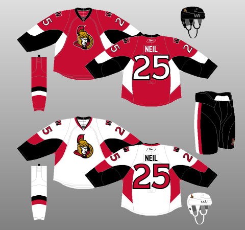
Overall, it wasn’t half bad. The design was cleaner than it had been in years, and the centurion finally looked like a half-intimidating professional logo. However, these jerseys marked the end of the original design, as the white home uniforms were finally retired, and the shoulder patches on the red road jerseys were replaced with a new design. The Senators’ jerseys matched again, but they had gone for a fixed 3-D logo rather than the unique 2-D profile.
There were some good points, though. With the Reebok redesign, all third jerseys were removed for the inaugural season of the new uniforms, forcing the Senators to discard the hideous black and gold jerseys. Also, the new shoulder patch used a new logo, inspired by the last logo the original Senators used from 1929-1934. It was very clean, capturing the heart of both franchises, and must have left many fans wondering, “Why isn’t that our logo?”
Another Awful Third Jersey
When the third jersey program was reinstated in 2008-09, the Senators were ready with a follow-up. An annoying trend was beginning to pop up in professional sports of using the team’s nickname as the logo; the season prior, the Tampa Bay Lightning emblazoned “BOLTS” on their jerseys. The Senators somehow got in on the ground floor and decided to put their “SENS” nickname on a jersey. The result was one of the worst uniforms of the last 20 years, thanks to how painfully boring and uninspired it is.

Nothing about the jersey worked. Like the black and gold alternate before it, it was far too cluttered with red and white outlines. The pants, arms, shoulders, and waist all got the two-tone trim; the only part that didn’t get extra outlines was the logo, which was arguably the only part that could have used it. Fans immediately lambasted the uniform, referring to it as the “SNES” jersey in reference to the Nintendo console of the same name. While it worked as a simplified nickname, it was a terrible logo choice. At least a bolt is an actual thing.
The Heritage Jersey Is Born
For three seasons, the NHL had to suffer through the sporadic use of the “SNES” jersey, but it was finally kicked to the curb in 2011 to make room for a new jersey to honor the Senators’ 20th anniversary season. Fans were undoubtedly unenthused about another new third jersey, but what they received was surprisingly… amazing. Dubbed the heritage jersey, the team hired to design it hit it out of the park.
The heritage jersey was a perfect combination of classic and modern NHL; a nod to their past while taking a bold step forward. There was nothing to dislike about the design. The logo was simple, but intentionally so, drawing the eye more to the contrasting colours of the uniform. Even the shoulder patch was carefully chosen, drawing inspiration from the crest worn by the Senators in the 1920s, which humbly proclaimed that they were the champions of the world. The whole jersey was the logo, and it looked really good.
The Senators were selected to play in the Heritage Winter Classic in 2014 against the Canucks, a pseudo-rematch of the 1915 Stanley Cup Final between the pre-NHL Ottawa Senators and Vancouver Millionaires. As they already had the perfect version in their heritage jersey, the Senators simply switched the black for an aged white to create the Heritage Classic road uniform. In a reversal of fortunes, the Senators beat the Canucks 4-2; the Millionaires originally beat the Senators three games to none, winning their first and only Stanley Cup.
While also referred to as a heritage jersey, the white version was only ever worn a couple of times, as it was more accurately classified as a special event jersey. Still, both versions were incredibly popular and made fans hopeful as to what might come next in the future.
Adidas Makes Minor Adjustments
Ottawa kept the same kit for five seasons until Adidas was awarded the NHL’s jersey rights. Like Reebok before them, they suspended the third jersey program for the inaugural season of their new uniforms. While not unexpected, the change meant that the heritage jersey had to be retired. Owner Eugene Melnyk hinted that they would be back in some form, but fans already had little faith in the team’s management, so there wasn’t much hope in seeing the Senators’ best jersey again.
Other than the removal of a fan-favourite uniform, Adidas changed little else. The splash of colour on the sides got smaller, and the curving underarm design was replaced with straight lines. The biggest change was that the numbers were changed to the heritage style, a nod to their lost third jersey. Otherwise, the redesign looked exactly the same, which means that the “O” jersey could have been kept… right?
The Heritage Classic Returns
As had become the custom, the Senators unveiled another third jersey the season after the branded redesign. However, despite every indication that the “O” was dead, the third jersey was revealed to be yet another iteration of the heritage design. After trying black and white with great success, they opted for a red design, adding a bit of silver on the armbands and chest for a little extra flair. The “O” logo was also changed to white to balance out the colour palette.

The jersey had first been worn at the 2017-18 NHL 100 Classic when the Senators faced off against the Montreal Canadiens. It was a true battle of the founding fathers; the Maple Leafs, while often thought of as one of the two original franchises, didn’t get its name until 1927, playing as the Arenas and St. Patrick’s beforehand. The Senators won the game 3-0, with Craig Anderson getting the shutout.
You may also like:
- Alexei Yashin Trade Tree Continues to Grow
- NHL Rumours: Karlsson Leaving Penguins, Gavrikov Unhappy & Toews Rejoining Blackhawks
- Predicting 2026-27 Senators’ Forward Lines With Current Roster
- Best NHL Players by Age in 2026-27
- Every Eastern Conference Team’s Biggest Question Mark in 2026-27
Thanks to the success of the centennial season, the Senators decided to adopt the jersey as their alternate for the 2018-19 season and announced that it would be worn for all Thursday night home games. While not quite as impressive as the previous two versions, it still channeled the same classic designs that were so popular with fans. One can only hope that it will be around for a long time.
Going Back to Their Roots
In early October 2020, the Senators finally released their new jerseys for the 2020-21 season. The redesign had been in the works for roughly two years and had become one of the worst kept secrets in the league, with numerous rumours and leaks popping up over the internet during that time. But when the official announcement was made, everyone could finally breathe a sigh of relief, because, for seemingly the first time in franchise history, the Senators gave their fans exactly what they wanted.

While advertised as a return to their first 1992-93 jersey, the 2020-21 redesign was actually more similar to the uniform released in the team’s second season, with two red bars on the arm bordering white numbers, a red collar, and a large red stripe along the bottom. The only major difference appeared on the logo; the black crests were now bordered with gold instead of red, and the line extending from the centurion’s neck was also changed from red to gold. The gold ring that bordered the face was also decorated with laurels, rather than the name of the team as it had been on the first logo in 1992-93.
Not only was the new look exactly what fans wanted and received incredibly well, but it was what the team needed. When the team began testing the waters for a total redesign to their logo in July 2018, the team was at one of its lowest points in franchise history. They missed the playoffs after going to the Conference Final, were embroiled in a controversy between two of their star players (both of whom would leave in the coming months), and their ownership was becoming known as one of the worst in the league. Fans yearned for the early days of the franchise when they had nothing but hope, optimism, and high draft picks.
Thankfully, the Senators listened, and with the new jerseys, the team feels almost like a brand new franchise again. Their roster has little resemblance to the one back in 2017-18, with a core of young stars leading the way and a commitment to youth and development. Their farm system is finally being given chances, and a playoff push doesn’t seem all that far away after missing it for the past three seasons. There is a new energy in Ottawa, and it was helped in no small part by their new uniforms.
Reverse Retro Alternate Joins the New Look
Joining the retro redesign is an alternate jersey that plays it very close to the Senators’ regular uniforms. Ottawa has had a rough history when introducing alternate jerseys, but the Reverse Retro variation may be one of their strongest creations yet. Although the team has yet to wear them in an actual game or make an announcement as to when they will, early reviews are mostly positive.
First of all, it gives the Senators a red alternate, much like they had back in 1997-98, but instead of the weird black swoop across the middle, these jerseys stay pretty close to the original design, but with the colours simply reversed. The only chance is on the black crest’s borders and the centurion’s neckline – those return to red. The Senators didn’t have much to draw from in terms of retro designs, especially after their redesign, but these alternates played it safe and simple, which was the right call.
The Future Is Bright
The 2020-21 season marks the third time the Senators have undergone a complete redesign in their relatively short 28-season existence, but it may have been the most important. The team has been working hard to forge a new identity that encompasses the youth movement that has been slowly taking over throughout their long rebuild, and the latest redesign does exactly that. The team has found the greatest success when looking into the past, and much like the black, white, and red heritage jerseys, they found that their perfect jerseys were under their nose the whole time.
It’s a stark change from their previous mentality to be modern and on the cutting edge. Previous redesigns have been met with indifference to outright disgust, and the team struggled for many years to find the right new look. Its turned Ottawa into notorious tinkerers when it comes to jerseys, and so, while time will tell if this redesign will remain unchanged, one thing is for certain – the Senators currently have some great-looking jerseys.
Free Newsletter
Get Senators History coverage delivered to your inbox
In-depth analysis, breaking news, and insider takes - free.
Subscribe Free →