The Florida Panthers are on the rise.
Since ending the 2017-18 National Hockey League season on a 25-8-2 run, the Panthers have added some quality depth up front, their defense has another year of experience and an intriguing addition, and they’ve bolstered their goaltending battery.
Now that the Panthers are finally, finally a force to be reckoned with on the ice, they’d do well to upgrade their aesthetic game, as well.
Panthers Military Branding Dull, Disappointing
The current iteration, redesigned ahead of 2016-17 and carried over into the ADIZERO era, is a cacophony of awful.
The whole military theme is bothersome, certainly with regards to concept, but mostly with regards to execution. The logo, “a more mature and stoic panther,” comes across as pompous and arrogant, while also not really being all that nice to look at. The striping on the body doesn’t go all away around. The numbers on the shoulders look absolutely absurd. And, perhaps most criminal, the colour scheme is dull, flat and utterly devoid of any joy or happiness whatsoever.
This era of Panthers branding is a badly-executed, boredom-inducing embarrassment.
Even the Panthers seem to agree, reverting to their previous secondary logo for the centrepiece of the team’s 25th anniversary patch.
#FlaPanthers ownership and executives, John Viola & @Caldwell16, show off our 25th Anniversary Logo at today’s unveiling! pic.twitter.com/6thVTn24sj
— Florida Panthers (@FlaPanthers) June 15, 2018
I wouldn’t mind seeing said crest make a comeback, perhaps updated to include one of the only redeeming features of the Pensive Panther jerseys, the prowling panther that which can be seen on the sleeves of the Cats’ current kits.
But, I digress.
The need is clear. The Panthers need serious upgrades in the sweater department.
It’s back to the future for them.
Panthers Must Reject Present, Make Best of Past
Fortunately, the Panthers have a number of very nice design elements from their past they can draw upon to create their new ensembles. No, don’t worry, nothing from the JetBlue era.

The original Panthers sweaters had a bright, vibrant colour palette, while the Reebok Edge era brought full-length shoulder yokes and a cleaner, more streamlined look (eventually). I’ve brought both features back into the fold, doing away with “Panthers Flat Gold” (which is the actual name) and reinstating yokes on the sweaters.
Gone are the shoulder numbers (well, not actually gone, just back on the sleeves, where they belong). Instead, the shoulders feature the Panthers’ original secondary crest, while the updated version of Florida’s original, much more aggressive and endearing “Leaping Panther” logo adorns the jersey’s front. All is right with the world.
Really the only thing left over from the Pensive Panther setup is the unique collar tie-down, the laces of which form a single “X.” This nod to Florida’s state flag is a nice, subtle detail that’s more than worthy of inclusion in my proposed kits. Credit where credit’s due.
Just a note: I tried to match the typeface the Panthers currently use for their numbers and lettering as best I could, but it’s not a perfect match.
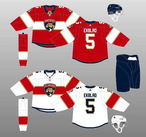
Panthers Home Jersey Concept
I’ve always felt the Panthers have looked best in red – particularly the darker shade they switched to in 1999-2000, so I’ve stuck with it as the base for their home jerseys.
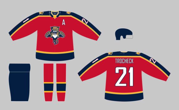
The full-length shoulder yokes take after the Reebok Edge-era jerseys, but the fact they now have contrasting trim is a nod to the Panthers’ original duds.
Additionally, as you can see, horizontal tail stripes are back! Normally, I’m not a huge fan of asymmetrical striping packages, but I feel the tail-hugging striping in this template allows for an uncomplicated progression into the pants.
This effect is especially apparent on the red uniforms, as the thick, navy-blue stripe flows directly into the navy-blue pants for a smooth, seamless transition.
Panthers Away Jersey Concept
My proposal for the Panthers’ away ensemble uses contrast to make its point.
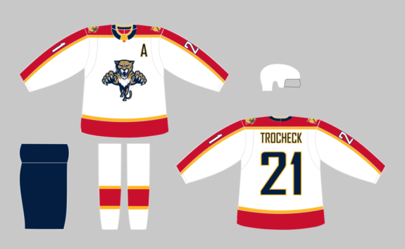
The bright, sunrise-esque colours of the sweaters and socks are interspersed with the navy blue of the pants, providing pleasing contrast when the Cats are on the road, all wrapped up in a crisp, clean package.
Panthers Alternate Jersey Concept
Florida could literally do nothing but slap the Leaping Panther on a navy background, and they’d instantly have one of the best-looking jerseys in the league, let alone specifically within the minefield that is the NHL’s third jersey programme.
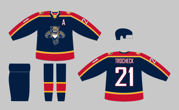
The story is no different here, with the bright red and gold nicely balancing the dark background of the sweater.
I really don’t think there’s any need for a separate primary logo or even a different design template for a Florida alternate sweater. The Leaping Panther is an excellent crest. The Panthers’ old colour palette is magnificent. And a template such as this would need no alteration to provide the Panthers with a world-class third jersey.
Panthers Primed for Success
The Panthers’ on-ice product is primed for success. The organisation has taken an already reasonable team and boosted its capabilities in every single area.
Likewise, the franchise’s uniform history gives the Panthers all the tools they need to get their aesthetic game back on track.
There should be exciting times ahead in South Florida. There’s no reason their sweaters shouldn’t express that fun, optimism and general joie de vivre.
(Logos and colours sourced from Chris Creamer’s SportsLogos.Net and Logopedia, and ColorWerx, respectively.)
Free Newsletter
Get Florida Panthers coverage delivered to your inbox
In-depth analysis, breaking news, and insider takes - free.
Subscribe Free →