Perhaps the greatest sin a sports team can commit is to be boring. Witness this year’s Ottawa Senators, a team stocked with a balanced attack, the world’s best defenseman and a goaltender playing out of his mind. This was also a team brimming with heartwarming stories, from Craig Anderson’s wife Nicholle battling cancer, to the comeback of Clarke MacArthur, to the redemptions of Dion Phaneuf and Bobby Ryan, to the extraordinary fortitude of general manager Bryan Murray. Not to mention the fact Erik Karlsson finally put to rest all doubts regarding him being the National Hockey League’s best defenseman.
And yet, everyone without a dog in the fight wanted Pittsburgh to win. Even within the ranks of the so-called Sens Army, many were apathetic, evidenced by the Senators’ inability to sell out home games during their impressive run to the Eastern Conference Final. While a variety of reasons have been put forward for this shameful display of fandom, the simplest explanation is that there are far less expensive ways to induce sleep than watching the Sens.
Predators Always Entertaining

The Nashville Predators have never had a problem with excitement. Sure, they haven’t always been the most enlivening team with regards to results, but dammit they try! From questionable ownership, to blockbuster trades (Peter Forsberg, Mike Fisher, P.K. Subban), to employing troublesome characters (Alex Radulov, the Kostitsyn brothers, Mike Ribeiro), the Predators have never been a boring team to follow.
Nashville’s Nascent Jerseys
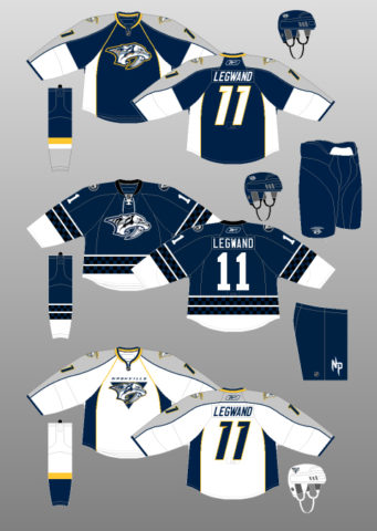
Predators’ First Home and Away Uniforms
Their jersey game has followed suit. Nashville’s inaugural season (1998-99) introduced two jerseys featuring a navy blue, silver, gold and white colour scheme surrounding the head of a ferocious-looking saber-toothed cat. The logo is a nod to Nashville being the site of the discovery of a skeleton of one of these prehistoric creatures, while patches referencing the city itself adorn the shoulders.
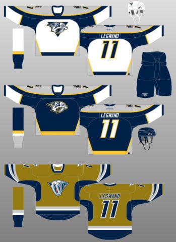
Though these kits look rather drab, one has to remember that the 1990s had been a rollercoaster of a time for uniform design. The era’s preference for bright colours combined with new patterning technologies led to some truly mystifying design decisions.
By the end of the decade, most of the traditionally conservative NHL, having seen what trying new things hath wrought, had scurried back into the darkness – literally. Thus, the Predators’ dark, dreary, underwhelming first attempt wasn’t exactly out of place. It should be noted that the silver bits on these jerseys actually shimmered, which was a nice touch.
The triangle striping underneath the arms seems a bit out of place, considering the jerseys already had tail striping (or, considering what Reebok Edge would bring, perhaps it was ahead of its time). The sweeping designs on the sleeves are highly complicated and contrast poorly with the simple pant and socks.
This lack of coordination leaves the uniform without much flow. It’s a little hard to look at, if I’m honest. Even the swooping shoulder yoke, though excellent to behold – and shimmery to boot, came down so far that it passed through the captaincy letters.
Though possessing a great logo and some interesting elements, Nashville’s initial foray into the world of jersey design feels like it was rushed into service without much deferral to expertise or user testing.
Predators or Mustard Tigers?
And then came 2001. Remember that one time I told you the Preds used gold in their colour scheme? Someone obviously forgot to tell them that, as they rolled out a horrifying mustard-yellow entry for the 2001-02 season. And “mustard” is a generous term. The colour more closely resembles bile or, for a kinder comparison, the stuff that comes slithering out of your nose whenever you have the flu.
The stomach-churning base colour surrounds a very alive-looking saber-tooth head, whose protruding canine teeth are tinted light blue, possibly as some sort of reference to ice. The navy blue underarm accoutrements are curious as a design choice, as they serve no other purpose that to make the wearer look as though he or she is sweating profusely. Combine these nonsensical design choices with the heresy of a square (!!!) neck, and it just seems like this kit was designed to be revolting for the sake of being revolting.
On the positive side, the shoulder patches are a nicely skeletonised version of the prehistoric cat’s head, and the silver and navy sleeve striping swoop together to create a fang motif. The tail striping, pants and socks are traditional, helping to balance out the wackiness of the rest of the uniform. I like it when teams own their identity, and there is no better example of embracing oneself than this Predators alternate kit.
We’re still talking about this horrendous alternate uniform today, so can it really be that bad? Yes, yes it can. Definitely bad. Though, it must be said, not boring.
The Predators Meet Reebok Edge
Nashville’s Nod to Conformity
Which is why their next attempt was so very disappointing. 2007 brought the Reebok Edge redesign and corresponding pressure for teams to go vertical. The Predators fell into this trap, altering their already drab home and away jerseys to accommodate the league’s pathological desire to ruin the aesthetic experience.
The tail stripes were removed, replaced with single-colour bars under the arms. Single-colour blocks replaced the admittedly complicated sleeve striping, though these new additions did not extend all the way around the arm, being interrupted instead by the inexplicably long shoulder yoke. Topping it all off was gold vertical piping, which again bisected the captaincy letters.
In fairness, it should be noted that these design choices were a part of the Reebok Edge uniform system and were therefore not uncommon across the NHL (for instance, see my chronicle of the Edmonton Oilers uniform history). And the team at least had the sense to make the saber-tooth skull their new secondary logo.
Amazingly though, the Preds somehow managed to come out with a uniform set that managed to be not only bereft of sense and traditional design, but also dreary and boring at the same time.
Nashville’s New Hope
2009 brought the first glimmers of hope, with Nashville’s introduction of a navy blue alternate kit. The absence of gold and near-absence of silver, replaced with a more liberal use of white, eliminated a key flaw in earlier Predators dark jerseys: the navy base overpowering the lighter colours in Nashville’s palette. You might also notice the faint checkerboard pattern within the striping; the team apparently just couldn’t resist slipping in something jaunty.
The Preds combined this simplified colour scheme with traditional, horizontal striping and a lace-up neck, creating a very nice alternate jersey that is still, to this day, the most classically inspired kit in their catalogue. It also made Predators games featuring an alternate uniform safe to watch, without the risk of mustard-induced vomiting.
Predators’ Golden Era
Predators Boldly Glow
The Predators’ 2011 redesign continued this positive trend. Along with removing one colour (silver) entirely, they also rebalanced their palette, swapping gold for navy as the dominant shade of their home jerseys. The results are nothing short of sensational.

The golden background surrounds a simplified and colour-corrected version of the Predators logo, and a basic, non-italicised font. The road jerseys are largely the same, save for thinner tail stripes. Tail and sleeve striping is navy blue and, mercifully, horizontal. Vertical piping is still present, though its execution is much more pleasing to the eye, effectively framing the Predators logo and captaincy letters, and being accompanied by horizontal equivalents within the sock, sleeve and tail striping designs. Even the contrasting bib stripe on both sides of the jersey just seem to make sense.
What makes this kit so special though is the fact the Predators, yet again, wholeheartedly embraced their own identity, this time focussing on the city of Nashville. The secondary logo on the shoulder is a guitar pick (referencing Nashville’s legendary music scene), with a tri-star design inside (a symbol of Tennessee). That said, this shoulder patch only appears on one shoulder, thoroughly annoying fans of symmetry. More nods to music are found elsewhere: piano keys line the inside of the collar and guitar strings stretch across the centre of the numbers.
Present-Day Predators
A couple of tweaks bring us to the present day.

The Predators have added a gold stripe to their pants, which I’m not really a huge fan of (I feel it makes the uniforms look too busy) but it is relatively inoffensive. They have also reversed the colouring on their socks for their road uniforms, rendering them opposite to the jersey striping. Again, not sure it was necessary, but there you go.
Most interesting is the fact that Nashville, after trialling them for a few games last season, have begun exclusively wearing gold helmets at home. This is clearly not an aesthetic choice, as it unbalances the home colour scheme and burns the retinas of those watching. Is it paying homage to the Swiss League, who forces the leading scorer of each team to wear a golden helmet? Is it some other, unexplained nod to Nashville culture? Or is it simply the Predators getting antsy after a period of relative uniform normalcy? Whatever it is, it seems to be working; the Preds are 8-1 on home ice during these playoffs.
Nashville Never Boring
The Nashville Predators have run the gauntlet of polarisation throughout their 18 seasons of existence. They’ve been a bottom-feeder, and they’ve also made a Stanley Cup Final. They’ve iced an expansion team, and they’ve had some of the biggest superstars on the planet. On the uniform side of things, they’ve been depressing, repulsive and downright glorious. But one thing’s for sure: they’ve never, ever been boring.
Free Newsletter
Get Nashville Predators coverage delivered to your inbox
In-depth analysis, breaking news, and insider takes - free.
Subscribe Free →