Over the years, NHL teams have released numerous jerseys that many hockey fans have simply fallen in love with. While hockey fans certainly have some sweaters that have a special place in their memories, there are some uniforms that fans probably wish they could somehow forget.
Of course, with hockey uniforms constantly changing every few years, there will undoubtedly be a fair amount of successful designs and color schemes that teams will employ. Despite the fact that lots of NHL jerseys have enjoyed long-term success, there are quite a few jerseys that just failed to hit the mark – especially some jerseys that were used during the late 1990s and early 2000s.
Forgettable NHL Jerseys #1: Buffalo Sabres (2000-2006)
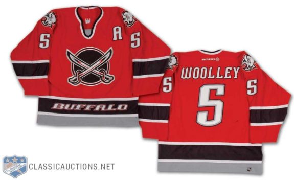
The Buffalo Sabres have had some pretty decent jerseys over the years, but this red alternate sweater certainly wasn’t one of them. While other teams have been successful when employing red coloring for their jerseys, the red hue in this jersey draws the viewer’s eye directly to the logo in the center of the uniform and the illustration in the middle of the sweater definitely isn’t a saving grace.
Departing from the profile head-shot of a Buffalo, the two criss-crossed sabres look like a very simple and bland design that doesn’t do much to stand out from the eye-catching red backdrop. Add in the fact that the word “Buffalo” is written on the bottom black stripe and you have a jersey that is not very easy to look upon.
Forgettable NHL Jerseys #2: Phoenix Coyotes (1998-2003)
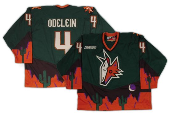
Could this list have been structured without including or mentioning the “Peyote Coyote?” Probably not.
There are simply too many psychedelic colors and schemes going on in this sweater. Of course, there might be some way that a similar design can be successful on NHL jerseys, but this sweater went too far.
Starting with its color (forest green), the Yotes’ sweater instantly sticks out like a sore thumb. Factor in a multi-colored coyote head with two different and unequal facial patterns and you have a recipe for disaster. From the orange and purple colorings of the mountain and desert backdrop to the four cacti to the moon in the night sky, this sweater had way too many elements working against it to begin with.
Forgettable NHL Jerseys #3: Vancouver Canucks (2001-2006)
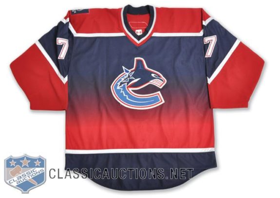
This color scheme just does not work. There’s definitely nothing wrong with the logo in the center, but the fading and alternating colors really throw the eyes off when looking at this jersey.
Mixing strong colors such as red and blue, one needs to space out the primary colors in order to help the eye adjust to them in a proper fashion. Employing no breaks that would effectively set these colors apart from each other in some way, this sweater just looks like a hodgepodge of bold colors with a logo slapped in the middle.
Forgettable NHL Jerseys #4: Dallas Stars (2003-2006)
This design had the privilege of being nicknamed “The Mooterus.” Need I say more?
While eerily similar to the Houston Texans’ jerseys, this sweater was ridiculed by fans that said that it too closely resembled the layout of a female uterus. Despite the fact that hockey fans can be pretty tough customers sometimes, their opinion of this jersey was quite justified.
Not only was the logo on this jersey a departure from the simple pattern that made the original Dallas Stars’ sweater so successful, the wavy design on the bottom of the jersey and on the sleeves certainly doesn’t give it any extra appeal.
Forgettable NHL Jerseys #5: Nashville Predators (2001-2007)
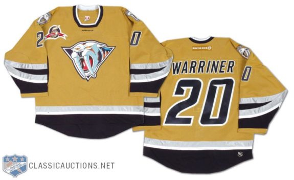
The mustard yellow color isn’t even the worst part of this jersey.
Much like the Sabres’ red alternate jersey from the early 2000s, the Predators departed from their usual design in favor of this more campy one. While the previous profile view of the sabre-toothed tiger worked as a logo for the Predators, this logo instantly brought up memories of the Mighty Morphin’ Power Rangers and Trini’s Sabre-Toothed Tiger Dinozord.
Add in the fact that the Predators used a square cutout for the neck space on the jersey and you get a sweater that seriously deviates from conventional standards for NHL uniforms.
This article was originally published in November, 2014.
I still cringe every time…thank God it is rarely…that I see a Mooterous as I walk through the AAC at a home game.
IDK, I like a lot of these
Most forgettable jersey from that era: Calgary Flames all-black jersey with the flaming horse head.
Islander’s gordon fisherman should be first on this list! By far, the worst uniform change.
What about the Canadians jersey that looks like they all just broke out of prison?
How can you not look at the Blues sweater in the mid 90’s with the huge red stripes in it…. that was their every game road sweater LOL
How is that Canucks jerseys on the list while the Fishsticks jerseys aren’t?
Those 3rd jerseys weren’t even bad.
Really? No sweet teal of the California Golden Seals? Aghast, I am shocked and saddened all at the same time.
Uh, the article is about jerseys from the late 90’s to early 2000’s. Last I checked the Seals weren’t around after 1976. You were right though, their uni’s were garish!
LA’s Burger King jersey and Anaheim’s god-awful WildWing jerseys, the epitome of bad.
…whilst remaining a solid yet cynical fan, i’d still suggest that ANY sweater the sharks wear right now is forgettable…
Kings Burger King jersey and Islanders Gorton Fisherman are my top, er bottom two.
I absolutely loved both the Phoenix Coyotes and Nashville Predators jerseys at the time. I still use that Predators jersey on NHL 15 when I play. Sadly they don’t have that Coyotes jersey as an option, but I do remember as a kid playing as them just because of their jerseys and logo.
Part of my issue is what happened to the team after the change, but when the North Stars changed from the kelly green/black/white colors with the capital “N” and star to the all-black with “Stars” across the chest, they went from one of the best jerseys to one of the worst. Of course, now it is surmised that it was done in anticipation of the move to Dallas – but it was still a huge downgrade. If they had the current logo with a D and the Star (much better than the “Stars” logo), then they wouldn’t make my list of bad jerseys.
For this collection – I liked the Coyotes jersey, was disappointed the Islanders fish sticks were left off, and totally agree about Buffalo. Not a bad jersey for someone else, but having a buffalo head or silloutte was always classy.
The “North” Stars should have become the “Lone” Stars when they moved. Much more Texas.
That’s my favorite Coyotes jersey
While everyone has their favorite and worst jersey, the fish stick is the worst, and should have been No. 1 on the list. I just wore the Coyotes one last night to the Arizona-Anaheim game. Sorry, but I think it is the best 3rd jersey ever! Geckos on the shoulders? That rocks!
I am surprised that the Buffa-slug sweater wasn’t mentioned. I liked it, but others did not favour it as much. An I concur with others regarding the Canucks sweater… I did not mind that fading colours as much as the God awful German V sweaters of the 70’s.
I like the Buffalo & Phoenix jerseys. Beauty is in the eye of the beholder…
Do you really believe that’s the worst jersey Vancouver has worn? I’d say the V sweater from roughly ’78-’82 was easily the worst. The Coyotes jersey is actually quite popular among Coyotes fans.
I definitely do not believe that that is Vancouver’s worst jersey but this list was geared more toward jerseys from the late 90s to early 2000s. Those would definitely be candidates for an extended list.
Wow. It’s right in the title and I missed it!
And the Kings “Burger King” gem was left off the list?
Hey abiglakingsfan, the article was geared more toward late-90s jerseys. That would definitely be a gem for an article like this, but I didn’t include jerseys from the early-to-mid 90s. Otherwise, I would’ve included other jerseys (including the LA Kings gem). Thanks for the read and response!
Late-90s and early-2000s*
I actually like those Coyote jerseys. They were original and fun. And that logo is better than the current one.
I hate awful taste.
Wow that Phoenix Coyotes jersey is awful
How……HOW can this list not include the Islanders “Fish Sticks” jerseys…….
No Kidding…..the Gortons Fishermans Hockey team!!!
I still like the Phoenix design as unique and flashy. I also liked the “fisherman” design on the Islanders
jersey many years ago.
Good list
Perhaps I’m a bit biased, being from Buffalo, but I loved the red crossed swords jersey. I always hated the red and black era, and that awful goathead logo, and I felt that the red jersey was a saving grace of sorts. It’s not the best designed jersey in the world, and perhaps forgettable in the sense that it could be considered boring, but it isn’t halfway as offensive on the eyes as some of the others.
Hey Vera, thanks so much for the read and response!
Sabres fans that I talked to mostly DO like the red jersey, but I’m very much a fan of the old “goathead/buffalo” design. I don’t think it’s as bad as the other jerseys in the post, but I still find it hard to look at – probably because I grew up with the older “goathead/buffalo” jersey design.
Thanks again for reading and commenting, Vera! I appreciate it!