Since beginning play in the 1917-18 season, the NHL and its teams have seen drastic changes as well as improvements regarding team uniforms. Not only have jersey designs changed throughout history, but so too has technology, with development constantly adapting to bring players ultimate benefits without inhibiting their skill or style of play.
Typically, NHL team uniforms and their designs change from time to time, while select organizations, such as the Original Six teams stick to their historical, iconic designs. The Colorado Avalanche are a team whose design has seen considerable change throughout its history, largely in part due to relocation, but also resulting from improvements in uniform technology.
Colorado Avalanche Jerseys: 1979-1995
In 1979-80, the Quebec Nordiques made their arrival in the National Hockey League. Following seven seasons of play in the World Hockey Association, which was dismantled in June 1979, the Nordiques carried over their WHA jersey design into the franchise’s first NHL season.
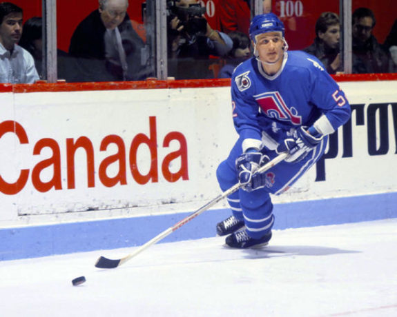
These baby blue beauties were donned by the Nordiques throughout the team’s entire 16-year tenure in the NHL. Naturally, the jersey design was not the “exact” same throughout the years. Small changes were made to striping on the pants, moving from one stripe to two, while sizing alterations to the fleurs-de-lis, which bordered the base of the jersey, as well the main logo, were also made.
The “Nordiques”, meaning “People of the North”, and this jersey are iconic in both Canadian and Quebec hockey history. The team logo, whose true design is commonly unknown, is that of an igloo, with a hockey stick alongside it, illustrating the relation to the north, as the Nordiques were the most northern team in the NHL during their existence. The cool, blue colors of the jersey represent both the NHL team that Quebec lost as well as the hope that the team will return in the near future.
Colorado Avalanche Jerseys: 1995-2007
In 1995-96, the Quebec Nordiques were relocated to Colorado. Since Colorado didn’t fit the bill as a “northern” city, the team was forced to adopt a new nickname, and with it, new jerseys. Known for its mountainous regions and rugged terrain, the Avalanche were born and so too were new uniforms.

The Logo: The new Colorado logo was designed to represent the surrounding environment. In the middle, an “A” was placed to represent the Avalanche, while a puck flows down from its peak, similar to an avalanche, form a mountain.
The new jerseys were definitively different, with the previous blue largely removed, replaced with an attractive dark burgundy color. Throughout this six-year time period, similar to with the Nordiques, small changes were constantly being made. This jersey design instilled the basis for Avalanche uniforms in the future, as virtually the same burgundy, blue and trim colors have remained the same. It is this jersey that the Avalanche wore when they hoisted their most recent Stanley Cup in the 2000-01 season.
They also added an alternate jersey in 2001, featuring an all-burgundy top with black pants. The word ‘Colorado’ was written diagonally down the front. The white numbers were outlined with black, and there was a black stripe along the bottom of the jersey. That alternate wasn’t used after 2007, but a variation of it was used in 2009. The jersey was blue instead of burgundy, as the burgundy was moved to the shoulders.
Colorado Avalanche Jerseys: 2007-2017
The beginning of the 2007-08 season saw major changes made to NHL jerseys across the entire league. The NHL introduced the Edge jersey system, designed by Reebok over a three-year time period. New uniforms were created to be tighter fitting, more flexible, and less water absorbent, allowing for greater player maneuverability. Stemming from a newly made uniform, most teams made substantial changes to their uniforms, and the Avalanche were no exception.
The new-look Avalanche jersey suited the Edge system extremely well. Conforming to the new style, the Avalanche kept their original colors, yet made a bevy of subtle changes. Unlike in years prior when the burgundy color wrapped 360 degrees around the jersey, blue was placed under the arms, while on the white road jerseys, burgundy. Sharp, white and blue piping was used to separate the two colors on each jersey, creating a crisp, edgy-looking new uniform for the Avalanche.
The modern look for both the home and road jerseys has become one of the most popular-looking jerseys in the NHL. Alongside these creations was the previously mentioned third jersey, whose heavy use of blue brings back memories of the franchise’s Nordiques days. Meanwhile, the use of burgundy and sharp piping compliments their current home and road designs.
Colorado Avalanche Jerseys: 2017-Present
This wasn’t a drastic change, as the Avalanche went back to the jersey style from the 1990s and early 2000s. The color under the arms (blue at home and burgundy on the road) was removed, and the main color of the jerseys wrapped all the way around. Another change was made in the 2020-21 season, where Colorado moved to blue pants and helmets with their home jersey – marking the first time since they were in Quebec that blue helmets were worn.
From 2015 through the present, Colorado has also boasted a unique third uniform. With navy blue jerseys and pants over navy blue and burgundy socks, the alternate uniform is a much darker look. The jerseys sport white shoulders, with an image of the state flag of Colorado on the left shoulder.
The logo on the front is a triangular mountain with the familiar ‘C’ in the style of Colorado’s state flag – a throwback to the old logo of the Colorado Rockies (which later became the New Jersey Devils). Those third jerseys were used increasingly more often after the 2015 season, both at home and on the road.
Special Jerseys
There haven’t been many changes for the Avalanche uniforms since the franchise relocated to Colorado before the 1995-96 season. Even the alternate uniforms have been sparse. But there have been three other uniforms that the Avalanche used on special occasions.
The first of those came in 2016 for the NHL’s Stadium Series, when they donned white jerseys with blue shoulders and gray and burgundy stripes on the arms. The numbers were also burgundy. The logo on the front was the same ‘C’ from the Colorado flag, sporting a black circle in the center. They brought out another one-time-use uniform for the 2020 Stadium Series, where the top half of the jersey was blue, and the bottom half was burgundy. They were also split with a white line through the middle of the jersey and the sleeves. The front was adorned with an enormous ‘A’ that was perched atop a mountain range.
They released a special uniform in 2021 for their reverse retro jersey, and it was insanely popular among fans. The throwback looked like the home jerseys from the days in Quebec, including the old Nordiques logo and the fleur-de-lis on the shoulders and around the bottom trim. However, the color scheme remained blue and burgundy.

The biggest change in jerseys obviously came when the franchise moved from Canada to the United States, but there have been only cosmetic changes since then. The alternate and special jerseys have made appearances, of course, to mixed reviews. There will no doubt be uniform design changes in the future, but the Avalanche have remained relatively steady since that unforgettable first season in 1996.
Which of the Colorado Avalanche jerseys is your favorite?
This article was originally published in October 2014.
Free Newsletter
Get Colorado Avalanche coverage delivered to your inbox
In-depth analysis, breaking news, and insider takes - free.
Subscribe Free →