On Nov. 10, the San Jose Sharks released this tweet with Adidas Hockey, teasing the brand new “Reverse Retro” jersey, a fourth jersey to add to the home, away, and third jersey repertoire for 2020-21.
Adidas then began teasing parts of the concept, as opposed to an animation as in the previous tweet two days later, featuring the collar, what looks to be part of the arm, and the Adidas logo in a series of three images.
Another four days after that, the jersey was released to a resounding amount of support from fans. In response, the Sharks changed their profile picture on all of their social media to reflect this, going back to the logo that they used from their inception into the NHL until around 2007.
Per a press release from the NHL and Adidas, they described the jersey and part of its history.
“The Sharks’ first third jersey circles around to take another bite in this Reverse Retro jersey. [The] Sharks’ recognizable crest, combined with sleeve numbers and point accents, brings back classic vibes from the team’s 1998 season.”

This is a gorgeous jersey, with their iconic logo from the early days of the team on a gray background, with tones of black, teal and white on the arms and neck line, while on the back, another field of gray is featured with the numbering in teal. The numbering and lettering on the jersey uses the same font as well.
Comparing to the Original
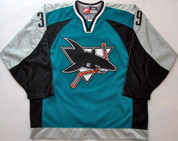
As you can see in the picture of the Nike Jersey above, that old design is possibly the inspiration for the Reverse Retro rendition. The name of “Reverse Retro” in this case is extremely appropriate, as they completely reversed the location of the colors in the original. The gray that is on the shoulders and running down the arms instead becomes the focal point and base of the jersey, being featured prominently on the front and back.
Speaking of focal points, the teal that was the feature in the late 90s has now been relegated to accents on the arms, neck line, and bottom of the jersey. The black that once was on the sides of the teal feature is still there, but in the arm area where the numbering on the side is located.
The Logo
Going to a classic logo was the theme of many of the other Reverse Retro jerseys. The Rangers did it with the old Lady Liberty head logo, the Carolina Hurricanes and Colorado Avalanche did it with their Whalers and Nordiques logos, respectively, so on and so forth.
This is fitting that the Sharks went back to the old logo. The same day that the jersey was released, the Sharks released a tweet asking fans which player they think of when they see that jersey, nodding to the old logo.
I think of a few players when I see this jersey. Patrick Marleau in his first few years as a Shark, Evgeni Nabokov, current goalie coach, Jonathan Cheechoo, and Owen Nolan.
My Opinion
I absolutely love this jersey. Coincidentally, before this jersey was even rumored to be released, I was searching for the old Sharks jersey on eBay. I was not necessarily in the market for one, I was just perusing the site to see what I can find. This was because I loved that old logo, and deep down, I wish they would bring back that logo. Obviously, my dream came true when they released these, and I couldn’t be happier at the way they turned out.
The Sharks Reverse Retro, like the others, will be released on Dec. 1 for purchase. According to an article on the San Jose Sharks website, it will be at the Sharks Store at SAP Center, the Sharks official website store, the Solar 4 America Ice Pro Shop, as well as NHL.com and Adidas.com. It will cost you around $200 when it is released.
This jersey throws back to the beginnings of the team, giving younger fans a piece of history in a modern setting.