A few weeks ago, I put together a list of my 10 favorite NHL sweaters. Those are the best of the best but what about the worst of the worst? It’s time for the NHL’s Ugly Sweater Party. It is after all the first of December.

New York Islanders’ Alternates
While I really like the Flyers’ orange jerseys, most sweaters with a different color name plate than the main background color just don’t do it for me. The current Islanders third jersey has a weird font for the numbers and just an awkward looking name plate contrast. The Flyers have black writing on a white name plate with an orange background allowing a crisp contrast. However the Islanders blue letters get lost on a white name plate with a blue background, not a good contrast.
Minnesota Wild’s Whites
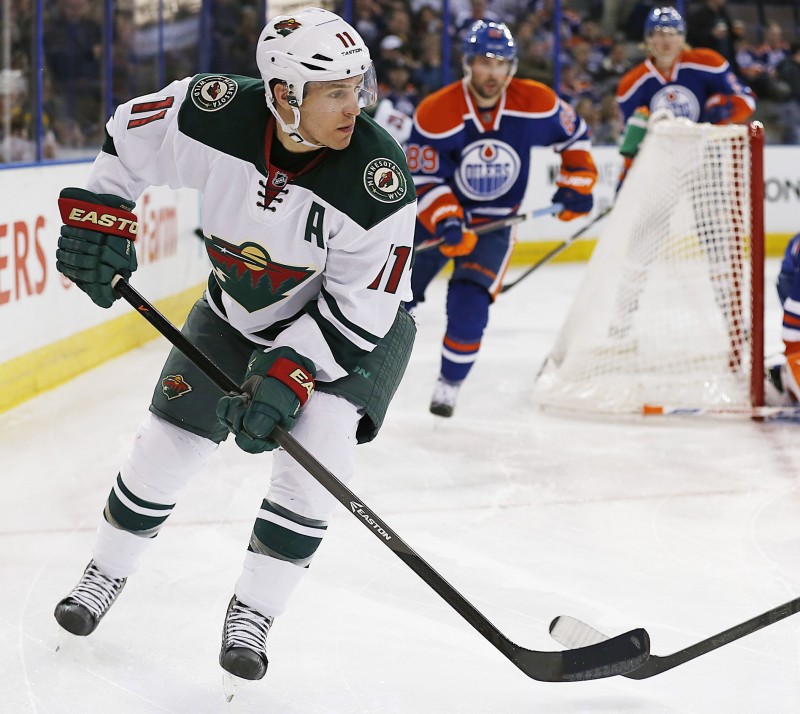
Some out there gave me grief for putting the Wild’s red jersey in my favorites list. While it is still the same basic group of colors, I can’t stand the Wild whites. The red numbers with green letters, it just looks way too much like Christmas for me. You want to talk about an ugly sweater party, just wear one of these.
San Jose Sharks’ Teal
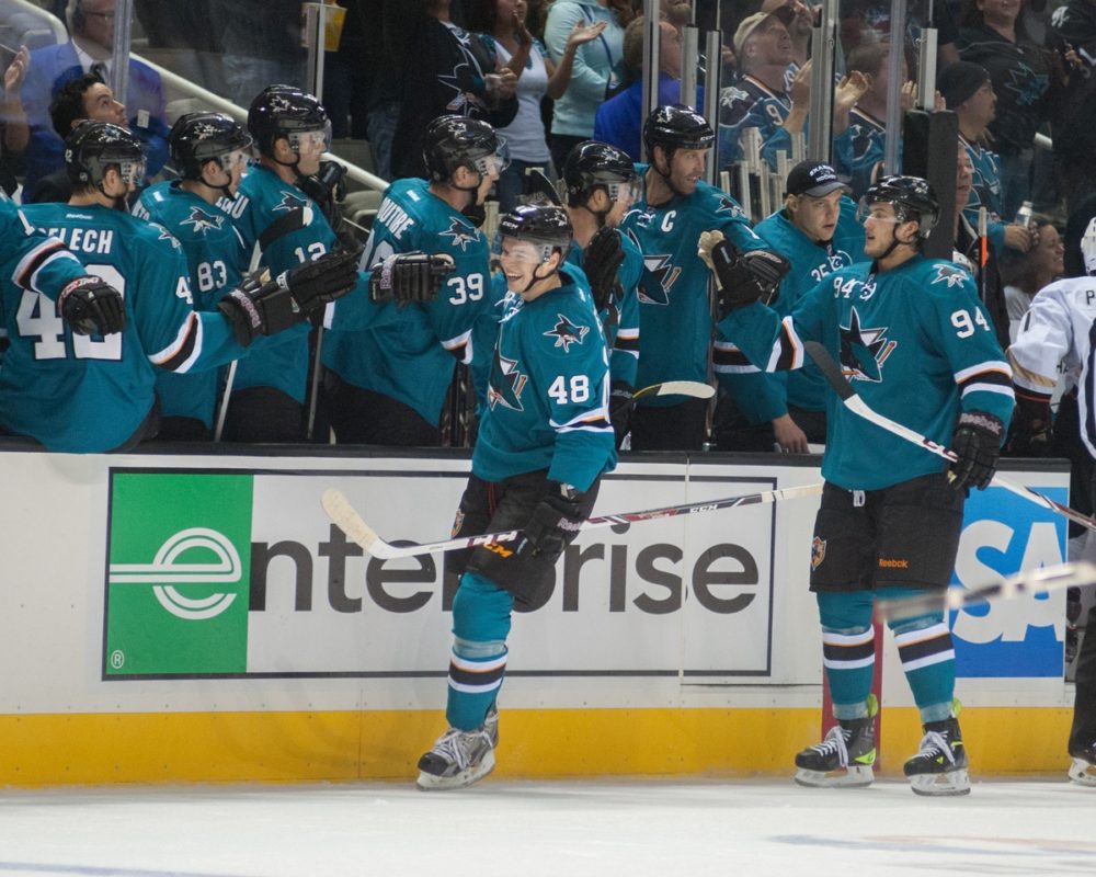
Where I’m going to get a lot of grief from my loyal readers, is this one. Primarily I cover the Sharks here at The Hockey Writers, and historically I love the Sharks teal jerseys. Unlike most, I have typically loved both the teal and the alternate black no matter the era. However, personally I find the current teal to look boring, nothing interesting, little contrast, they look like practice jerseys to me.
Nashville Predators’ Yellow
Anybody need a highlighter? I think that is all I have to say here. Although they are better than that old off-yellow, whatever that color was that they used to wear, I still think these are atrocious.
Dallas Stars’ Green
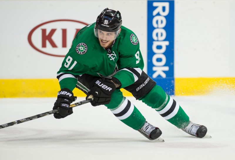
For some reason a lot of people seem to love the Stars’ new jerseys. The bright green just doesn’t do it for me. I know many fans grew up with this type of color with the North Stars, but growing up my image of Mike Modano is the North Stars black jerseys he wears in his Mighty Ducks cameo with Emilio Estevez.
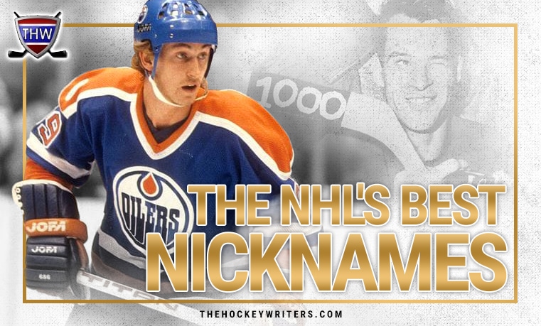
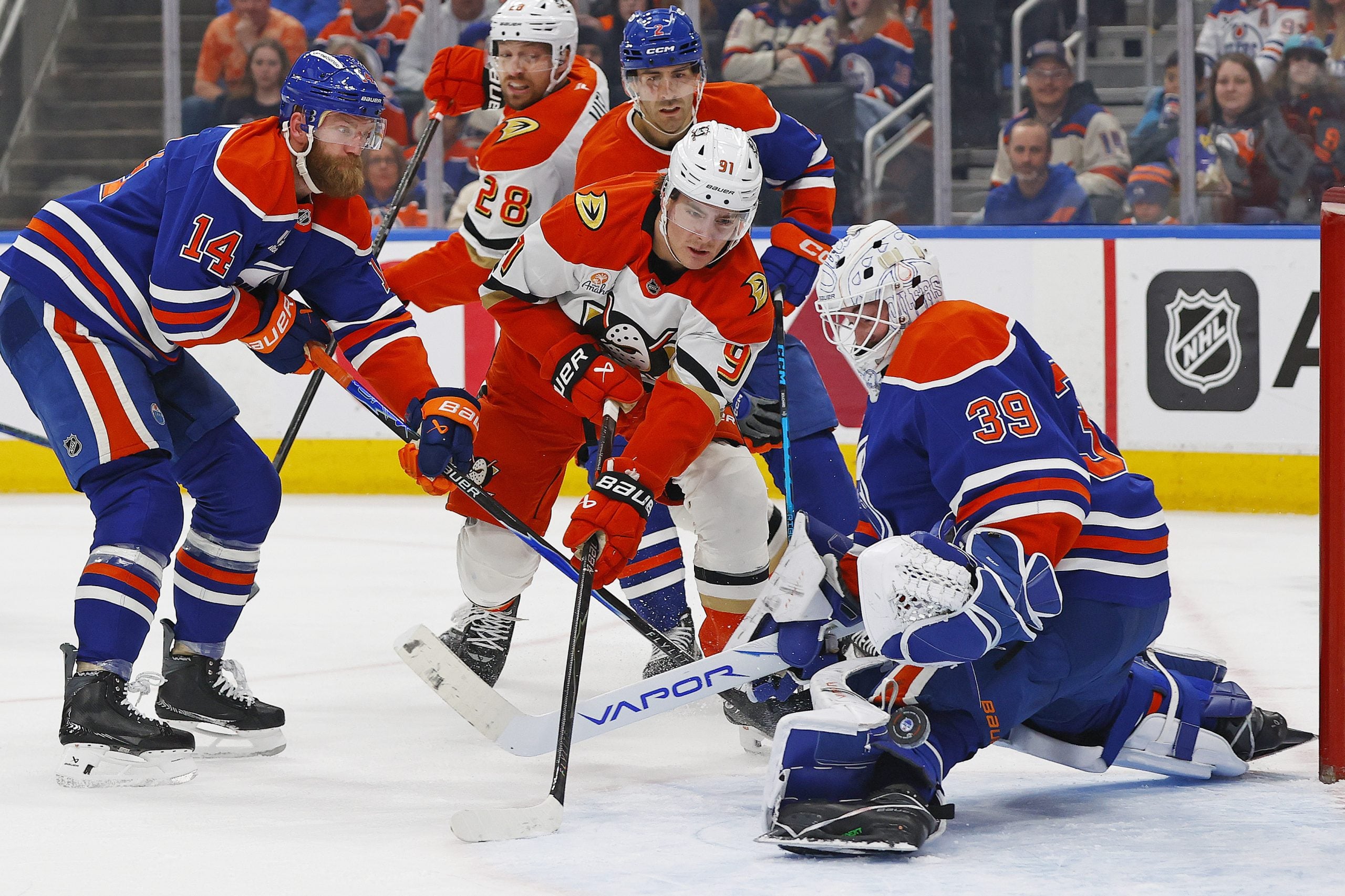
Edmonton Oilers’ Blue & Orange

Who do they think they are? The 1980’s Denver Broncos? Yuck.
Pittsburgh Penguins’ Baby Blue
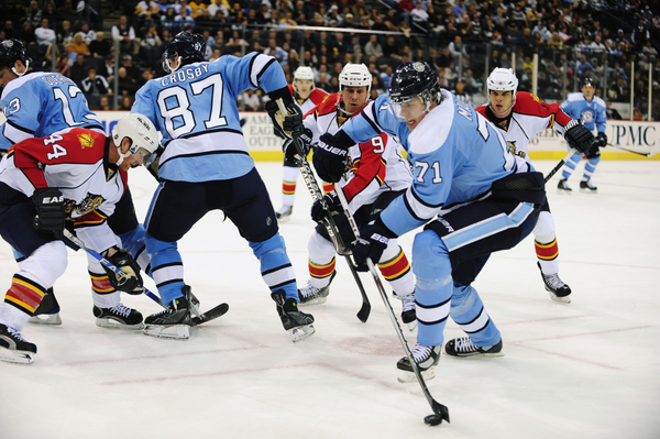
I don’t know what it is, but it bothers me like no other when teams throw in alternate uniforms with zero resemblance whatsoever to their main jerseys and main color scheme. Not quite sure how long ago they last wore these or if they are primarily their outdoor game jerseys or what have you, but personally I’m not a fan. They look like giant babies out there.
Anaheim Ducks’ Whites
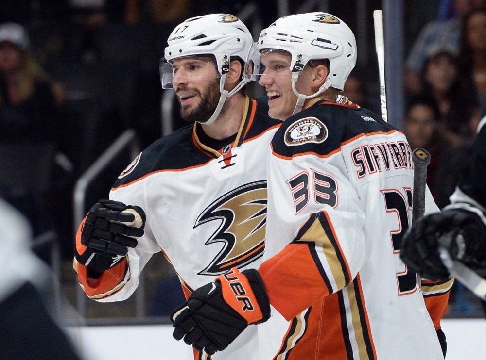
Is that brown? Or black? That really looks like brown, and unless your team name is the Browns, that is a terrible color choice for a jersey. These are awfully reminiscent of the Minnesota Wild whites, but at least red and green are good colors by themselves. I’d rather wear an ugly Christmas themed jersey than a jersey that looks like it belongs in the toilet.
Calgary Flames’ Reds
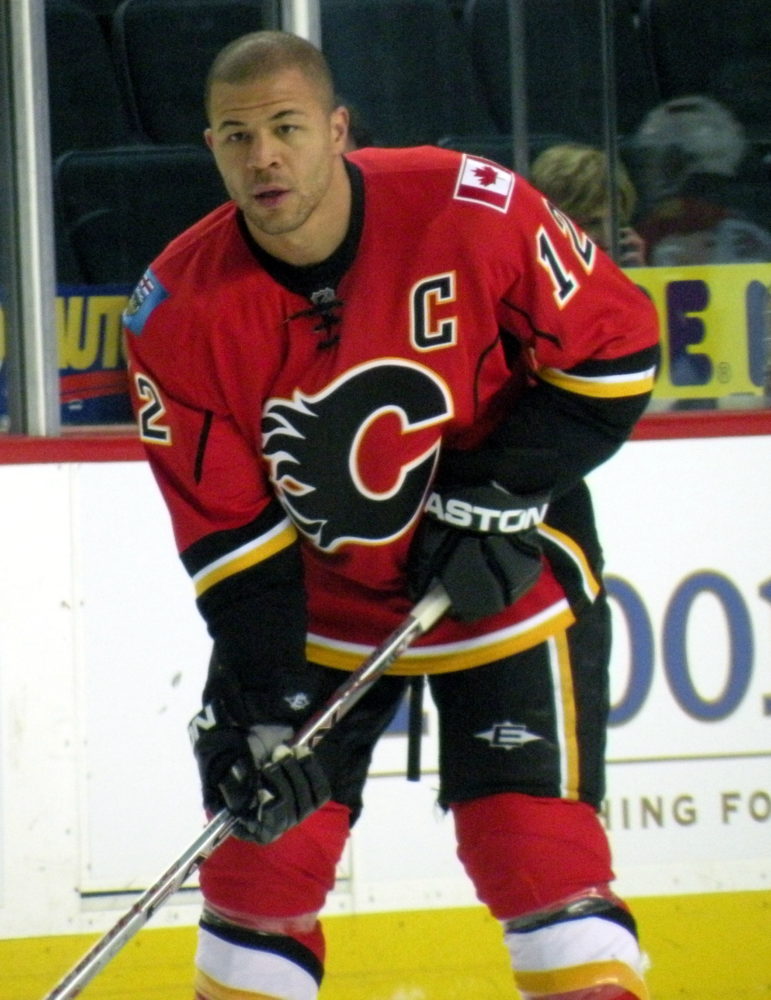
Not sure what it is but the black logo with orange border on a bright red background doesn’t do it for me. I’m a big fan of the logo itself, but I much prefer Calgary’s whites.
Buffalo Sabres’ Blue & Yellow
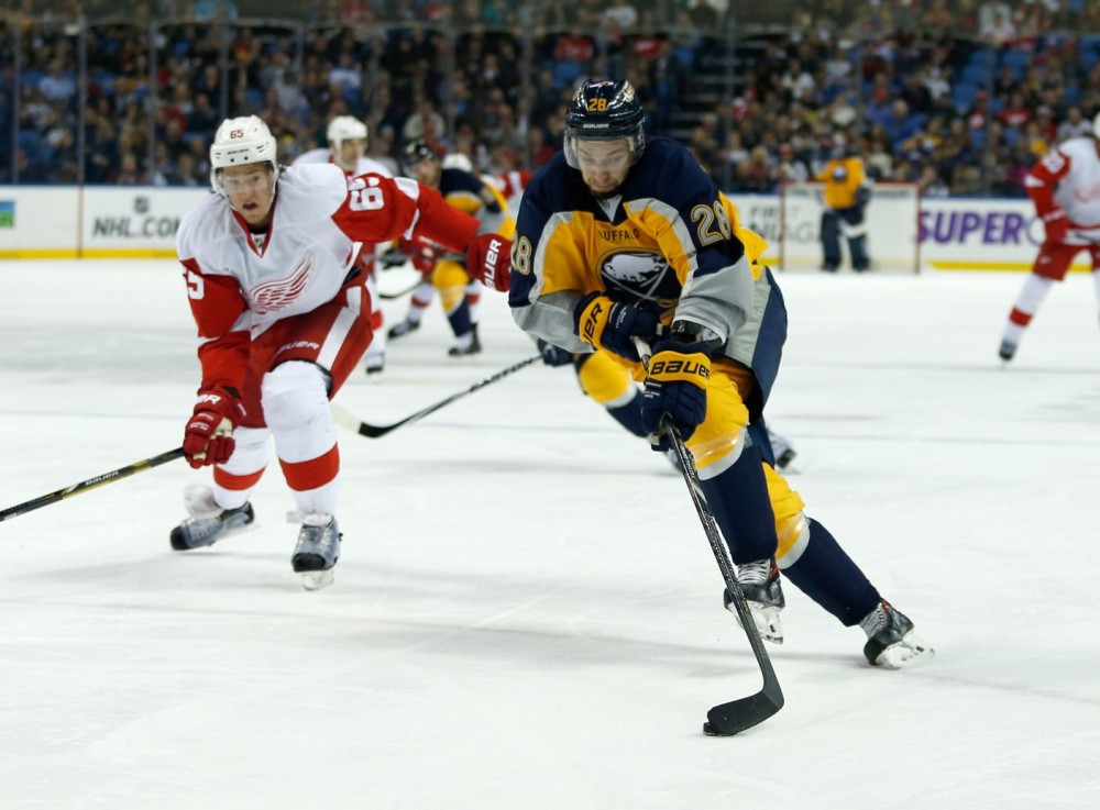
A lot of you may have major qualms with some of my choices for ugly sweaters but I think we can all agree that this new Sabres jersey is by far the worst in the entire league. Is it mainly yellow? Is it mainly blue? Whatever it is, it is an ugly one.
Have a problem with my list of ugly sweaters? Let me know in the comments below which ones you feel I’ve done wrong. Or which ugly ones I forgot about!
Free Newsletter
Get Humor coverage delivered to your inbox
In-depth analysis, breaking news, and insider takes - free.
Subscribe Free →


I don’t hate the sabres at all, i just think their red and blacks with the buffalo face logo were much better jerseys
You’re just a Sabres hater nitwit !!! Never have anything good to say!! Goof!
They are sweaters, but as a writer, it is critical to try and mix up terminology to avoid sounding redundant, jerseys is the primary alternate term.
Did i not reference the North Stars original color scheme? Or did you just look through the pictures and not actually read the article?
The Oilers? You clearly have no regard for the classics. Oh, and if you had followed hockey for more than a few months you would know about a team called the Whalers, they won a cup shortly after they moved to Carolina. You would also know the original team in Minnesota called the North Stars that moved to Dallas. They are a big reason we hockey fans (actual) have an affinity for the Dallas green.
This is a pretty weak article. I know your school paper “credentialed” you to cover the Sharks but this is silly. Did you just google an image list then pick out the ones you don’t like,
slow day at the office eh?
Could everyone please stop calling them “jerseys”? They are “sweaters”
To each their own lol
Yeah i wasn’t including Olympics but those were awful. The 2010 ones were much better. Hey at least your sabres beat my sharks twice? lol
Oddly enough people criticized me for not having the leafs on my top 10 favorites list. I just dont see the appeal of a logo shaped like a leaf lol.
tomatoes tomatoes
Actually… you check yours. The Stadium Series Sweater been adopted as the teams 3rd jersey this season. The awful Black ‘Lacrosse-like’ jerseys have been done away with.
I kinda like the Sabres yellows.
Do you watch NHL Hockey? Thats the islanders stadium series jersey not 3rd jersey. Check your facts junior
As a Sabres fan, I heartily agree about the awfulness of that blue, yellow, & gray mess. It’s hard enough to suffer through rebuilding, but that thing just adds insult to injury. At least it’s their 3rd jersey so we don’t have to look at it that often. I would add to this list the ugliness of the 2014 US Olympic team’s sweater with the cringeworthy shiny stars on the shoulders.
This list should only have one jeresy: The Maple Leafs
Right, orange and blue contrast works, i just dont like the orange shoulders on top of blue jerseys, their 2005-06 uniforms i thought rocked better. As for the Penguins, that may be their old color scheme but their known now for goldish yellow, black and white, and im not a fan of their baby blues throwbacks. Appreciate the comment!
Over the years growing up rooting for the Sharks, i usually hate white and prefer the teal and the black, but the new white jerseys are much better than their new teal. The wild white just reminds me to much of candy canes.
lol to each their own mate, no need for name calling haha
Funny, I think Wild has the best white jerseys in the league. I would gladly own one and this is coming from a guy who usually hates white jerseys.
Oilers have some of the nicest jerseys in the league.. you sir are an idiot.
I am not sure if you knew this but the Penguins jerseys go back to their original jerseys when the team was created and the Edmonton jerseys are based upon the jerseys they wore during their dynasty years.
I mean i fully admit that I’m not familiar with every teams history of jerseys. These are just ones im not a fan of currently.
It seems that perhaps you are unaware of some NHL team’s uniform history. Nice try though.