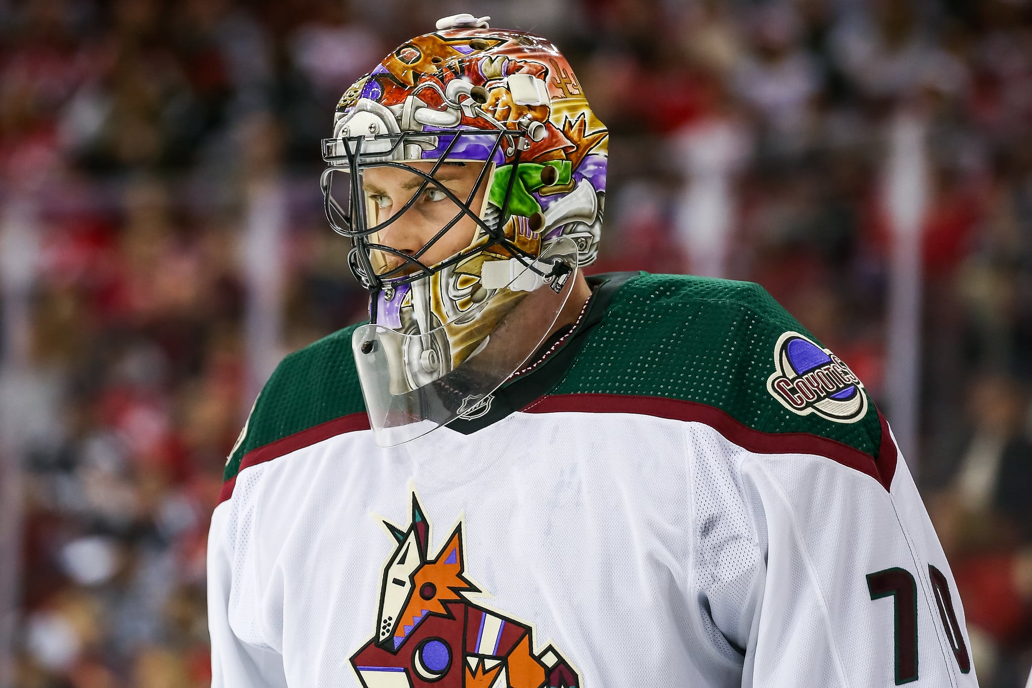
- White & Black Kachina (1996-03, 2021-2024)
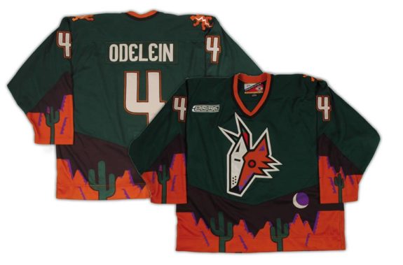
- Desertscape Alternate (1998-03)
- Reebok Edge White & Red Howling Coyote (2003-14)
- The Running Coyote Alternate (2008-14)
- White & Red Howling Coyote (2015-21)
- Reverse Retro (2021 & 2022-23)
- Desert Night (2022-2024)
- Coyotes Jerseys Brought Uniqueness to the Desert
The Arizona Coyotes franchise had an extensive history revolving around its jerseys and logos, as the club saw numerous rebrands throughout the years. While the team’s mishaps got the best of them, it’s important to note that the franchise hit on nearly every jersey. From the iconic Kachina to the stylish Reverse Retros, there was no shortage of great jerseys; without further ado, let’s dive into the Coyotes’ rich jersey history.
White & Black Kachina (1996-03, 2021-2024)
When the team moved from Winnipeg to Arizona, there were many questions about what the team logo and jerseys would look like. There was also plenty of uncertainty around how well an NHL team would perform in the Southwestern United States, which had never been done before. The Coyotes needed to make a splash and wanted to stand out compared to the rest of the NHL with something different. That’s when the Kachina jersey was born.
After they revealed the iconic Kachina logo six months before the 1996-97 season, it was also the debut of some of the best sweaters in NHL history. The colors consisted of forest green, brick red, sand, sienna, and purple, and the centerpiece of the magnificent uniform was a hockey stick-wielding coyote on skates, with traditional Southwestern colors. Lots of the inspiration behind the jersey came from Arizona’s rich Native American history, which played a part in the creation of the jersey and logo. Another interesting fact many people didn’t notice was the crescent moon on the logo in the middle of the jersey was designed to look like a ‘C’ for Coyotes.
The Coyotes rebranded shortly before the 2021-22 season, where they reintroduced the same iconic Kachina, making both jerseys permanent again. The team had several ups and downs throughout its existence, but despite the struggles, they had arguably the best jersey in the NHL with the Kachina.
Desertscape Alternate (1998-03)
The Coyotes introduced the world to the Kachina right before their inaugural season in Arizona, shortly after they debuted the Desertscape alternate. This jersey was against a deep green backdrop bordered by a desert landscape, (including the crescent Moon rising over it all) making this a wild design. It was a bold move to make a green jersey, but the team already had the Kachina, so why not make things even wilder?
The designer of the Kachina and the Desertscape logo didn’t even design the jersey, as he said the following, “The league came back to us and had us build the Coyotes mask, for that mask jersey, just the mask, not the jersey.” It also introduced fans to the oft-forgotten salamander logo, which was a patch on the left shoulder of the jersey.
While the Desertscape had its cool looks, did players enjoy wearing them? Stan Wilson, Coyotes’ equipment manager said this, “Oh, for sure, without question it’s the Kachina now, back when we originally wore it, the design of it, the actual material was tough. It absorbed so much water, so it was so heavy, the originals that we wore back in the 90s. The new ones now, they’re all built with the new technology so they’re so much better. The guys love them, the players … they would wear it all of the time if they could.” After having the Kachina as the primary jersey for more than seven years, the organization thought change was needed, rebranding into a new era.
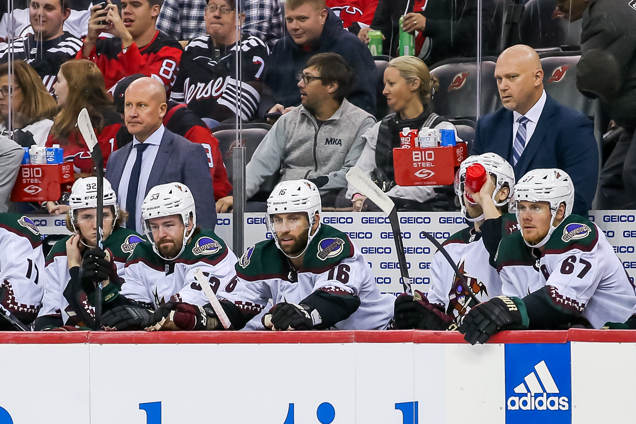
Reebok Edge White & Red Howling Coyote (2003-14)
The Coyotes completely rebranded the organization in 2003, and with that came new jerseys. At the time, this made sense since the team was moving into their brand new arena, Jobbing.com, but now this looks to be a massive mistake. The away and home jerseys during this time were much more bland than their predecessors, as the colors consisted of brick red, sand, black and white.

In addition to it being the primary jersey for the Coyotes for over a decade, it also played a huge part in some of their few playoff runs. They wore these jerseys during the 2012 playoff run, which was ultimately halted in the Western Conference Final against the Los Angeles Kings. Other than that, these sweaters aren’t very memorable, primarily because they were the ones to replace the Kachina. However, just like in the 1990s, they also had an alternate jersey that brought out more than these did.
The Running Coyote Alternate (2008-14)
After the Coyotes rebranded in 2003, they had yet to have an alternate jersey since the Desertscape was introduced in 1998. When the team changed the logo to the howling coyote, they needed an alternate to complement the primary logo. A body had to be added, and thus, the Running Coyote was born.

This jersey wasn’t anything too crazy, but it was a nice change to the rather bland red and white Coyotes jerseys at the time. It had a centerpiece of a full-body coyote and was a pretty nice jersey, all things considered.
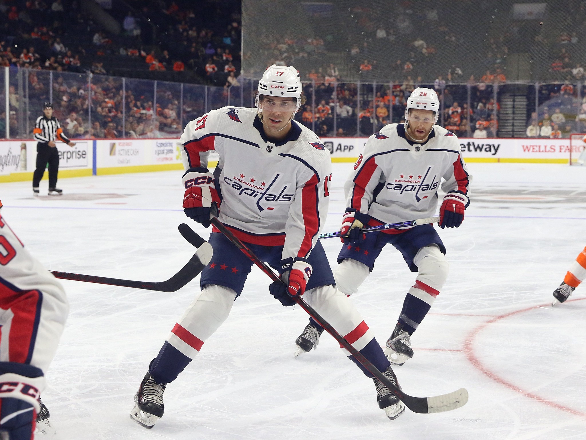
White & Red Howling Coyote (2015-21)
This era of the Coyotes was certainly an all-time low, the commute to Glendale wasn’t ideal, and the team seemed to struggle on the ice constantly. Shortly after being renamed the Arizona Coyotes instead of the Phoenix Coyotes, the team again changed its jerseys.

These jerseys had much more pop to them, despite failing to last more than six seasons. The color was similar to the brick red during the 2003-14 era, but it seemed darker, fitting in more with the desert theme. They had a positive impact compared to the Reebok Edge jerseys, which were pretty boring and didn’t stand out, especially since they were the Kachina’s replacement.
Reverse Retro (2021 & 2022-23)
When the NHL announced it’d be doing Reverse Retros, there was excitement across the league, with many hoping to see their favorite team bring back classics. That’s exactly what the Coyotes did with their first Reverse Retro design. It was a nod to the 1998 Desertscape jersey, except this time, it was purple. It had the same Peyote Coyote as the centerpiece of the jersey; it also had the same design at the bottom with a desert and some cacti. This was the team’s first time trying purple, and while it looked great, some didn’t like the contrast between the purple and desert landscape at the bottom.
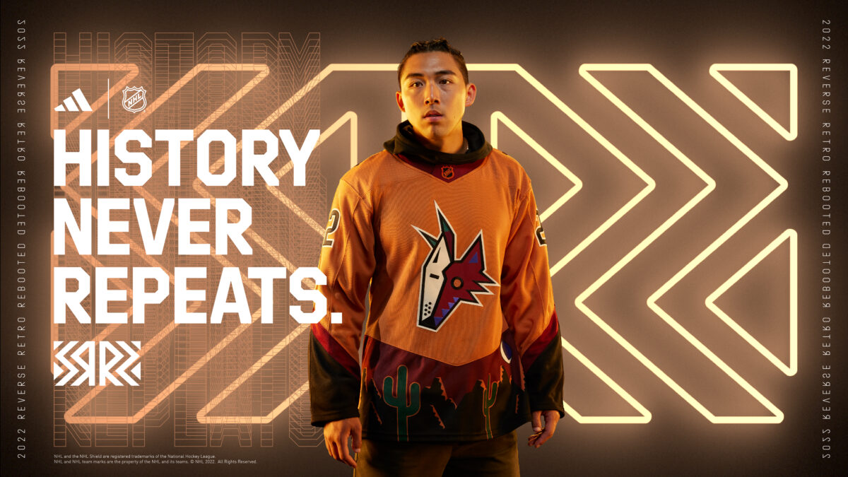
Fast-forward to the 2022-23 season, where the NHL released the second Reverse Retros for each team, and the Coyotes went with a very similar design. Only this time, it had a desert sienna color. This one popped, and fans and players loved it. “We are extremely excited to introduce our new Desert Sienna Reverse Retro alternate jersey,” said Coyotes President & CEO Xavier A. Gutierrez. “Our fans loved our purple Reverse Retro jersey, and we are confident that they will also be impressed with the cool changes to this classic jersey – especially the unique color that was inspired from our Kachina head logo. This is a great opportunity for us to grow our brand with a new and innovative jersey and connect with our Coyotes fans and our fans in waiting. We can’t wait to see our players wear these incredible jerseys at Mullett Arena.”
Desert Night (2022-2024)
With all the past jerseys being bold and having strong colors like the Kachina, the Coyotes’ third jersey last season was the exact opposite. The jersey color was burgundy, which is a similar color to the brick red on the Kachina, and it was worn 14 times during the 2022-23 season. It remained the Coyotes’ alternate entering the 2023-24 season.
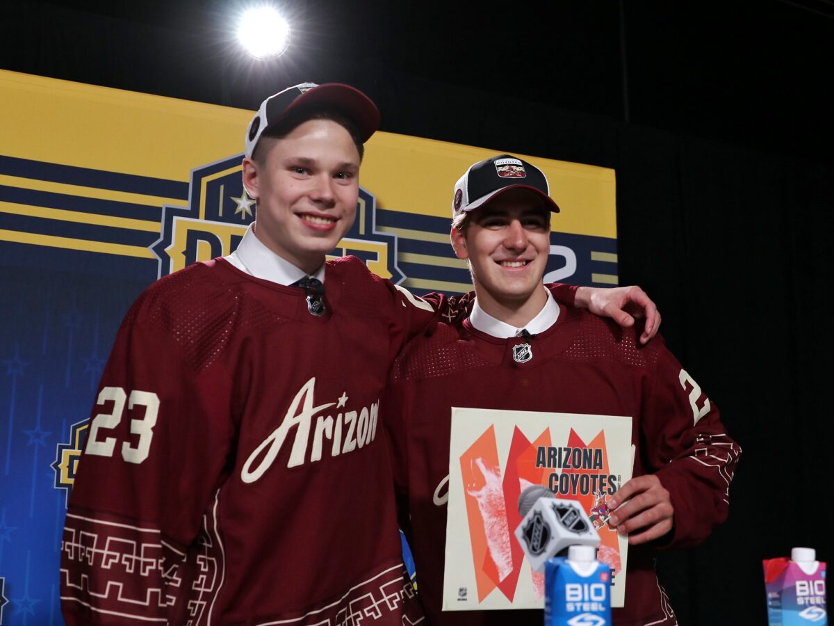
It was also heavily promoted at the 2023 NHL Draft, where first-round draft picks Dmitri Simashev and Daniil But wore it after being selected. “My inspiration for the third jersey came from the environment, the community, the colors, and the clay – roots of the AZ Culture. I feel honored to pioneer with the Coyotes the reimagining of the sport alongside culture and design,” said Villaseñor. Villaseñor looks to continue making an impact in the desert, as his jersey will continue being used this season.
Coyotes Jerseys Brought Uniqueness to the Desert
There’s no doubt the Coyotes had one of the richest jersey histories in the NHL. The Kachina remains an iconic image in the state of Arizona and was one of the most recognizable jerseys insports,; as well as the newer jerseys like the Desert Night and Reverse Retros, which also made an impact upon arrival.
Free Newsletter
Get Arizona Coyotes coverage delivered to your inbox
In-depth analysis, breaking news, and insider takes - free.
Subscribe Free →