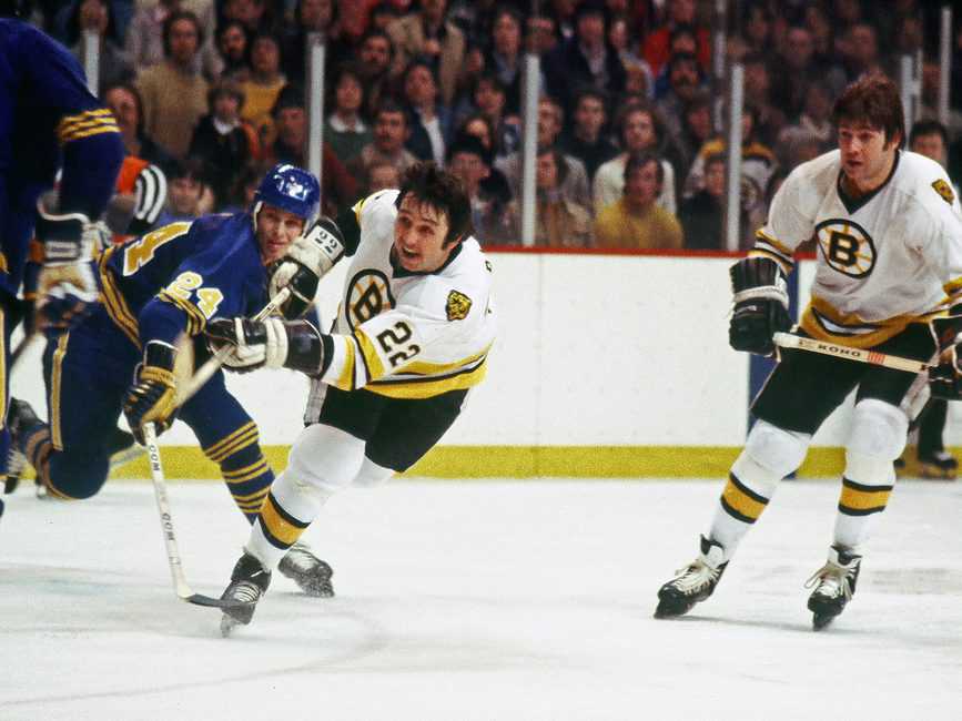
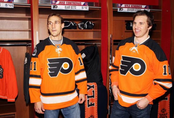
Dating back to 1967, when the NHL saw its first expansion, the Philadelphia Flyers have had one of the most iconic uniforms in hockey. As one of the only teams to utilize the color orange in their uniform, the Flyers sweaters have almost always stood out. On top of that, the use of the same primary logo during their 58-year history has made them one of the league’s most recognizable franchises.
The Flyers’ jersey has never really undergone a significant change. They’ve never strayed from their original color palette of orange, black, and white, and the unwavering use of the original logo has stifled crazy alternates. Through a series of minuscule changes, the Flyers have had some tremendous jerseys. Their catalogue of uniforms also brings some obvious blunders, but overall, their constant use of the original setup hasn’t allowed for any questionably bad jerseys.
The Originals
From the beginning, the Flyers have had one of the most classic jerseys that never tried to do too much.
With simple striping on the sweater, the Flyers introduced the world to their “Flying P” logo. It’s never been a very well-understood emblem, but it’s synonymous with the organization.
Orange and white were the stars of the jersey, with black serving as an excellent complementary color at the end of the sleeves and on the pants. The original sweaters weren’t the most detailed, but over the following five or so years, the jersey gradually added some much-needed detail, such as an outline around the back and sleeve numbers and the introduction of names on the back.
Cooperalls Era
Almost 40 years later, most people have probably happily forgotten the “Cooperalls”. It’s almost impossible not to mention them when discussing the history of the Flyers jersey. The Cooperalls were a full-length hockey pant that the Flyers wore in 1981-82 and in the 1982-83 season when the Hartford Whalers joined in on the fun.
They were scrapped, for obvious reasons, fairly quickly, but during those two seasons, the Flyers also made some pretty significant jersey changes as well.
In the first Cooperall season, the Flyers did away with the orange or white stripe at the bottom of the jersey. In the second, they amped up the black, adding a black stripe at the bottom and a black stripe along the neckline and around the cuff of their gloves.
This new-look jersey, introduced in the 1982-83 season, was easily one of their best all-time sweaters and eventually became the cornerstone of their full-time uniform.
Introducing the Black Alternates
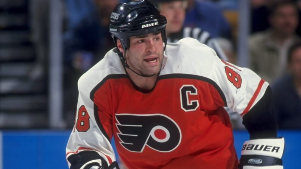
After 14 years with their original orange and white jerseys, the Flyers took one of the boldest design and branding steps in franchise history. During the 1997-98 season, they introduced the first alternate in the form of a black jersey. The sweater kept the same pattern and design as their home and away jerseys; a very different concept for an alternate than the rest of the league, just recolored with black as the base with white sleeves and
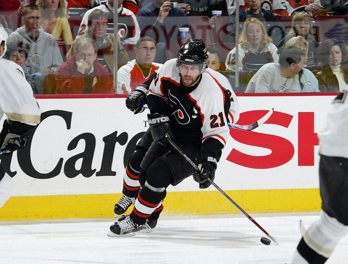
Their black alternates, one of the most beloved in team history, served as the team’s third jersey for the next four seasons. At the start of 2001-02, the Flyers made their black sweater their road jersey, officially retiring the orange jersey.
Highly-Disputed 3D Silver Alternate
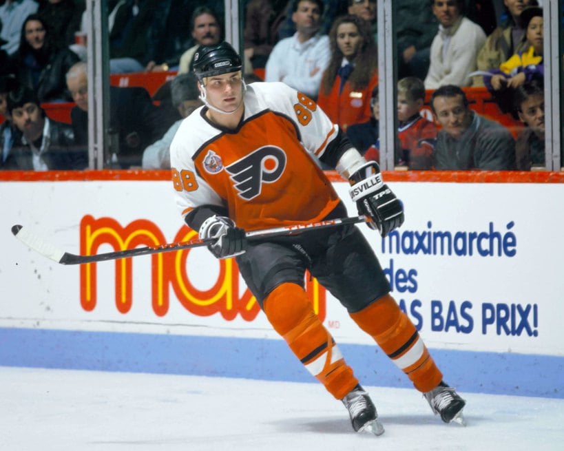
However, it didn’t take long for the Flyers to re-introduce an orange jersey into their rotation. In
The main emblem along with the name and numbers were also outlined by this silver trim, giving the jersey, and especially the logo, an almost 3D look. To this day, it was probably one of the Flyers’ most ambitious jersey designs and is, by far, one of the most highly-debated jerseys among Flyers fans. Even 13 years after it left rotation, it still receives its share of criticism.
Reebok Edge Era
When the Reebok Edge system took hold during the 2007-08 season, the Flyers’ jersey saw some very minor changes.
They stuck with their black and white base setup, with orange as the jersey’s tertiary color mainly on the sleeves, names, and numbers. They took the modern approach of the Reebok Edge system but maintained the classic properties that had made up their jerseys to that point.
Return to the Old School
Throughout the Reebok years, beginning in 2008, the Flyers kicked off what became a return to their classic uniforms of the 1970s. They again added a new, orange-based third alternate jersey. This time, however, it completely disregarded the league-wide style and adopted a throwback look over something more modern.
This one paid homage to their franchise’s original orange road sweater, with only one real difference. They added a white nameplate with black lettering to the back of the jersey while keeping the rest of it the same as it was four decades earlier.
For the memorable 2009-10 season, the Flyers officially made it their new home jersey, as the black Reebok jersey became their alternate. For the past 10 years, this design has served as their home jersey.
With the return to the classic uniform plan set in motion, the Flyers came full circle for the 2010 Winter Classic against the Boston Bruins. Their special outdoor game jersey was the same as the team’s original white uniform worn in the 1970s and became the team’s official away sweater later that same year.
2012 Winter Classic
When the Flyers were announced to play in the 2012 Winter Classic against the New York Rangers, fans scratched their heads about what the team would do for a new special-edition jersey. They had already made the switch to the classic uniform for their home and away jerseys, and it was much too soon to attempt a re-invented throwback jersey from the 1980s to 2000s.
So, the Flyers introduced something new. With a new burnt-orange look, the jersey was trimmed with black and had a unique cream color that was also used for the nameplate and bordering of the numbers. The best part of this jersey, by far, was the turnpike logo that held the captaincy letters.
Just like the silver, 3D alternates from the early 2000s, the 2012 Winter Classic sweater was another wildly ambitious jersey. This one, however, was much more well-received by the fans, and the Flyers made it an official third alternate jersey for the 2014-15 and 2015-16 seasons.
50th Anniversary Gold
One color that doesn’t go well with an orange, black, and white color scheme is gold. Unfortunately, the Flyers didn’t get that memo when they designed their 50th Anniversary jerseys to be worn during the 2016-17 season.
With a more straight-line style of striping along the sleeves and bottom of the jersey, the Flyers could’ve introduced a pretty solid alteration of their road whites. It was the gold numbering, however, that really buried the chance of these jerseys being a hit.
Alongside the Flyers’ traditionally incredible color combination, the gold stuck out like a sore thumb. It turned out to be a good thing they only used this jersey for one season as the fans still actively try to forget this golden catastrophe.
Re-inventing the Black Alternates
It was only a matter of time before the NHL set up a Flyers vs. Pittsburgh Penguins outdoor game. When the iconic Keystone rivalry made its way outdoors in 2017, the Flyers finally listened to the cries of the fans and introduced a new black jersey. Although the design was fairly simple, it’s still probably one of their best alternates to date.
With black at the base and some standout orange striping, the sweater demoted white to the tertiary color to be used for the bordering of the numbers and the outline of the logo.
You may also like:
- Flyers Sign Jamie Drysdale to 4-Year Extension
- NHL Rumors: Red Wings GM, Mantha Speaks, Rielly News, and McDavid to Flyers?
- 6 NHL Teams That Have Improved the Most This Offseason
- NHL Rumors: Kane’s Two Teams, Savoie Talk, Root of Larkin’s Rift
- Grading Flyers’ Trevor Zegras Extension
For the past two seasons, the Flyers have used their black Stadium Series stunners as their third jersey. Although it’ll likely be fazed out with the introduction of a new alternate, it’s easy to believe the Flyers will return to a black jersey for their home or away primary sweater at some point.
2019 Stadium Series
After their disappointing loss to the Penguins in the 2017 Stadium Series, the Flyers had a shot at redemption two years later. The 2019 Stadium Series took the cross-state rivals to Lincoln Financial Field in Philadelphia. This represented another opportunity for the Flyers to create something entirely new.
Going with a two-tone look, the Flyers and Penguins both went with uniforms free of white. The Flyers utilized a slightly darker shade of orange than usual with black trim and striping as well as an all-black crest.
Although the game’s uniforms resulted in some pretty questionable helmets, both jerseys were solid. However, this brand-new take on the Flyers jersey was again met with mixed reviews. Considering its short run, though, it wasn’t worth expending too much energy.
Reverse Retro
Last, but not least, we’ve seen the recent “Reverse Retro” jerseys that went live league-wide during the 2020-21 season. The Flyers look has been met with mixed reactions, but overall, it is a solid nod to their jerseys of the 1980s through 2000s. It’s supposed to remind fans of the days of Eric Lindros and the “Legion of Doom”, drawing inspiration from their orange uniforms of that time.

It utilizes the same burnt orange of the older jerseys but essentially swaps the colors of the sleeve, moving white to the cuff and black to the shoulders. All in all, there’s not much to say about the jersey other than it’s solid and suits the reverse retro concept. It’s not necessarily the most creative sweater, but there aren’t many options for a team that uses just three colors in all of their uniforms with the same logo every time.
Over the years, the Flyers have established they aren’t willing to step out of a specific box when it comes to their uniform. Unlike most of the teams in the league, they are uninterested in incorporating additional colors or alternate logos into their kits. That’s not always a bad thing, as they’ve produced plenty of incredible sweaters in their time. However, it’s almost always going to mean expecting something strikingly similar when a new uniform rolls around.
Free Newsletter
Get Flyers History coverage delivered to your inbox
In-depth analysis, breaking news, and insider takes - free.
Subscribe Free →